It's that time of the year. Time to argue about what the best books were—what was good, what was bad, but most importantly, which ones were the most good looking.
There's probably not a lot of overlap here with say, the NYT best book cover list, partly because I don't see the point in repeating them, and partly because I'm more of a genre and small press reader, and I naturally gravitate towards those titles. The small presses especially are where you find some of the bravest design work, because they're more likely to take risks.
So, for better or for worse, here are my top ten book covers of the year. My sincere hope is that you will find something here to pique your interest.
![]() 'Furnace' by Livia Llewellyn
'Furnace' by Livia Llewellyn
Artist: Mike Garlington with designer Scott R. Jones
Why it's great: A fantastic short story collection that will fill you with dread. That's hard to ''say'' with a cover, but well, they did it. Now I know what you're going to ask. ''Does that mean there are stories in this book about women holding goats loaded down with china and knick-knacks?''
That's not the point. The point is, it gives you an accurate description of the vibe these stories have, it's piquing your interest, it's telling you ''this book is not like the others,'' and that's really as good as it gets when you have to create a cover that sells a book effectively. The typography is just the icing on the cake and adds a lot to the final result.
What the book is about: In an earlier LitReactor column, I described the stories in this book as ''some firmly in the genre of horror, some defying categorization, all somewhat disturbing in a way you're not likely to have experienced. It's not quite Clive Barker and it's not quite Poppy Z. Brite—it's something altogether different—but that's as close as I can get.''
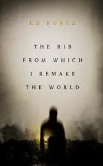
![]() 'The Rib From Which I Remake the World' by Ed Kurtz
'The Rib From Which I Remake the World' by Ed Kurtz
Artist: Erik Mohr
Why it's great: CZP always has some strong contenders for my end of the year list, and this year was no exception. Erik Mohr knocks it out of the park once again with a subtle yet terrifying cover.
What the book is about: A small town murder mystery featuring a creepy carnival and a somewhat unconventional ''detective.'' Described to me as ''horror noir.'' I'm only thirty pages into it, but already intrigued.
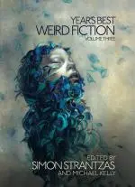
![]() 'Year's Best Weird Fiction Vol 3' by Simon Strantzas and Michael Kelly
'Year's Best Weird Fiction Vol 3' by Simon Strantzas and Michael Kelly
Artist: Beatriz Martin Vidal with designer Vince Haig
Why it's great: It's just beautiful. The art by Vidal is top notch; the typography understated and classy. It's effective in telling you this is a weird fiction collection, which is not the same as a horror fiction collection, which is not the same as a literary collection. It's unique and so is this book.
What the book is about: If the title didn't give it away, it's a collection of the best weird short stories of the year. It includes stories by Robert Aickman, Matthew M. Bartlett, Nadia Bulkin, Ramsey Campbell, Brian Evenson, Marian Womack and Genevieve Valentine.
![]() 'Shit Luck' by Tiffany Scandal
'Shit Luck' by Tiffany Scandal
Artist: Matthew Revert, who made multiple appearances last year.
Why it's great: It's got kind of a 70s vibe, but also a little bit of pulp? Strong typography, and the title of the book works well with the art to create intrigue over what exactly this one's about. Revert has a really wide range and this cover proves it.
What the book's about: A trip through the afterlife after getting murdered by a serial killer? Yes, please. An edgy, quick-paced and fun read if you like your books weird.
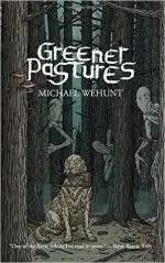
![]() 'Greener Pastures' by Michael Wehunt
'Greener Pastures' by Michael Wehunt
Artist: Michael Bukowski
Why it's great: One of my favorites of the year. Shock Totem knocks it out of the park with this one. The typography is both fitting and stays out of the way of the captivating, detail-rich artwork. And it's creepy as all get out.
What the book is about: A collection of weird fiction, often scary, often strange, never boring. There are round-robin stories about spooky old movies, a trucker getting lost in the nothingness of the road at night, and a really different kind of vampire. One of my favorites of the year.
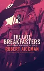
![]() 'The Late Breakfasters' by Robert Aickman
'The Late Breakfasters' by Robert Aickman
Artist: M.S. Corley
Why it's great: The colors are beautiful on this one. Corley is an extremely talented illustrator and graphic designer. Seriously, check out his website and you'll find a slew of new favorites and some instantly recognizable covers.
What the book is about: Robert Aickman's only novel, plus six of his best short stories. Never been published in the US until now, grab it if you're a fan of Aickman or weird fiction.
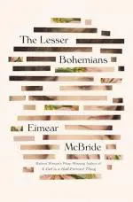
![]() 'The Lesser Bohemians' by Eimear McBride
'The Lesser Bohemians' by Eimear McBride
Designer: Oliver Munday
Why it's great: It's been done before, but it's a really nice execution. Sounds like I'm damning with faint praise, but I have a soft spot for designs like this one (old paintings and illustrations, repurposed through graphic design) and I wanted to include at least one.
What the book is about: Coming of age story set in the 90s about a young Irish woman who moves to London to attend drama school and pursues a relationship with an older actor.
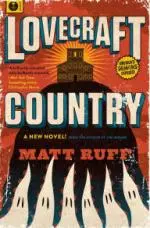
![]() 'Lovecraft Country' by Matt Ruff
'Lovecraft Country' by Matt Ruff
Designer: Jaime Putorti
Why it's great: Updated pulp-era designs are always great when done right. This is a good example. It probably wouldn't pass for an old pulp cover at second glance (typography is a bit fancy), but it's a nice throwback design with modern sensibilities.
What the book is about: Lovecraft and Jim Crow's America. Far from a pastiche, and no matter how you feel about H.P. Lovecraft's legacy, this is an important book.
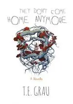
![]() 'They Don't Come Home Anymore' by T.E. Grau
'They Don't Come Home Anymore' by T.E. Grau
Artist: Candice Tripp with designer Ives Honavessian
Why it's great: I like the negative space so much and the art is just fantastic. The handmade (I'm guessing) typography is a nice touch and rounds out the design. Just lovely.
What the book is about: Teenage vampire girls and obsession. I'm not selling it very well. You should pick this up.
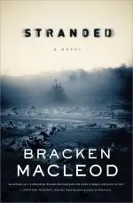
![]() 'Stranded' by Bracken Macleod
'Stranded' by Bracken Macleod
Designer: Jamie Stafford-Hill
Why it's great: I really like the typography on this one.It uses the photography assets to strengthen the design. I've always like understated design for what are arguably genre novels like this one. This works very well.
What the book is about: A ship lost in the Arctic, the crew falling ill one by one. It's kind of like The Thing, but on a boat. You should check it out.
Compiling this list gave me a chance to look back on the books I read and the covers that caught my eye throughout the year. It's inspiring the kind of work being made out there, both in the writing and my area of expertise—cover design. And that's me, for 2016. Argue with me in the comments!

About the author
George Cotronis lives in the wilderness of Northern Sweden. He designs book covers and sometimes writes. His stories have appeared in XIII, Big Pulp and Vignettes from the End of the World. He is also the editor in chief at Kraken Press and Aghast: A Journal of the Darkly Fantastic. You can see his work at www.ravenkult.com or read his rants over at his blog.

