It was a good year for books. Let's take a look at what I consider the best, most original book covers of 2015. This is most definitely a subjective selection, but I tried to pick books that represent different styles, genres, publishers and artists/designers. Props to Lazy Fascist Press for pushing the envelope, Matthew Revert who I had to limit to one entry, and that really great The Visible Filth cover. It was a close call for #1. And probably #2. Here goes.
![]() 1. 'Animal Money' by Michael Cisco
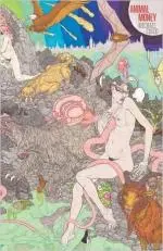
1. 'Animal Money' by Michael Cisco
Artist: Toronto-based Mat Brown does these incredible, surreal, sometimes sexy drawings. Lazy Fascist licensed his work for the cover of Animal Money. I wish there was more stuff like this on book covers. Mat's website is a head trip that's strongly recommended.
Why it's great: You know, I'm not really an art major. I'm self-taught myself, so I find it hard (and often ridiculous) to try and analyze art. I can tell you why this works as a book cover though. Besides looking amazing, if you caught this at a bookstore, there's no way you wouldn't stop and pick it up. There's not going to be anything like it on the shelves. Letting the art breathe by keeping the title footprint small is a smart decision.
What the book's about:
A living form of money results in the unraveling of the world.
![]() 2. 'The Visible Filth' by Nathan Ballingrud
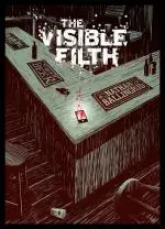
2. 'The Visible Filth' by Nathan Ballingrud
Artist: Pye Parr is the real deal. You can tell he knows what he's doing by checking out his behind-the-scenes works in progress over at his website. I already knew his work from The Awesome and Fowler's Nyctophobia.
Why it's great: The author name on the beer mat is a touch of genius. The title design looks cool and doesn't intrude too much on the art. The bar corner makes it look dynamic, as much as an empty bar can be.
What the book's about:
When Will discovers a cell phone after a violent brawl his life descends into a nightmare. Affable, charismatic and a little shallow, he’s been skating across the surface of life in a state of carefully maintained contentment. He decides to keep the cell phone just until the owner returns and everything changes.
Then the messages begin.
Will’s discovered something unspeakable and it’s crawling slowly into the light.
![]() 3. 'The Pleasure Merchant' by Molly Tanzer
3. 'The Pleasure Merchant' by Molly Tanzer
Artist: Matthew Revert. I've already sung his praises in a previous article.
Why it's great: Skulls are dope and the weird ass wig/fruit salad fills me with joy. Everything else is just really solid design by Matthew, clean and bold.
What the book's about:
Apprentice wig-maker Tom Dawne’s dream is to complete his training, marry his master’s daughter, and set up a shop of his own. Unfortunately for him, when one of his greatest creations is used to play a cruel prank on a powerful gentleman, Tom is dismissed—and forced by fear of poverty and the need to clear his name to serve the very man whom he suspects set him up.
Tom quickly realizes he has bitten off more than he can chew… though as it turns out, it’s not actually more than he desires. As Tom becomes less of a servant and more of a surrogate son, his ambitions change, and so do his pleasures, until it’s no longer easy for Tom to tell if he’s pulling the strings… or trapped in a bizarre web of someone else’s making. Matters become no clearer when Tom meets the mysterious professional libertines who seem to lurk at the center of all his troubles: a man willing to procure anything for anyone, so long as it gives them pleasure, and his obscure assistant, whose past has been irretrievably lost.
Some might even say it was stolen…
![]() 4. 'Carter & Lovecraft' by Jonathan L. Howard
4. 'Carter & Lovecraft' by Jonathan L. Howard
Artist: Ervin Serrano
Why it's great: The tentacle ampersand is a cool detail that takes up most of the cover. You essentially get the idea behind the book from that and the name Lovecraft, so it's pretty effective for a minimalist design.
What the book's about:
Daniel Carter used to be a homicide detective, but his last case―the hunt for a serial killer―went wrong in strange ways and soured the job for him. Now he's a private investigator trying to live a quiet life. Strangeness, however, has not finished with him.
![]() 5. 'Gutshot: Stories' by Amelia Gray
5. 'Gutshot: Stories' by Amelia Gray
Artist: Fernando Vicente. Fernando has this really cool series of illustrations that draw inspiration from turn of the century anatomy illustrations. One of them was licensed for the cover design of Gutshot by Strick&Williams.
Why it's great: I instantly recognized Fernando's work when I saw the cover. It's just such a great idea, mixing traditional illustration with those really weird (and sometimes funny) old anatomy book illustrations. I like the soft tones in the title design. The exposed neck viscera stands out against everything else. It's just cool as heck.
What the book's about:
A woman creeps through the ductwork of a quiet home. A medical procedure reveals an object of worship. A carnivorous reptile divides and cauterizes a town. Amelia Gray's curio cabinet expands in Gutshot, where isolation and coupling are pushed to their dark and outrageous edges. A master of the macabre, Gray's work is not for the faint of heart or gut: lick at your own risk
![]() 6. 'Futuristic Violence and Fancy Suits: A Novel' by David Wong
6. 'Futuristic Violence and Fancy Suits: A Novel' by David Wong
Artist: Rob Grom. Also the designer of another of my favorite book covers, the one for John Dies at the End (also by David Wong).
Why it's great: It's an interesting take on design based on repeating patterns. Before the book's release, the author posted three similar designs on his Facebook and asked fans to vote on their favorite. This was mine. It's just a really good depiction of both what the book is about and the kind of humor David Wong writes with.
What the book's about:
Nightmarish villains with superhuman enhancements.
An all-seeing social network that tracks your every move.
Mysterious, smooth-talking power players who lurk behind the scenes.
A young woman from the trailer park.
And her very smelly cat.
Together, they will decide the future of mankind.
![]() 7. 'Surreal Worlds' edited by Sean Leonard
7. 'Surreal Worlds' edited by Sean Leonard
Artist: Another Matthew Revert.
Why it's great: I wasn't planning to include the same designer twice, but I admit I didn't recognize his work for The Pleasure Merchant. This, however, I did recognize. Collage work isn't my favorite, but this design is actually really effective and restrained.
What the book's about:
From beyond the boundaries of the imagination and the universe…
An anthology of surrealistic compositions created by some of the finest names in genre fiction. A showcase of international talent undaunted by the conventions of language and common narrative structures. Here is timelessness. Here is Surreal Worlds.
![]() 8. 'The Devil's Detective: A Novel' by Simon Kurt Unsworth
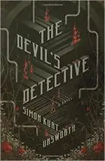
8. 'The Devil's Detective: A Novel' by Simon Kurt Unsworth
Artist: Michael J. Windsor. Also the designer behind Johannes Cabal: The Necromancer and a slew of others (Including some Dan Brown!).
Why it's great: I just really like type design, a skill I'm seriously lacking in. This is a good example of typography and design working together. It's lean and mean.
What the book's about:
Thomas Fool is an Information Man, an investigator tasked with cataloging and filing reports on the endless stream of violence and brutality that flows through Hell. His job holds no reward or satisfaction, because Hell has rules but no justice.
Each new crime is stamped "Do Not Investigate" and dutifully filed away in the depths of the Bureaucracy. But when an important political delegation arrives and a human is found murdered in a horrific manner—extravagant even by Hell's standards—everything changes. The murders escalate, and their severity points to the kind of killer not seen for many generations. Something is challenging the rules and order of Hell, so the Bureaucracy sends Fool to identify and track down the killer. . .
![]() 9. 'Bats of the Republic: An Illuminated Novel' by Zachary Thomas Dodson
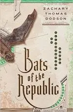
9. 'Bats of the Republic: An Illuminated Novel' by Zachary Thomas Dodson
Artist: Actually, this was designed by Zach. Check out the project on his website.
Why it's great: You have to look at the project to get an idea of how insane this thing is. The design work involved in making this was probably a lot more intensive than the actual writing.
What the book's about:
Bats of the Republic is an illuminated novel of adventure, featuring hand-drawn maps and natural history illustrations, subversive pamphlets and science-fictional diagrams, and even a nineteenth-century novel-within-a-novel—an intrigue wrapped in innovative design.
In 1843, fragile naturalist Zadock Thomas must leave his beloved in Chicago to deliver a secret letter to an infamous general on the front lines of the war over Texas. The fate of the volatile republic, along with Zadock’s future, depends on his mission. When a cloud of bats leads him off the trail, he happens upon something impossible...
![]() 10. 'Invisible Streets: A Thriller' by Tony Ball
10. 'Invisible Streets: A Thriller' by Tony Ball
Artist: Anthony Morais.
Why it's great: I like clever design. While I'm sure there are other covers out there with a similar premise, this is a great example of type incorporated into the design.
What the book's about:
It’s the mid-1960s, and the City is a hulking shell of itself. Bohemians, crooks, and snarling anti-Communists have their run of the place, but if Nathan Canada has his way, all this decline and decadence will soon be nothing but a distant memory.
What's your favorite book cover of the past year? How wrong are my choices? Let us know in the comments.

About the author
George Cotronis lives in the wilderness of Northern Sweden. He designs book covers and sometimes writes. His stories have appeared in XIII, Big Pulp and Vignettes from the End of the World. He is also the editor in chief at Kraken Press and Aghast: A Journal of the Darkly Fantastic. You can see his work at www.ravenkult.com or read his rants over at his blog.
