Spurred on by the One Story Per Week Writing Challenge, I recently decided to set up a personal website. A platform to showcase my writing, podcasting, and editing. Here are some of the lessons I learned and steps you can take to set up your own.
Pages
Before buying a domain name, choosing a content management system and setting up an email list, you should decide on the pages you’d like your website to include and then write copy for each.
About
You’ll want an ‘about’ or ‘biography’ page as a way of introduction. Many authors simply include their official biography—see Irvine Welsh’s. This is not only useful to new readers looking to learn more about you but also to magazines, newspapers, websites, and other media so they can include your info alongside any article you’re featured in. Of course, the length of the article will determine the length of the bio, which is why some authors include bios of varying lengths. John Joseph Adams includes bios of 80, 150, and 240 words.
In addition to my regular bio, I included a little information about the function of my website and what I’m hoping to achieve (inspired by the likes of Pat Flynn). Jasper Bark has a fun ABout page that fits his personality and writing perfectly. As with everything, do what works for you, and if you want to include multiple bios go for it. There are no absolute rules.
Writing/Books
Use the website as your calling card and to showcase your work. Information about books, links to articles, perhaps even free stories or samples. David Moody links to free work on Wattpad, and Juliet E. McKenna shares a number of stories and extracts for free.
You may wish to further separate your writing into categories such as fiction and non-fiction. Seth Godin has clearly defined sections for different modes of writing: Books, Free Stuff (a great intro to his work), and Blog. If you have multiple series you could categorise your books that way. David Moody does this effectively with striking cover images. See, too, Lauren Beukes’ minimalist yet eye-catching visual approach to displaying her books.
If you’re going ultra barebones, I reckon you could get away with just a ‘Books’ and an ‘About’ page, though many writers include more. Check out Joe Hill’s website, it has a great minimalist look and only includes ‘Books’, ‘About’, and ‘Merchandise’ pages.
Contact
This need not be your email address or even a contact form, but could simply link to your online accounts. On my contact page I’ve linked to my email, Twitter, and Instagram. Chuck Palahniuk’s website has a contact form that comes with various terms explaining what his team can and cannot do. Social accounts (Facebook, Twitter, Tumblr, and Pinterest) are linked to as part of the website’s header image.
Recommendations
A place to recommend products, books, podcasts, and other tools that you use that may be of use to others. Check out Iain Rob Wright’s Publishing Tools and Resources. This is also a good opportunity to include affiliate links and make a little cash via your recommendations. But only ever recommend tools and products you use and believe in if you want to keep your integrity intact.
Testimonials
A place where others write kind things about you and your work. This page serves the same function as a cover quote. Often authors incorporate testimonials and quotes as part of their ‘Bbout’ page. Margaret Atwood’s website includes quotes about her work in the footer of her website. Note, too, her Awards and Recognitions page.
Other pages to consider include Upcoming Events, a shop selling books and merchandise, FAQs, a list of media appearances/interviews, and any freelance services you offer. This is by no means an exhaustive list. My advice is to start slowly and with fewer pages. You can always add pages later.
Website's Purpose
One page I deliberately left off the list is a Blog or News page, because you’ll need to decide whether you want blogging to be one of the primary focuses of the website. Broadly speaking you’ll fit into one of two categories. Either you’ll be actively blogging and providing readers with regular updates, or you’ll want the website to be more of a landing page for information on you and your work. If the primary function is that of a landing page I’d recommend opting for a static landing page that doesn’t display the latest blog posts or news instantly, a la Damien Angelica Walters’ website. You don’t want to show your blog posts on page one if you’re not updating regularly, as the website may appear neglected and outdated. If, however, you’re blogging frequently and want the blog to be a focus, consider positioning it as the website’s centrepiece.
That said, just because you blog regularly doesn’t mean your blog has to be front and centre. Chuck Wendig has an excellent blog but his landing page displays his portfolio of work.
Building The Website
If you’re building the website yourself rather than outsourcing, the two options I’d recommend are either WordPress.org or Squarespace. There are numerous articles weighing the pros and cons of each, but here’s a quick summation of why you might choose one over the other:
- In my experience, WordPress is a little cheaper for a single website and a lot cheaper if you end up building numerous websites.
- Squarespace is easier to use.
- WordPress has more customisation options, themes, and plugins.
- You can create a great looking website quicker using Squarespace.
- Squarespace has a dedicated support team, WordPress has a huge online community offering support. Dreamhost’s customer support team has helped me solve issues with my WordPress website, too.
- WordPress requires more backend maintenance in ensuring plugins and themes are kept up-to-date.
Personally, more customisation options, cheaper cost, and previous experience with WordPress meant that going with WordPress was an easy decision. That said, if this is your first website, you have no desire to create multiple websites, and you want to do it quickly and with ease, I can see the appeal of Squarespace.
If you have any specific questions let me know in the comments.
Domain Name
Generally, I’d recommend going with your author name and .com or a location specific equivalent which is what I did with www.michaeldavidwilson.co.uk. FYI, I would have bought .com, too, but Michael David Wilson the data analyst and artist beat me to it.
Perhaps you want something a little different or your name isn’t available. Chuck Wendig has www.terribleminds.com and Stephen Graham Jones can be found at www.demontheory.net.
That said, yourname.com keeps things simple, memorable, and means people might even guess their way to your website. Better still, buy yourname.com as well and forward to your preferred domain name. That’s what Stephen Graham Jones did. Click www.stephengrahamjones.com and see for yourself.
Design and Aesthetics
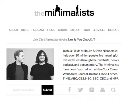
I wanted a clean and minimalist design so the content could speak for itself. I love The Minimalists website and wanted something similar albeit with a right-hand navigation to inject social proof and colour. My recommendation is to look at other websites for inspiration, then put your own spin on things.
Social Proof
Consider linking into your social media channels, particularly those where you’re most active. You can do this on your contact page, as buttons near your header, or even down the side of the website. I’ve included my Twitter and Instagram posts as part of the right-hand navigation. I wouldn’t recommend more than three social media platforms—it's better to do a few effectively than many half-heartedly. And besides, after last year’s social media break/experiment, I limit my social media use. I still don’t have social media on my smartphone or tablet.
Mailing List
Even if you don’t plan on sending out a newsletter just yet I strongly recommend collecting email addresses. I wrote about why a mailing list is more important than social media a couple years back and still stand by it. There are various places you can collect email addresses: at the end of each blog post, in the side navigation, or as a popup. Do what works for you.
Editorial Schedule
If you’re planning on regularly blogging, then I recommend setting yourself an editorial schedule. Look at how much time you can commit to each week/month then plan out when you’re going to write your articles. You may be tempted to go all-in and commit to 2–3 blogs per week. I recommend starting slowly to set yourself up for success. Look at what you can comfortably manage then set the bar a little lower. Once you’ve got into the groove you can build on it. Too often people are over-ambitious when starting out, can’t meet their goals, and lose motivation. 2–3 posts per week sound great when you’re in the honeymoon phase of your website, but once other writing commitments, work, family, social engagements, and all that good stuff kicks in it’s easy to ditch the blog first. I’ve committed to a single blog post per month. That’s it. Anything else is a bonus. I set the time and date for writing the post in my Google Calendar and follow the schedule.
For article ideas I have a folder in Evernote. That way, if an idea comes to me, I jot it down and explore it later, when it’s time.
Not sure what to write? Read other blogs for inspiration. Initially, I stumbled as the scope of the posts I intended to write were too big. Articles that would have taken days to research and write, articles that would be better suited for the likes of other magazines and websites. So I decided to scale it back, to focus on brief blog posts, simple ideas, thoughts, musings. Posts like Failing Without Failing and Let’s Celebrate Finishing Stories. David Moody writes about films and books he’s enjoying—check out his thoughts on Train To Busan. A few months back Lucy A. Snyder wrote about why aspiring novelists should write short stories, and Neil Gaiman often answers reader questions.
Final Thoughts
Don’t feel you have to get everything right before launching your website, but do ensure the basics are in place. I’d recommend using some sort of analytics tool to keep track of website traffic and how visitors are finding your page. WordPress has the Jetpack plugin and Google Analytics is an amazing tool to use, too. That said, don’t worry too much about site statistics. Having an author website is an investment and readers will grow slowly over time. You’re in this for the long haul, so just concern yourself with creating the best website and content you can. (Side note: if you launch a WordPress author website you may want to explore this article on WordPress plugins.)
Please share your author websites in the comments and let me know the one thing you’ve done with your website that resulted in the biggest gain.
Good luck!

About the author
Michael David Wilson is the founder of the popular UK horror website, podcast, and publisher, This Is Horror. Michael is the author of the novella, The Girl in the Video, and the novel, They’re Watching, co-written with Bob Pastorella. His second novella, House of Bad Memories, lands in 2021 via Grindhouse Press. His work has appeared in various publications including The NoSleep Podcast, Dim Shores, Dark Moon Digest, LitReactor, Hawk & Cleaver’s The Other Stories, and Scream. You can connect with Michael on Twitter @WilsonTheWriter. For more information visit www.michaeldavidwilson.


