Don't Write Comics is a multi-part essay about writing comics, understanding what your options are, finding the right artist, and everything you need to do to get a strong comic book pitch package together.
So, against all my advice last time, you’re still planning to write a comic book series, huh? And you’ve done all your research as detailed in Part I, right?
All right then, let’s talk about what you need to pull together in order to pitch the project to publishing houses. For the purposes of this piece, I’m going to use a pitch I put together this past spring in collaboration with artist Meredith McClaren for a project called Heart in a Box.
Heart in a Box is a six-issue mini-series, but it could also easily be published as a single volume Graphic Novel. Which essentially means it breaks up into six neat parts, but it’s easily modifiable into one seamless story with a feeling of “chapters” as well.
WHAT YOU'LL NEED
So here’s a list of what you need for your pitch, some of which we’ll tackle in this column, and the rest in next month’s installment:
- At least one Full Script for a 22-page comic book
- A Synopsis of the full series – all the way through to “the end”
- A tight “Elevator Pitch”
- Clear Specifications – the format, length, and type of project you’re pitching
- A smart logline that sums up your project (Optional, but great to have)
- A minimum of three Sequential Art Sample Pages – preferably fully finished (inked, colored, and lettered)
- A Sample Cover Illustration (Optional, but great to have)
- Character Design Sheets (Optional, but great to have)
As detailed above, you can see that unlike with prose, or even screenplays, you technically don’t have to finish your entire script before submitting it to publishers. You can probably safely write the first issue and have a detailed synopsis of the full series and be okay. The same way that in Non-Fiction you can generally submit a few chapters and a synopsis and nobody panics. Many writers that pitch a lot of projects at once in the hopes of getting one picked up choose to go this route because it can save them precious time and ups their odds. Comics is a very small industry; you can run out of publishers to pitch to very fast. It’s not a bad plan, but as someone who at one time struggled very much with getting to that precious “the end” and who doesn't have a lot of publishing experience, it’s not for me. I write the whole damn thing.
This is, of course, more time consuming up front and it can also result in more time editing down the line if you get picked up by a house that wants to make a lot of changes. But personally, I find my confidence in the project is much higher if I know exactly what I’m selling. I also prefer to give my artist (and more on that later) the advantage of the entire story. I like both of us to know exactly where we’re going as soon as possible, which I feel helps everything in the long run, including the collaboration process in general. You’re a team, and thus you only perform as well as your weakest link.
So, at a minimum you’re writing your script for a 22-page issue and a detailed synopsis for each issue. You should also pull together a short introductory pitch or “elevator pitch,” but I wouldn’t recommend finalizing that until you’ve finished the project or at least the pitch package. If you want to write a draft of your pitch it might help you clarify (for yourself) what your story is about, what your themes are, who your primary characters are, etc., but polishing it to that “perfect pitch sheen” should be one of the last things you do.
SPECIFICATIONS
The specifications you’ve already taken care of, since you decided in the last installment what you were writing. Again, we’ll use Heart In A Box as an example:
FORMAT:
A six-issue full color limited series, written by Kelly Thompson, with full color art and lettering by Meredith McClaren.
I know that "full color" repeated twice in the same sentence sounds redundant, but it does have a purpose. The first instance clarifies for the reader of the pitch what you intend the series to be and the second instance clarifies that your artist will be doing all the art themselves, rather than needing to hire (or needing the publisher to hire) a colorist.
THE SCRIPT
For the script itself you should make sure to use an appropriate formatting template. Much like with screenplays, there are ways to do this correctly and look like a professional and ways to do this incorrectly and look like an amateur. Unlike screenplays, there’s some acceptable variation in the comic book template. I personally like this one, which can be found on Dark Horse’s submission guidelines page. It’s a nice hybrid of what I learned in school and what I’ve seen since then in my travels (and by 'travels' I mean comic scripts I've read, since I never get to go anywhere). Anything similar to this template will probably be fine. The most important thing is to keep the formatting consistent and clean, so there’s perfect clarity in what the script asks of the artist, and so that a reader can easily visualize what you’re asking them to imagine.
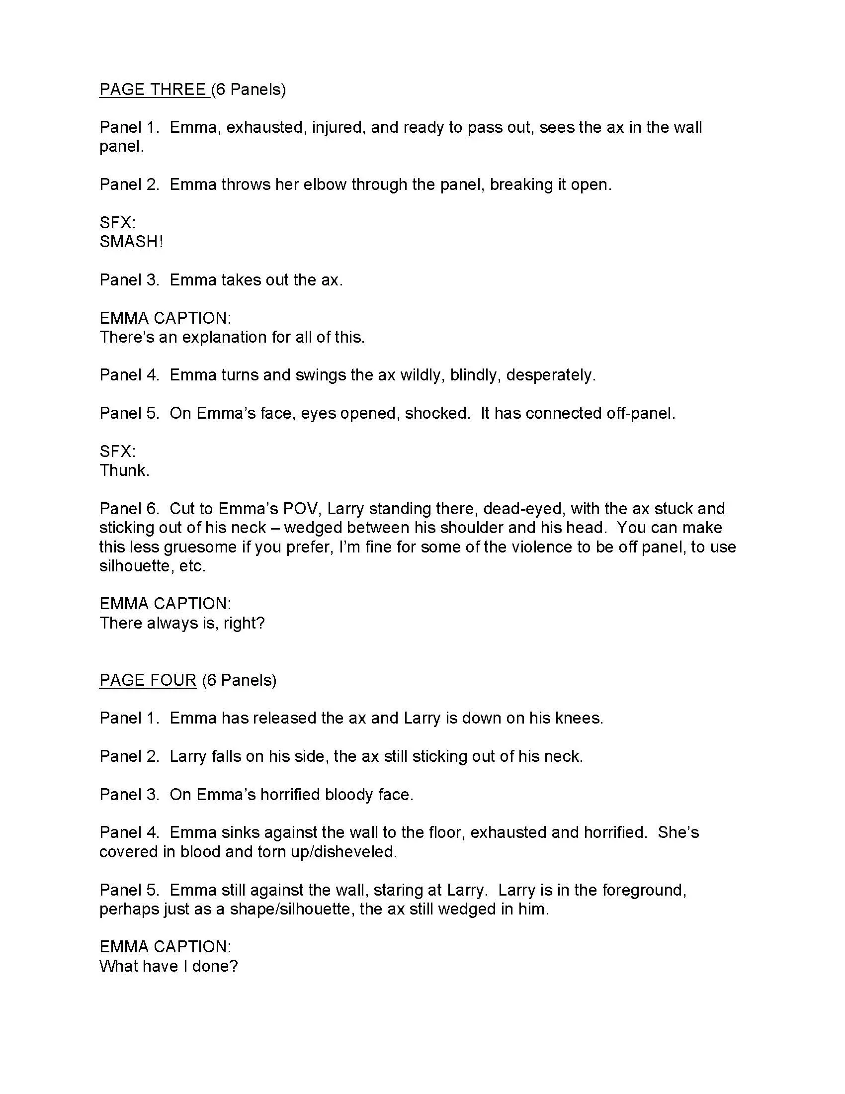
Here’s a sample page from Heart In A Box to give you an idea of how the script should look:
Click to see it larger
Keep in mind as you write that how much you should describe each of your panels is largely dependent on your relationship with your artist. If you’re working with someone green that needs more help in understanding your vision, you should use more description and be as specific as possible when it comes to everything from the size of the panel to the camera angle. If you’re working with someone more experienced and/or someone you already have good communication or collaborative experience with, then you can probably describe less and give them more freedom to visualize the story in their own way. An important thing to remember as you write is that while your vision for the story is obviously important, you have an artist who hopefully excels at creating visuals. They may have many ideas superior to your own and for the most enjoyable collaboration and the best possible product, I suggest keeping an open mind.
STUMBLING BLOCKS
The biggest stumbling block for most people writing a comic for the first time is trying to fit too much on a page - both too many panels per page and too many words and word balloons into panels. And this is where your research should come in very handy. If you've been reading and absorbing great comics as instructed last time you're going to have a natural instinct for how much feels like too much on the page (and how much feels like too little). And don't be shy about it. If you're struggling, go ahead and open a book that looks right to you (i.e. the appropriate amount of words per panel or page) and count them. Help yourself understand how much can fit on the page to still retain the visual you desire. That said, especially as you’re first learning, less tends to be more. Planning for fewer panels per page gives your artist more flexibility, and planning on less text per panel gives you room to add and modify without unraveling everything as you go along. Less text also leaves room for more visual storytelling and you always have to remember that the best comics are a perfect merging of art and words. Not just words with some art thrown in, or vice versa. As a rule, unless I have a specific need for a page and thus a specific number of panels in mind - like for a single splash page or a nine-panel-grid page, I try to plan for between 4 – 6 panels on each page, so that the artist can do more or less as the story requires. I do not like my text overcrowded and pacing is important to me, so I tend to go to the extreme end of less text per panel. I find you can always add more, but it’s harder to take away when you’ve tightly plotted a comic book.
If you have any drawing experience, many writers find it useful to do their own thumbnails (small sketches), especially as they’re learning what fits and what doesn’t on a typical page. It can help you feel out how you want your story to be paced and how it’s going to look – too crowded or too bare. Here’s an example of thumbnailing a script from an old project that I never published:
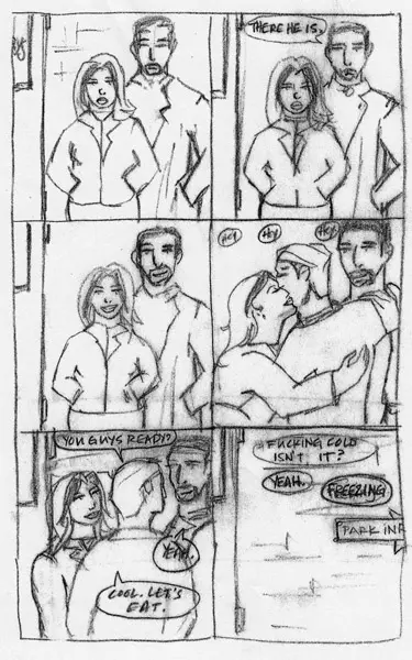
As I have gotten better at figuring out how I like things paced and how much I can fit on a page, I’ve done away with this method as it slows me down - which is why I have no examples of it for Heart In A Box. I also found that it sometimes made me too attached to an idea of how the story should fold out when artists I collaborate with often bring better ideas to the table. But it’s a good technique to help you learn - for me it was invaluable.
Keep in mind as you write your comic that though it’s in theory much shorter and quicker than most prose is, unlike most prose, comics are built like a house of cards, and changing one thing on page ten can screw up every page after that. I highly recommend a solid outline and detailed synopsis so that you know exactly where you’re going while you write. It will minimize how much time you have to spend going back and unknitting your story because you forgot to put in the panels where the guy meets the girl, or whatever.
ACCEPTING REALITY
Just accept now that you’re still going to have to do that editing anyway. After you’re done and the script looks all beautiful you’re going to sit back and re-read it and find problems on page two that screw up the pacing and layout of everything that follows. It’s going to happen. But by planning carefully, not over-writing, and keeping fewer panels to a page you can minimize the damage. For example, if you forgot to include a panel that introduces something key on page two, if you’ve only specified five panels for that page, you can probably add a panel without much difficulty, and without throwing off the delicate balance of the rest of the book. If you’ve specified nine panels for every page, you’re in big trouble because you’ve left yourself no room to edit without undoing everything. You've also left your artist no room to breathe. And a miserable artist makes for a miserable project indeed.
And with that we come back around to why you should only write comics if you love them. Comics are not prose, it’s an entirely different art form, and it really has to be considered as such. Writing comics requires a completely alternate muscle than writing prose does…related, sure, but absolutely different. That said, if I haven’t frightened you off yet, come back next month for our final installment to find out where to find the best artists, how to get them involved in your project, if you need to pay them (and how much), what kind of writer/aritst contract to use, and how to know if you've got "the right" artist for your project.
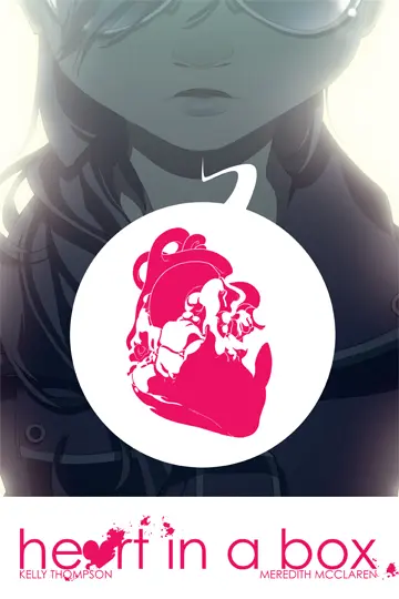
In the meantime I’ll leave you with the gorgeous cover illustration (see item #7!) from Meredith McClaren for our project Heart In A Box:

About the author
Kelly Thompson is the author of two crowdfunded self-published novels. The Girl Who Would be King (2012), was funded at over $26,000, was an Amazon Best Seller, and has been optioned by fancy Hollywood types. Her second novel, Storykiller (2014), was funded at nearly $58,000 and remains in the Top 10 most funded Kickstarter novels of all time. She also wrote and co-created the graphic novel Heart In A Box (2015) for Dark Horse Comics.
Kelly lives in Portland Oregon and writes the comics A-Force, Hawkeye, Jem & The Holograms, Misfits, and Power Rangers: Pink. She's also the writer and co-creator of Mega Princess, a creator-owned middle grade comic book series. Prior to writing comics Kelly created the column She Has No Head! for Comics Should Be Good.
She's currently managed by Susan Solomon-Shapiro of Circle of Confusion.
