Welcome back to the second part of my cover design crash course. Last time, we talked a little about sourcing stock photography, combining photos, and the dubious technique of just sticking a striking stock image behind some typography and calling it a day.
Last Time
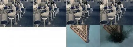
Here's what we did for our three fictional books: Better Strangers, Bad Ritual and Black Waves.
Better Strangers: We combined some decent photography into something that's a little more evocative.
Bad Ritual: Flipped the figure upside down, added a landscape at the bottom just because it looked cool.
Black Waves: This one is typography based. I already did the title design, but we'll tighten it up a bit.
Let's get started.
Better Strangers
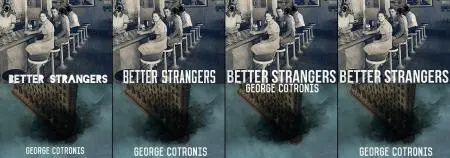
This one is a bit tricky, because we need something bold to mask the point where the two images meet and kind of blend them together. Unfortunately, the title is on the long side, so we have to keep the font size small. Moonshiner looked okay, but wasn't chunky enough. Bebas Neue is a slimmer version of Bebas that usually works well in these cases, so I went with that. I experimented with having both title and byline in the middle, which didn't look too bad, but ultimately decided against it.
Fonts from left to right: Blackout Midnight, Moonshiner, Bebas Neue. Byline is in Vincent.
Bad Ritual
Relatively straightforward. There's really only one place for the title to go, and that's in the middle. There are three fonts that I thought looked pretty good, but I went with the last one, because the handwriting seemed to fit the design better. This is one of those covers I would have probably gone back to the drawing board with; I don't like how the title looks sandwiched by the two images.
The fonts, from left to right, are: Ailerons, Blackout Midnight and Close. The byline is Bebas.
Black Waves
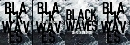
I'd already happened upon the title design I wanted for this one early on, but it's always good to experiment. I tried it with the byline in the middle, but it felt too crowded. For anyone who cringed at the typography sins of the original, version #3 should pacify you, even if the kerning isn't great. It's not bad, might have look good in white, too. Ultimately I just went with the original. I just tightened up that V a little bit.
Fonts: Vincent for the title, Bebas Neue for the byline.
Wraparound Cover
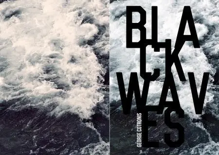
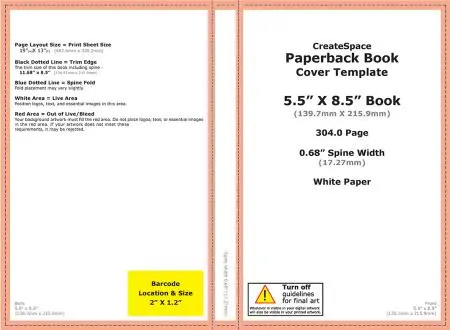
Making the wraparound cover for print is relatively easy. Assuming you're going with a print-on-demand (POD) service like Lulu, Createspace or Lightning Source, they should have templates available that you can download. You'll need to know the size the book is going to be and how many pages (for the spine thickness). 6 x 9 inches is typical, but not the only option. I like 5.5 x 8.5
It'll look something like this.
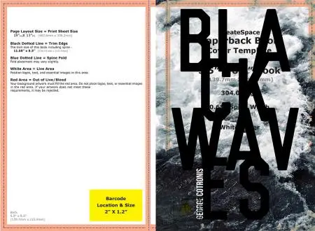
All you need to do is drop your cover in there, making sure the important parts are enclosed by the orange border, or they might be cut off. If you set the Layer Mode to something like Darken, you can get an idea of where the title ends up at (see below).
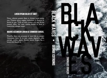
The hard part is blending your cover with the background as it goes towards the spine. This image could actually have covered the whole spine, but for the purpose of our exhibition, we'll assume it doesn't. The easy way to do this (or at least, my preferred way) is to use the Burn tool in Photoshop to darken the edge of the cover until it fades into black.
The first step is to use the Magic Wand tool, select the white areas in the CreateSpace template and delete them so we can what's going on underneath.
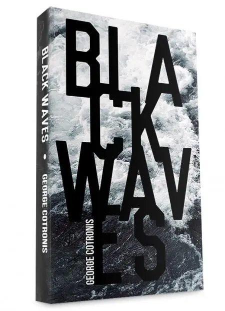
Then add a layer of pure black under your wraparound cover. Next, use the Burn at a low Opacity setting (around 30%) to slowly darken the edge of the cover. If it looks a bit strange, don't worry about it. You'll never see the actual printed book laid out like that. The faded side will end up on the spine of the book.
The title design for the spine is just a matter of using the same fonts that we used on the cover. Just make them smaller to fit. I seperated the title and the byline with a dot I created by using a hard round brush.
For the back cover, I'm not doing anything fancy. Sometimes I'll mirror the cover image and lower the opacity a lot, or offset it so that only part of it is visible. In this case I just picked a texture, used the Burn tool to darken the edges and slapped it on there.
For the backmatter text, use any decent serif font; I like Caslon. You don't have to justify it like I did, but make sure you uncheck hyphens in the paragraph options (on by default in Photoshop). I used Bebas Neue to make some lines stand out.
Here's an example where I used the same image for the back cover, at a lower opacity.
And that's about it. I don't like back covers that are too busy. You can certainly add an ''About the Author'' section and any blurbs you might have gotten. Don't go crazy with the fonts; use a maximum of 3 different ones (not counting the serif) for the whole thing. Two is better.
Where do I get fonts?
There are a ton of places on the internet where you can get fonts from. One thing you should pay attention to is what the license for each font is. Some fonts you can download for free do not actually grant you the right to use them in commercial projects (such as your book cover).
I get my fonts from FontSquirrel (free fonts for commercial use), Decade Type Foundry, Lost Type Co-op, and Ten Dollar Fonts (just what it says on the tin). There's plenty more.
So now what?
Go forth and create. If you have any questions or want to show me what you've made, you can leave a comment here or follow the links to my blog and email me. I'll be happy to give feedback.

About the author
George Cotronis lives in the wilderness of Northern Sweden. He designs book covers and sometimes writes. His stories have appeared in XIII, Big Pulp and Vignettes from the End of the World. He is also the editor in chief at Kraken Press and Aghast: A Journal of the Darkly Fantastic. You can see his work at www.ravenkult.com or read his rants over at his blog.
