If you're self-publishing or want to, probably one of the first roadblocks you're gonna hit is that you need to source your own book cover. The simplest way to get over that hurdle is to hire a professional cover designer, or perhaps purchase a ready-made cover. The former can be a bit tricky, but asking around your author circle of friends will usually turn up someone reliable. For the latter, an internet search is sometimes all that is required.
For the more DIY-inclined, I feel you can do a passable job at creating your own book cover. Sometimes they turn out better than those generic ones, too. We can't cover design basics here, but I'm going to attempt to teach you a few tricks to create a halfway decent cover for your next book. Fellow designers and artists, forgive me; this is quick and dirty.
My name is George Cotronis. I've been creating book covers for more than a decade, mostly for the small press and some tabletop game companies. You can see my work at www.ravenkult.com.
Introduction
Probably the most common advice I hear on the subject is “emulate the Amazon Top 100 for your genre.” I'm of two minds on this. On one hand, it makes sense because this is what sells, and if your cover looks like one of these books, you're telling readers “my book is like that other great book you like.” Unfortunately, my artist ego can't really go along with that. There are a lot of terrible, terrible book covers on the Amazon Top 100. Some got there because the author keeps pumping out new books and has a huge following. Some got there with Amazon promotions and sales. I just don't really care: I want to make good book covers. Emulating bad ones seems counterproductive to me.
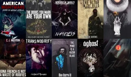
For the purposes of this article, I delved into the archive of book covers I've collected for reference. I tried to identify some trends, or design styles that I thought would be easy to emulate. That's not to say the above examples are easy to do, but we're taking shortcuts here; these are designs you can fake with a little bit of effort, without ever copying.
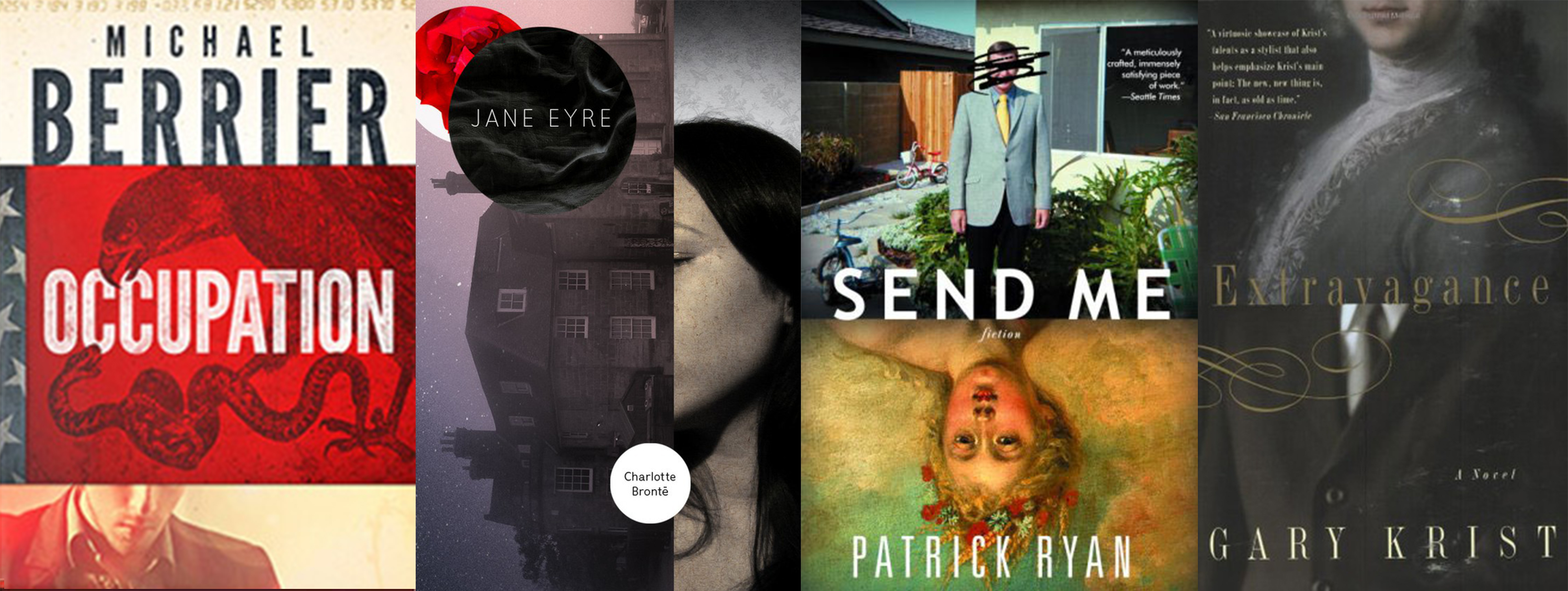
The “Blocky''
This is a good way to get an interesting design out of a couple stock photos. Sometimes it's hard to find an image that tells the story you want it to, so mixing a few of them can be useful. It also makes it less likely your book will have an identical cover to someone else's.
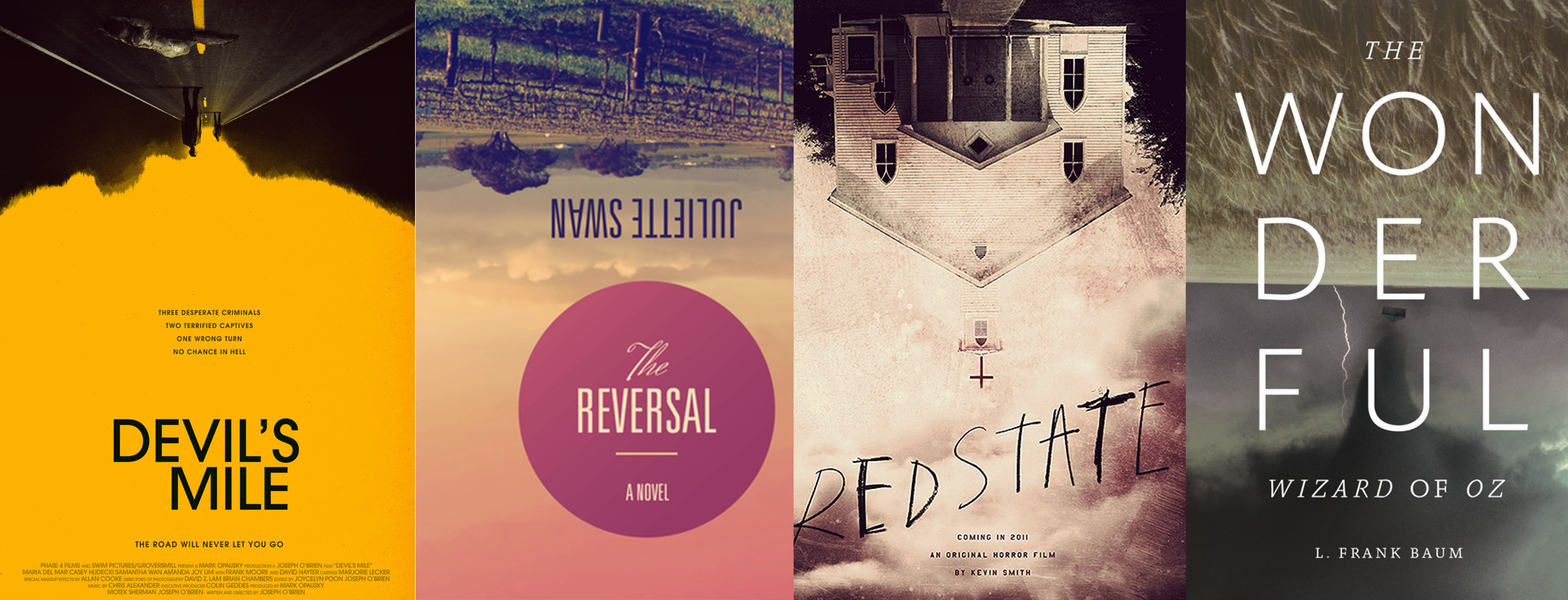
The “Upside Down''
This is a cheap trick, but I'm including it for the artistically challenged. Stock photography is often good, but rarely great. This is a fairly simple way to make a photo a tad more interesting. And maybe a bit confusing. Still cool though.
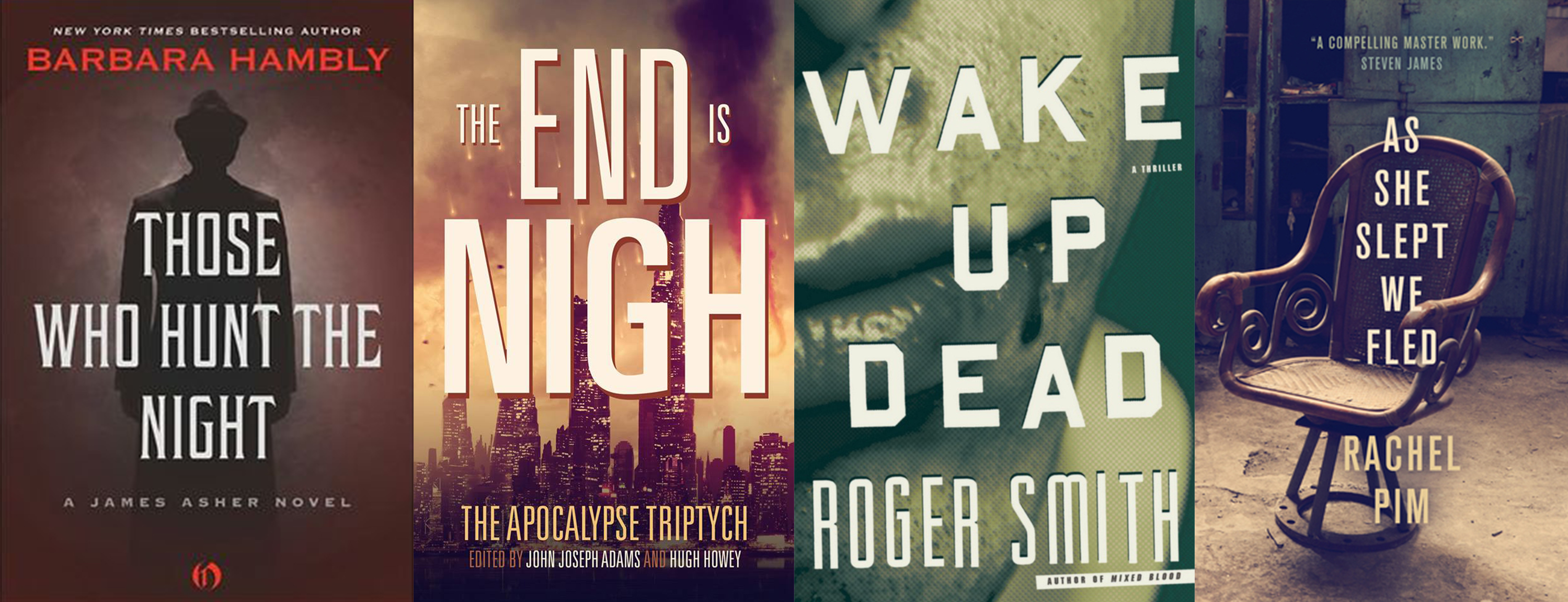
The “Mostly Text''
Granted, these are some pretty striking images in their own right, but the title dominates. Another easy way to get the most mileage out of your stock photos. You need a good eye for typography for this one.
The Experiment
As a simple way to illustrate these techniques, we're gonna create a book cover for three different fictional books, one for each “style.” I'll do a mix: One lit, one crime/thriller, and one genre novel. Please excuse my terrible examples.
- 'Better Strangers' - A marriage falls apart. Set in the 1950s.
- 'Bad Ritual' - A body is found in the woods, victim of a ritualistic murder. The police are uninterested, leaving two brothers to investigate the murder of their sister.
- 'Black Waves' - Retired police officer moves into an old house by the sea in Massachusetts. Something's already living in it.
I'm kinda cheating with these two-word titles, but the principles are the same for any title. I'll do alternate ones next time.
Part One: Stock Photography
You can get stock photos in a lot of different places. I recommend Fotolia, iStockphoto and ShutterStock. You can get free stock photos (with some restrictions) on picjumbo, Gratisography and Magdeleine. I'll be using the free ones today.
Update: Another great site we want to include here, is actually a collection of sites: 43 Unique Places to Find Remarkable Free Photos. But thanks to Yuri B. for the link!
You'll need some software. If you can't find an old version of Photoshop in a thrift store or something, your next best bet is either the free GIMP software which is almost identical, or Photoshop Creative Cloud for 19.99$ a month. We'll talk about fonts later.
Hopefully you already have some basic knowledge of how this kind of software works. Each image is on its own layer and you can put one in front of the other, you can cut them up, flip them around and pretty much do anything else you can imagine. This is outside the scope of this article however, so if you need to brush up your skills, Youtube has a ton of simple-to-follow tutorials.
Let's start with Better Strangers. Look at that terrible blurb. Not much to work with. I'll take the first approach. I'm thinking some vaguely vintage photography will do. I sourced this photo of a couple in a diner circa the 1930s. I'm going to block out everyone's face except for the two of them. We're only illustrating the principle here, so the bottom photo is largely irrelevant. Still, I'm picking something that looks striking and then adding a texture on it. Let's pretend this is subtext for the dissolution of marriage in the materialistic 50s.

Not bad for a ten minute job.
It looks okay for now. Typography will make it better.
On to Bad Ritual.
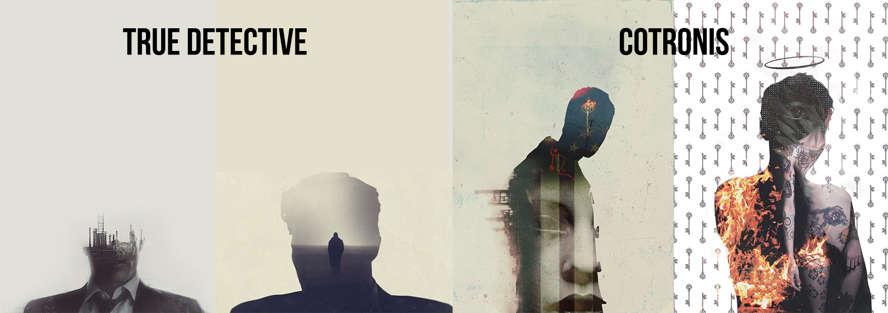
I'm gonna cheat a little here because my cursory search didn't really get me any good stock I could simply flip over for an interesting effect. So I'm doing what I call the True Detective thing and superimposing a photo on this dark silhouette of a person. It looked a bit empty at the bottom so I threw in a forest pic to fill space. I guess it's a mix of two of the above techniques.
The only thing you need to do to get that effect is put one lighter image on top of a darker one (almost completely black) and set the Layer Mode to “Lighten.'' The lower image I simply dropped on top.
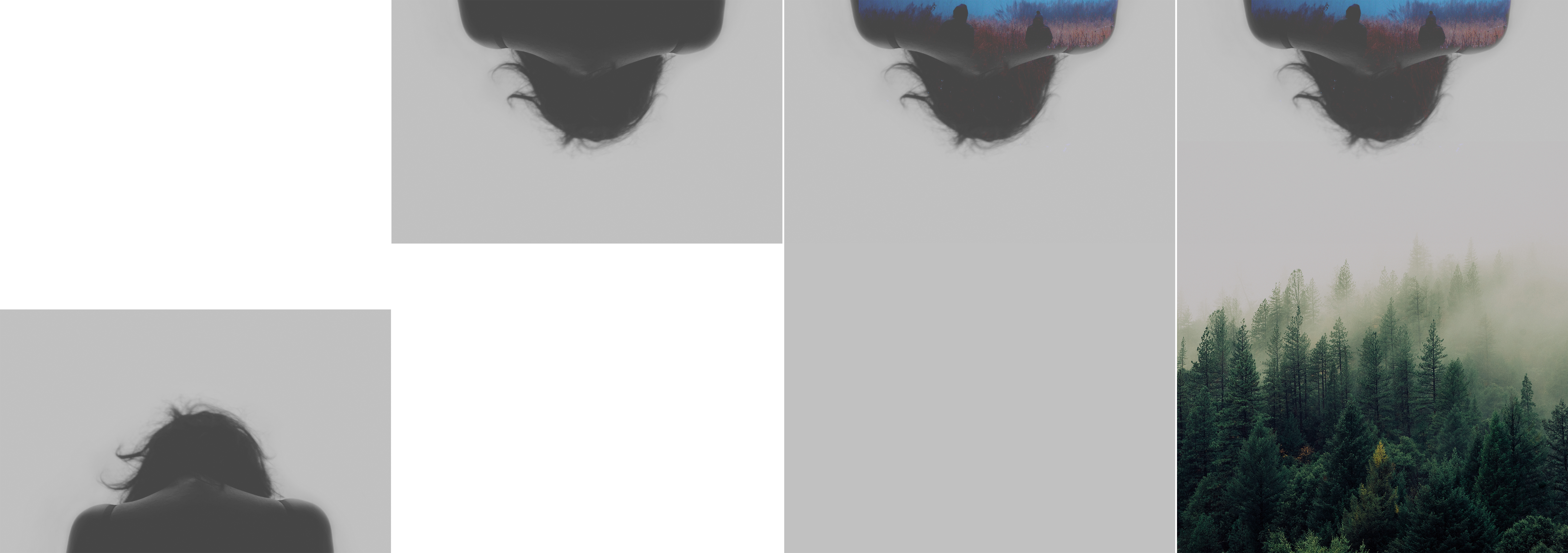
For reference, True Detective stills from the series intro and two of my book covers.
Last but not least, Black Waves. Hold on to your hats, this is going to be super simple and lazy.
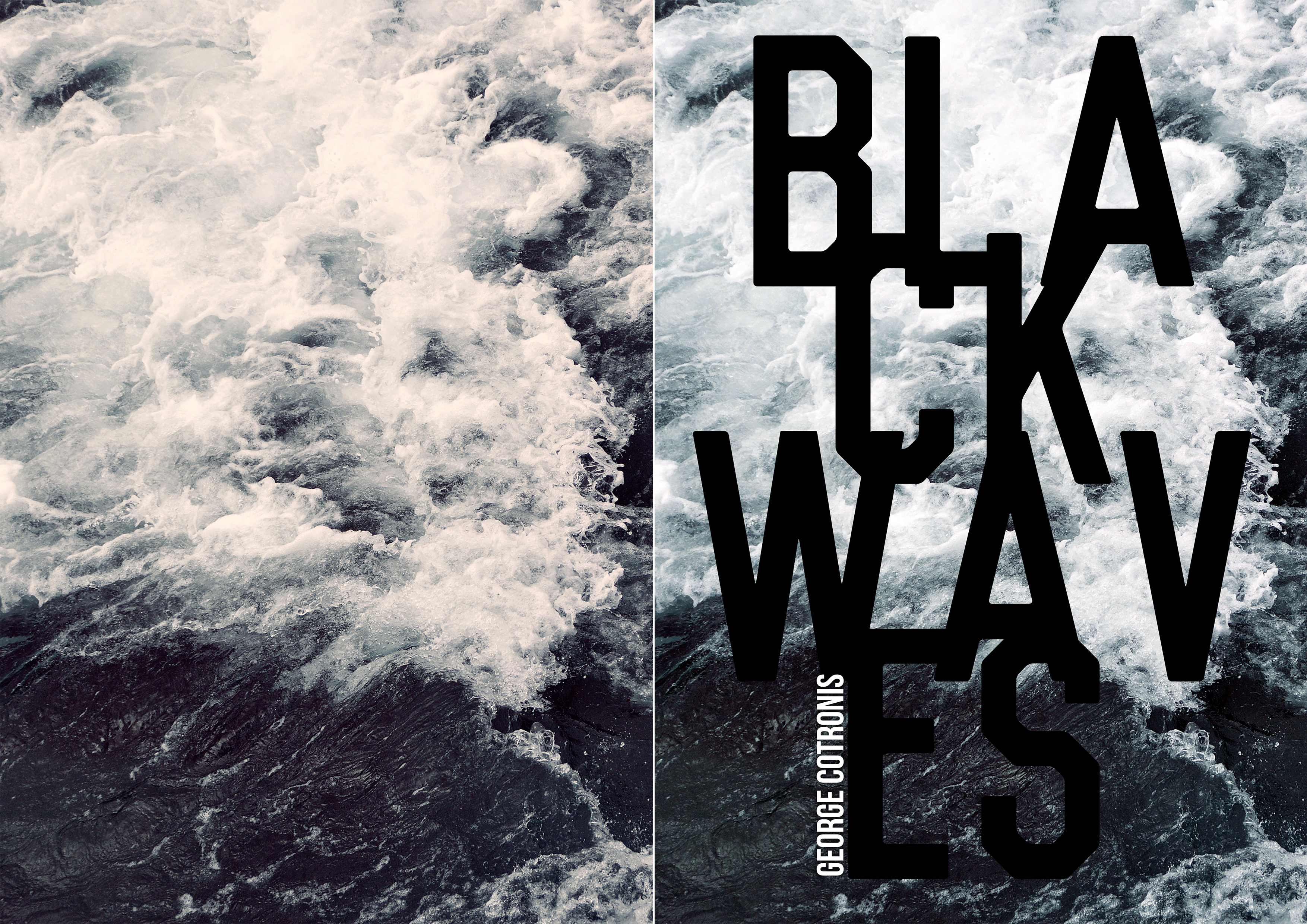
All I did here is some color correction. You can get decent results with Photoshop's automatic Contrast, Tone and Color. We're gonna talk about title design next time, but this wouldn't make any sense if I didn't show you the general idea at least. That typography is a crime against nature at the moment, but we'll eventually fix it.
Closing Notes
The time I spent on these was minimal; I had to make quite a few of them. You can probably do a lot better than this for your book just by delving a little deeper into those stock photo websites. I simply put in keywords like woods, forest, sea, waves, diner, vintage and simple things like that. You can get more creative (and specific) with yours.
Next time we'll talk about title design and we'll also create the spine and back cover for each of these books. Stay tuned and feel free to ask me questions in the comments below, or show me your favorite covers.
About the author
George Cotronis lives in the wilderness of Northern Sweden. He designs book covers and sometimes writes. His stories have appeared in XIII, Big Pulp and Vignettes from the End of the World. He is also the editor in chief at Kraken Press and Aghast: A Journal of the Darkly Fantastic. You can see his work at www.ravenkult.com or read his rants over at his blog.