In recent columns, I’ve given book cover designers a shit-ton of credit. This is (maybe) the column where I pull my head out of my ass and have a cup of fancy tea with something approximating objectivity.
Don't get me wrong — I stand by my guns (and taco analogies), in that I think designers do much to attract and prepare audiences... I still think they can (maybe) save the global economy. And — as keen readers may have even deciphered via my secret codes — I still believe top designers run a clandestine food delivery service that brings eggplant parmigiana to vegetarians marooned at golf tournaments that only serve St. Louis-style dry-rub ribs…
While that may be true (well, definitely not the last two parts… and maybe not the first), I will admit that sometimes designers suck, ruin books with their ill-fitting art, spit in your eggplant when they have bronchitis, and piss-off authors until they have to resort to legal action and name-calling.
Here are six such cases of classic authors who really, really, really didn't like their covers:
![]() 1. J.R.R. Tolkien
1. J.R.R. Tolkien
In addition to being the prolific father of fantasy literature (and making his name into a symbol decades before Prince did), Tolkien was also a pretty-legit illustrator… So, if anyone gets the okay to gripe about cover illustrations, and walk around in a tattered robe cursing in Elfish, it’s him.
Here’s a quote from a letter he wrote to Raynor Unwin (from The Letters of J.R.R. Tolkien) after Ballantine's American paperback of The Hobbit was released in '65 with Barbara Remington's dubious illustrations of lions and “pumpkins”
"I wrote to [Ballantine] expressing (with moderation) my dislike of the cover for The Hobbit. It was a short hasty note by hand, without a copy, but it was to this effect: I think the cover ugly; but I recognize that a main object of a paperback cover is to attract purchasers, and I suppose that you are better judges of what is attractive in USA than I am. I therefore will not enter into a debate about taste — (meaning though I did not say so: horrible colours and foul lettering) — but I must ask this about the vignette: what has it got to do with the story? Where is this place? Why a lion and emus? And what is the thing in the foreground with pink bulbs? [ed. – he would later call them “pumpkins”] I do not understand how anybody who had read the tale (I hope you are one) could think such a picture would please the author. ..."
It’s a good question — and he was right to ask it. Remington never got a chance to read the books and "didn’t know what they were about" when she designed the Hobbit cover, as she said in an interview with Andwerve.
After the first five editions of the paperback, as noted by the Tolkein Library, Ballantine finally removed the lion. The pumpkins and emus, however, stayed.
![]() 2. David Foster Wallace
2. David Foster Wallace
 2. David Foster Wallace
Love him or hate him, you have to admit that David Foster Wallace was a thorough dude (as in “388-footnotes-thorough”). So it’s difficult not to give him the benefit of the doubt when, after 10 years of writing and editing, his 1079-page opus Infinite Jest finally came out with an ill-fitting, cloud-bedecked cover.
He complained, when prodded in interviews, that it looked like an airline safety booklet and may have affected sales. (Say what you will, but after a half-million words, I think you earn the right to be a brat…) Here are more of his thoughts on the cover, as printed in David Lipsky’s Although of Course You End Up Becoming Yourself:
DFW: This was my major complaint about the cover of the book. …Is that it looks — on American Airlines flights? The cloud system, it’s almost identical...
DL: Oh, that’s funny. What did you want instead?
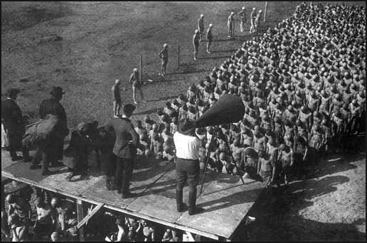
DFW: Oh, I had a number of — there’s a great photo of Fritz Lang directing Metropolis. Do you know this one? Where he’s standing there, and there are about a thousand shaven-headed men in kind of rows and phalanxes, and he’s standing there with a megaphone? It wouldn’t have been…Michael [Pietsch, Wallace's editor at Little Brown] said it was too busy and too like conceptual, it required too much brain work on the part of the audience….
DL: Because you were making a metaphor on the cover?
DFW: No, I just thought it was cool —
While it never got the Metropolis cover that Wallace wanted, Infinite Jest did recently get a better cover treatment in a recent reissue by Abacus (as detailed here by Dave Eggers)… And, If it's any consolation, his final novel — the unfinished Pale King, published posthumously in 2008 — got an exceptional (and apt) design from Wallace’s window, artist Karen Green.
![]() 3. J. D. Salinger
3. J. D. Salinger
 3. J. D. Salinger
As I’ve mentioned in a previous column, the clean, text-only design of Salinger’s oeuvre doesn’t really rev my engines or get me all weepy and ponderous about the wintering habits of ducks… The story behind the simple-as-hell design is pretty interesting though.
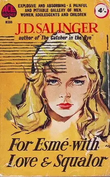
If you’ve ever seen the original Catcher in the Rye (or, you know, seen the cover printed on a T-shirt/tote/iPhone case), you know that Salinger wasn’t always a plain text guy. That only came about after Hamish Hamilton printed an unapproved design for a short collection based around For Esmé—with Love and Squalor. Not only did the publisher think the title Nine Stories wouldn't sell, but they also decided to sex-up the cover with a smoldering blonde — an odd choice for a title story in which the female protagonist is a seven-year-old girl…
Here’s the fallout from the cover, originally printed in Dot Dot Dot, (Via Book Cover Archive):
In the 1950s Salinger had a clause put in his publisher’s contracts that insisted only the text of the title of the book and his name were to appear on any future editions of his work, and absolutely no images. This hard line was particularly prompted by an early fatal experience with a publisher who covered a collection of short stories, then titled for Esmé – with Love and Squalour (after one of them) with a dramatic illustrated portrait of a seductive blonde. Salinger’s outrage is understandable: his Esmé is a precocious young girl of seven, and the story depicts a chance encounter and redemptive conversation with a solider on the verge of a nervous breakdown. Nevertheless, it’s instructive to see how various publishers and nationalities have dealt with Salinger’s legal one-liner over the past half-decade of reprints and new editions.
The lesson: Don’t mess with a recluse… or, maybe: Don’t try to use sex to sell a novel about a seven-year-old... Yeah, that second one is probably better.
![]() 4. Jack Kerouac
4. Jack Kerouac

Before he was the hard-living, road-traveling type to pop a load of Benzedrine and write a stream-of-consciousness novel on a 120-foot scroll, Jack Kerouac was the jock-turned-artist type to pop the collar on a shawl-neck sweater and write a Bildungsroman novel like his early idol Thomas Wolfe… Yet when The Town and the City landed with a dull cover like The Web and the Rock, Kerouac wasn’t particularly jazzed.
Here’s his letter to A.A. Wyn, who agreed to print the seminal On The Road in 1951, before balking at early drafts. In it, Kerouac states his dislike for the cover of his debut, and offers a sketch of what he’d prefer.
Dear Mr. Wyn:
I submit this as my idea of an appealing commercial cover expressive of the book. The cover for The Town and the City was as dull as the title and the photo backflap. Wilbur Pippin’s photo of me is the perfect On the Road one … it will look like the face of the figure below.
J.K.
On The Road wouldn’t be printed for another six years, and while it got some shitty paperback covers, the first edition hardcover was a gem, with a referential nod to the covers of the impressionistic bop records Kerouac dug…
![]() 5. F. Scott Fitzgerald
5. F. Scott Fitzgerald
 5. F. Scott Fitzgerald
In a previous column, I mentioned a Smithsonian article in which F. Scott Fitzgerald is quoted telling his editor to save Francis Cugat’s famed artwork for his book, saying, “For Christ’s sake don’t give anyone that jacket you’re saving for me… I’ve written it into the book.” However, If we’re to believe one of Fitzgerald’s drinking partners, the author soured on Cugat’s cover over time.
Sound Dubious? Does it help that the drinking partner in question was Ernest Hemingway? Papa describes the cover (and Fitzgerald's change of heart) in Moveable Feast:
Scott brought the book over. It had a garish dust jacket and I remember being embarrassed by the violence, bad taste and slippery look of it. It looked the book jacket for a book of bad science fiction. Scott told me not to be put off by it, that it had to do with a billboard along the highway in Long Island that was important in the story. He said he had liked the jacket and now he didn't like it. I took it off to read the book.
Did the author change his mind, or was he just trying to impress his buddy? We may never know... What we do know, however, is that, garish or not, I’m sure both Fitzgerald and Hemingway would have preferred the original cover to the eventual movie tie-in cover…
![]() 6. Hunter S. Thompson
6. Hunter S. Thompson

The good doctor was notoriously difficult, foul-mouthed and erratic — and he had a bad side too (to steal one of his jokes)… but, if his story is to be believed, he had good cause to dislike the original cover of Hell’s Angels. Not only did it offend his taste, but it also caused him to catch a beatdown from the rowdy motorcycle gang that served as the book’s subject.
Here’s Dr. Gonzo discussing the situation in a Rolling Stone interview in 1987:
I’d finished the book. Shit, the book was already in type. I didn’t like the cover. I told Random House, “You fucking pigs, I’ll go out and photograph it myself.” It was a Labor Day run. I was showing the Angels the cover. They hated it. And I said, “Hey, I agree with you.” I’m showing them the dust cover, and it said $4.95—whew, $4.95, that must have been a long time ago. And the Angels said, “Jesus, $4.95! What’s our share? We should get half.” And I said, “Come on.” I was getting careless, see. I said, “It takes a long time to write a book. Nothing—that’s your share.” The next thing I knew, I was waking up in the back seat of a car, and my nose looked like putty. My head was the size of yours and mine put together. It was morning, and a cop was looking in the window. He said, “My God, what happened to you?” And I said, “I went to a Hell’s Angels party last night."
Of course, all of Thompson’s stories have to be taken with a grain of salt — or a toke of hash — especially since Thompson attributed the same beatdown, in separate interviews, to a disagreement over motorcycles, and/or his intervention in a domestic altercation involving an Angel, the Angel's wife and, in some stories, a dog, as William McKeen points out in his bio, Outlaw Journalist)… Nevertheless, it's a fair warning to designers: get the design right or noses might get smashed into putty...
Luckily — for Thompson and his designers — he went on to less-controversial subjects (if you can consider politicians and his own self "non-controversial") and found the estimable Ralph Steadman to ink his covers. Theirs’ was a perfect pairing, and it prevented future beatdowns…
And that, I suppose, is one of the cornerstones to my new standard for cover designers:
At best, they should attract and prepare audiences; at least, they should prevent author beatdowns; in secret, they should bring you eggplant parmigiana.

About the author
Robert Bieselin is a writer and graphic designer, who splits time between New York and Los Angeles. He is currently the graphic designer at Book Soup in West Hollywood (booksoup.com), and previously, was an entertainment reporter at The Record (northjersey.com) newspaper in New Jersey.


