Everyone knows you’re not supposed to judge a book by its cover… What this column presupposes (to borrow a favorite movie line – itself associated with a pretty rad book cover) is, maybe you should?
To backtrack, when I say “book,” I mean book. I don’t mean flora, fauna, bank clerks, longshoremen, or one of those bathtubs that looks like it has feet. I’m talking about a literal paper-and-ink situation that you can carry under your arm or, I guess, in one of those belt things that 18th century kids use in old paintings and period movies. And when I say, “cover,” the same applies: I’m talking about the front of the book with the title and author and all that good stuff. That’s a book cover, as far as this column is concerned. (I’m not saying I disagree with the adage used symbolically – the whole, “Don’t judge people based on their skin color, or what they decide to wear on their heads…” business. I wholly endorse that, as well as the “don’t judge a taco truck by its duct-tape sign and peculiar clientele…” line. My point isn’t that the adage is false, but rather that it applies exceptionally to most everything except books.)
What else are you going to initially judge a book by, if not its cover? Size? Weight? Smell? Color?
Like it or not, a book’s front cover is its first chapter. In a perfect world, that wouldn’t be the case (but if this were a perfect world, I wouldn’t have to rely on passive sentence structures, parenthetical asides, and taco analogies to make my point – so deal with it... Our world is vast, ineffable and flawed.) Given this, we’re stuck with covers that serve as tone-setters for readers. No one has time to read the synopsis (much less the first chapter) of every book he or she passes, so either the cover does it for us, or we rely entirely on Oprah…
I vote for covers… So far, they’ve done a pretty good job.
When was the last time your eye confused a romance novel with a post-modern poetry collection? Have you ever accidentally bought a Louis L’Amour paperback thinking it was Murakami? (To backtrack again – Bravo! to genre covers in general - Romance, Western & Pulp especially. They’re usually not clever, they’re not subtle, they’re not artsy, but what better to serve as a visual representation of their content, itself not particularly clever, subtle, or artsy? They’re perfect, not because they’re perfect - often times they suck - but they perfectly depict the content they cover… and that’s one job of covers. The don't always have to be art...)
You could argue that album covers should be held to the same standard as novels… and I will, because I’d also like to make a case for tone (regardless of medium), and the other job of covers: to be art, and, as such, rival (or complement) literal interpretation by conveying theme/style/flavor, etc. :
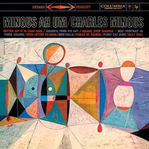
For example: This looks like the music on Ah-Um
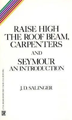
in the same way this

looks like the lessons/tone in Be Here Now.
Sure, it's not as cut-and-dry as heaving pecs and postures that imply thrusting thighs, but it gets the job done via tone and symbolism – where that indirectly reflects mad bass rumblings or acid-induced preaching, and not, say, an album about abstract shapes or a book about chairs and string balls. This is a less tangible criteria by which to judge covers, but as important, if not more important than literal representation… This doesn’t tell you what a book is, but how it is. It gives you a feel… and, in my opinion, books live or die on feel as much as they do on plot.
So, how do you get that “how?” Well, cover art is like any other art. When well done, it shows a deep understanding of what it represents, and pairs that understanding with an underlying mastery of technique: color palette, contrast, sizing, spacing and font. (Don’t sleep on the font, yo!) This pulls us a bit into a technique rabbit hole, which isn’t the point of the column, but it also serves as a good introduction to what the column will be about.
Down the line, I’ll be touching on all this while highlighting individual covers and picking the brains of their designers, relaying the history of famous covers, tapping authors and publishers for their preferences, and giving tips to independent writers to avoid things like this). But here, I just want to air my prejudices…. Give you an idea of what my ideas are and will be.
For (another) example:
This is Brilliant:
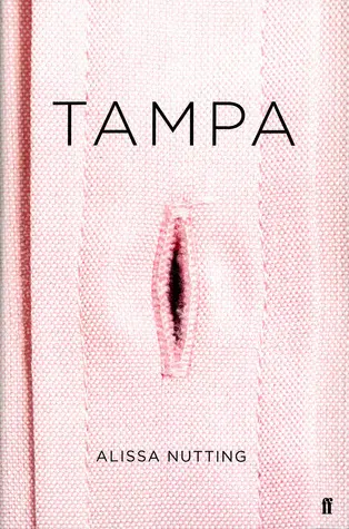
This one uses clever insinuation to tell you everything you need know about Nutting's controversial book chronicling a teacher's sexual encounter with students. The design seems over-the-top, until you stop and think about it.
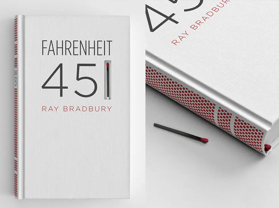
Device/allusion come into play in Elizabeth Perez's concept design for Fahrenheit 451. It's beautiful and telling to eyes that have never read the book. To those who know the story, it's genius.
And This is Bad, Bad, Bad:

Before you start yelling - yes, I think this is a great design. The problem? It doesn’t fit the book. If you didn’t know the story — or the movie's imagery — this design would initially read as whimsical and eccentric, with not a single whiff of anything sinister. I love the clock-cog imagery and dig the character representation, but it reminds me more of the hijinx in Modern Times than any "ultraviolence".
Here’s a good place to point out that something can simultaneously be bad and iconic… I love this cover (the typography and spacing are great!), but, like the previous Clockwork rendering, it just doesn't do its job. Yes, it's ubiquitous and recognizable, but if it weren't Salinger, you wouldn't give it a second look... and that, from a design-perspective, means it fails. (Interestingly enough — bad covers are the causes of this bad cover, as The Book Cover Archive pointed out a while back.)
So that’s a peak into what you can expect here: presuppositions, taco truck references, jazz allusions, provactive buttonholes, funny pictures of hats, and, yes, plenty of chatter about book covers and why I love and/or hate them...
To wrap up – before I run off like an antique bathtub with my books in a belt — I suppose I should justify the claim I made in my pre-supposing intro… What makes this a great cover?
(And how can a book that doesn’t exist have a great cover?)
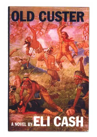
For starters, all we know about Old Custer (in the context of this book) is that the titular general survives his battle. That’s shown here. His brethren are all grounded, while he seems magically unscathed, wielding a sword, not a drop of sweat on his brow. And, though he has a gun, he’s using it to pistol-whip Natives… an absurd and confident depiction that perfectly represents an absurd and confident author and his fictional book. Paired with clean font (Franklin Gothic Condensed, I think), and you’ve got a book that can sell. How do I know? Because I tried it.
Last month, I did a window display at Book Soup in West Hollywood that featured fake books from Wes Anderson films. A few people inquired about Three Plays and Coping with the Very Troubled Child, but Old Custer took the cake, leaving a relatively large number of oblivious people embarrassed to have asked for the imaginary book...
I don't know about you, but I would call that a good first chapter.

About the author
Robert Bieselin is a writer and graphic designer, who splits time between New York and Los Angeles. He is currently the graphic designer at Book Soup in West Hollywood (booksoup.com), and previously, was an entertainment reporter at The Record (northjersey.com) newspaper in New Jersey.


