Photo by Edu Carvalho
Author photos are notoriously awful. For whatever reason—be it our noble dedication to the written word or a dogged desire to remain unseen—the writing community hasn’t taken any cues from the acting community that a headshot is a promotional tool. An amazing picture is a way to sell yourself and your brand. Along with an online platform, the author photo is a crucial tool to selling who you are and what you do best. To put it in perspective, this photograph not only represents you and your book, but it will also wind up plastered all over your website, social media, press kits, and all other forms of publicity devised for your work. Thus, if you’re only able to grasp one takeaway, please remember this:
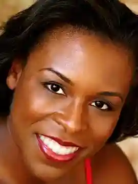
An author photo is a marketing tool. It should look like YOU on your best day.
In the theater world, a headshot is a calling card for the actor. The image conveyed in the photo is the casting director’s first indicator of where to place the performer—the girl-next-door, the Italian gangster, the quirky Nickelodeon mom, the hard-nosed detective, et cetera. As authors, we don’t need to convey a “type.” However, we do want to give the reader some insight into who we are as people and what we write.
Some authors have taken this to mean that we need to give our readers a depiction of what we look like when we are writing. This misconception has led to thousands of disastrous photos of authors with pets in their laps or novelists pretending to type at desks that are so far away from the camera we can barely see their faces. Lose the gimmicks. Keep it simple. Help the audience make the right choice because there are too many writers out there to f*ck around with something that's designed to help you succeed.
Complement Your Brand
The photograph should clue the reader into the type of work that you do and the experience your novels will offer. This doesn’t mean that if you are a horror writer you should take a menacing picture with a bloody dagger in the background. That’s creepy—the stranger danger type of creepy—and unprofessional. You don’t need to do a literal translation of your brand. A better approach is to have an unsmiling black-and-white photo with an industrial background and a steely glare. In contrast, a Christian romance writer might consider a big-grinned color picture set in a field of daises. The point is to think about the message you want to convey and make smart choices to support that decision.
Highlight Your Personality
Books are judged by their cover; therefore, to some extent, the reader is judging you and your book by your author photo. You may laugh, smile, smirk, frown, or gaze off into the distance, but the key is to find what suits your personality and your work. If you are unsure about your personality, ask friends to e-mail you a list of ten descriptors so that you can get a sense of how people see you. Decide if you agree then determine where your brand and your personality intersect. Aim to represent that convergence in your photograph. You can be a sophisticated author of PI novels (think Hank Phillippi Ryan) or a tomboyish romance writer (think Miranda Kenneally). Just be sure to play to your strengths. The goal is to make your personality and passion identifiable, so be specific with your choices.
Be Professional
You want to have fun with your photos, but don’t forget to be professional. Remember, an author’s photograph is, first and foremost, a marketing tool. Work to display a level of professionalism that pegs you as a knowledgeable and reputable member of the profession. Whether you are traditionally or self-published, agents and editors will consider a well-polished photo the first step toward legitimizing your career. Not to mention, a strong picture breeds trust between you and the reader, who will consider the effort an additional indicator of quality work.
Author Photo Do’s and Don’ts
DO target your audience. Create visual cues that identify you with the audience you’d like to target. If you are a young cozy mystery writer, but you know the audience for your book skews mature, find a way to cater to your audience while maintaining your identity. Perhaps this means dressing more conservatively in your picture to reflect the small-town values of the cozy reading community. On the other hand, don’t plaster your book with a sexy glamour shot if it’s a nonfiction book about the Bosnian War. Find a compromise between your personal appeal and the values of the demographic.
DO get a professional photographer. Part of selling your book is selling yourself, and the author photo is the cherry atop that dual marketing package. Not only is this picture representative of you, but it is representative of your brand. Don’t ruin your brand by relying on a selfie. Instead, plan ahead and put a little money, time, and consideration into choosing a photographer with the talent, equipment (quality lighting, digital retouching, and reproduction services), and contacts (some photographers have access to hair, makeup, and wardrobe professionals) to make you feel and look your best. After all, if you don’t feel good, you probably won’t look good.
Find someone who takes photographs as their full-time profession. I recommend choosing the same type of headshot photographer that actors use. If you are in a major city like New York, Boston, Chicago, or Los Angeles, you can find listings for professional headshot photographers in trade publications like Backstage. If you are not in a major city, use a hiring app like Thumbtack or look for local portrait and wedding photographers because their jobs are the closest to what you want—capturing you on your best day. Avoid department store photos. Yes, Store Brand X photos are cheap and easy, but that’s exactly what they’ll look like. This is your livelihood. Put your best foot forward—this includes ensuring your photographs have professional retouching as well as using a high-quality duplication service if you intend to use your author photo for flyers and in-store promotions.
Look for a professional photographer who will agree to a fee that is for a two- or three-hour session rather than per portrait. This will provide time to try several “looks” and guarantee you'll walk away from the photoshoot with different choices. Moreover, professional headshot or portrait photographers usually don’t require additional payment for the dissemination of their work. That is to say, upon contracting their services you’re granted permission to use, copy, and distribute the images they’ve shot for you. Nevertheless, common courtesy says to give them a photo credit at the base of the picture or in the acknowledgement section of your book.
DO some preparation for your photoshoot. Take time to interview several experienced photographers before choosing one to take your photo. Compare and contrast their online portfolios. Ask probing questions: “Do you have a studio, or will I be responsible for location? Will I be able to view some pics mid-session to gauge progress?” Also, consider whether you’ll feel comfortable with a male or female photographer. You want someone who is going to make you feel comfortable as well as someone who shares your vision of what makes you unique. If you have great rapport with the person taking your picture and you both agree upon the desired outcome, you are bound to get amazing results. Request referrals for photographers from friends. Knowing the photographer has succeeded with others may give you added confidence.
In addition, talk to your photographer about lighting. Will she use natural light? Will you be outside? Will he use a plain white backdrop or a textured one? (Avoid clichéd brick.) These are all things that you should know ahead of time so that you can adjust your hair, makeup, and clothing to match or contrast the environment. Also, think about what colors and clothing are best for your skin tone and figure. Choose several outfits for the photoshoot and have them on hand so that you can mix and match things based on how you feel, the lighting, the background, and any other variables that show up on picture day. Some outfits look different on camera compared to real life, so plan around those differences.
DO aim for a headshot or mid-shot. Why do authors insist upon taking full body photos where they are lurking in the shadows? Or photos where they are turned away from the camera? Or photos filled with a bunch of props? This is amateurish and distracting, not to mention foolish since the author photo is a writer’s one chance to make a personal connection with the reader. Your audience won’t be able to connect with you if they can’t see your eyes or if the picture shows more of your living room than it does your face. Your beautiful mug should be completely in focus and full of energy. Make your face and eyes the center of the shot or at the very least concentrate on creating an author photo that is a head and shoulders shot or a half-body shot. Help the viewer understand who you are and what you stand for by forcing them to focus on your face. Not your torso. Not your hands. Not your pet. Not the rolling English countryside. Many writers think this is limiting, but tons of emotion can flow through a tight frame. We see it every day in commercials. If you’ve taken the time to pinpoint where your brand and personality converge, a headshot or a mid-shot will give you more than enough room to present your best self.
However, the big reason a headshot is the best choice is that they look better on the internet. With the advent of cellphones, most people read books and surf the internet on their phone or tablet. Your author photo will more than likely come up as a thumbnail or as a picture that is vastly smaller than the one saved on your desktop. Therefore, having a tighter frame for your photograph will ensure the viewer can see you even if they’re unable to enlarge the image.
DON’T expect your author photo to last forever. You should reshoot your author photograph every four to five years to reflect changes in age, weight, branding, et cetera. Butterfly collars died with the seventies and so should the author photo that includes one. Being honest about who you are now will help you connect with your fans even if that means showing how you’ve matured over the years. You don’t want people doing a double take when you walk in the room for your book signing because you don’t look a damn thing like the person on your website.
DO get a second opinion. After your photoshoot, show the proofs to your friends and your agent to get a second opinion about what works. Often, we are too hard on ourselves and don’t have a clear vision of what we really look like when we are at our most comfortable. A second opinion will keep you from making the mistake of choosing a boring photo (because your hair looks perfect) over the slightly mussy picture that shows warmth and sincerity.
Now, Say Cheese!
Finding the “perfect” headshot formula is going to take time, so don’t be afraid to experiment. For example, if you write about cats and are known for your kooky kitty eyeglasses, you may want to have several pictures to highlight each pair. And that’s fine. “Perfect” is going to be different for each of us because that ideal formula should reflect our personal marketing goals. The key is to highlight the best parts of your personality and to avoid a photograph containing unnecessary distractions. Get started by gathering a list of positive traits from your friends then search the web to see what other writers are doing. I can assure you that discovering what resonates and what doesn’t will help you create your own perfect portrait.

About the author
Andrea is a writer and editor who specializes in mystery and romance. She holds a creative writing M.F.A. from Seton Hill University and a copyediting certification from UC San Diego. Her craft essays can be found on several websites such as Funds for Writers, DIY MFA, and Submittable. She also writes book reviews and entertainment news for the women's lifestyle website Popsugar and is the author of the Victoria Justice Mysteries by Polis Books. These killer courthouse cozies follow a young stenographer who realizes her transcripts hold the key to solving a string of murders (think Law & Order meets Murder, She Wrote). To learn more about Andrea’s work, visit ajthenovelist.com or follow @ajthenovelist on Twitter.


