As 2019 recedes from our collective memory, it’s easy to forget the trends that defined it, from fashion to film to food. Naturally this applies to literature as well — and it can be especially difficult to pin down cover design trends of a given year, as they tend to evolve gradually and may even re-emerge after long periods of dormancy.
Indeed, any seasoned cover designer will recognize that no cover design is 100% new. However, each year there will be certain colors, shapes, and textual arrangements that “has its day,” so to speak. Check out this gallery of book cover art to see plenty of examples covering a wide range of genres!
The great thing about design is that, while such elements are constantly in flux, we can still look back at a discrete era and identify its biggest trends — as well as how those trends might signify what’s to come. That’s what motivated me to investigate the most interesting, prevalent cover design trends of 2019, and attempt to predict what we’ll be seeing more of in 2020. Without further ado, here are my findings (and forecasts).
All caps over bright patterns
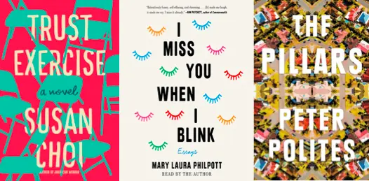
If 2018 sparked the trend of all-caps titles over colorful backgrounds, 2019 fine-tuned it with patterns — specifically, tiled patterns, mirror images, and other recurring design elements. One notable instance of this was Trust Exercise by Susan Choi; the cover features a bold pattern of turquoise folding chairs against a bubblegum-pink background. Mary Laura Philpott’s essay collection, I Miss You When I Blink, also boasts a bright pattern on the cover — this one of multicolored eyelashes (a simple, pleasing allusion to the title). And I wouldn’t leave out The Pillars by Peter Polites: a dazzling, gem-like cover that holds favor not only with me, but with many other designers as well.
What’s particularly intriguing about these covers is their departure from the warm, bright colors of last year (think The Incendiaries and The Immortalists) into an exciting realm of candy-bright hues. In this way, these cover designs project clear confidence in their authors’ abilities — they don’t need to convince you that they’re serious and literary, you should just know.
Prediction for 2020: Even brighter, less “conventional” colors and patterns that might seem more apropos for an Instagram influencer’s phone case, but will come to denote great literary merit (as evidenced by Trust Exercise winning the National Book Award).
Birds, birds, birds
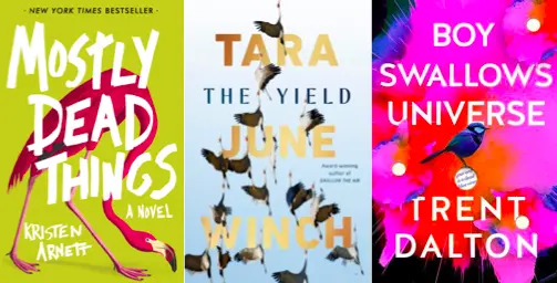
It’s unbelievable how many birds appeared on book covers this year. I’d posit a conspiracy, if they weren’t all styled in such different and unique ways. Yes, from the shifty-looking flamingo on the cover of Mostly Dead Things, to the flight-taking birds of Australian sensations The Yield and The Taste for Silence, to the perky-looking robins and wrens of This Is How You Lose the Time War and Boy Swallows Universe (which actually had multiple iterations of cover birds), 2019 was definitely an avian-dominated year.
Whether illustrated or photographed, these feathered friends all seemed to connote something profound within the book itself, promising a reward for the persistent reader. It’s also worth noting there were a number of bird-bearing, award-winning (or nominated) books in 2019 like Ducks, Newburyport. However, books like this with birds in the titles (see also: The Bird King and Descendant of the Crane) seemed to feature them less prominently on their covers, perhaps for fear of being too heavy-handed — every designer’s worst nightmare.
Prediction for 2020: Fewer actual birds (they’re overdone now), but more feathers, as we began to observe last year on covers like City of Girls and The Feather Thief. Maybe more beaks and talons, too, though I don’t want to count my chickens.
Mustard yellow covers
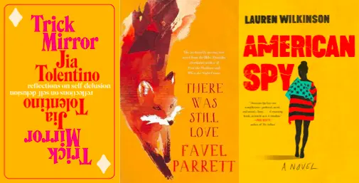
Move over, millennial pink covers, there’s a new sheriff in town: mustard yellow. Frequently accompanied by overlaying red text (should we call this trend “ketchup and mustard”?), there was an unprecedented number of yellow covers in 2019. Perhaps most recognizable was that of Trick Mirror, the highly anticipated and even more highly praised literary debut of New Yorker writer Jia Tolentino. Lauren Wilkinson’s historical thriller American Spy also features a mustard cover with bold red title text, accentuated by the red-striped shirt of the figure at its center.
Meanwhile, the cover of There Was Still Love by Favel Parrett dips into a slightly deeper goldenrod-and-rust color scheme, but still unmistakably lodges itself within this faction. Other noteworthy covers of the same shade included Late Migrations by Margaret Renkl, Act of Grace by Anna Krien, and On Shirley Hazzard by Michelle de Kretser. It may just be a coincidence, but Australian cover designers in 2019 seemed especially fond of this color reminiscent of carnival corn dogs and blooming marigolds, so we likely won’t see it replaced anytime soon.
Prediction for 2020: A gradual tapering of mustard and goldenrod, and eventually, another unusual-yet-appealing color family at the forefront. My money’s on lilac and lavender — we haven’t had a good crop of purple covers in awhile, and it seems like a natural resurgence after the popularity of pastel covers in 2017 and 2018.
Flora intertwined with text
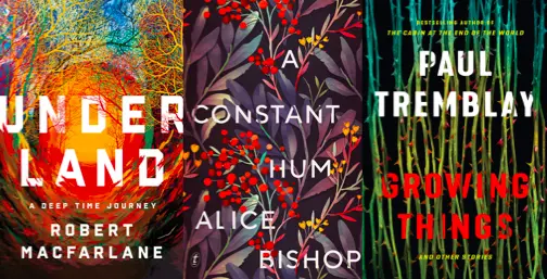
Similar to the combo of all caps and bright patterns, this cover trend can hardly be confined to 2019. Floral covers in particular have been ubiquitous for quite some time, but last year we saw a meteoric rise in the specific phenomenon of plants curled around and within titles on covers: Underland, Growing Things, A Constant Hum, The Old Drift, The Need, and more. All of these 2019 books have carefully designed covers with text that interacts with a variety of trees, stems, and flowers, rather than merely sitting on top of them like oil on water.
As a reader, you can practically feel yourself being taken in by the vines. It’s also interesting to see how these recent covers tend toward darker colors and fewer flowers, in stark contrast to the bright covers of flower-adorned earlier books like The Ensemble and What We Lose. The cover of Alice Bishop’s A Constant Hum is particularly evocative, with its bruise-like colors and firethorn berries, subtly communicating the nature of the stories within.
Prediction for 2020: Even fewer flowers — if that Vanity Fair piece is anything to go by, readers no longer think blossoms are awesome — and more thorns and vines to reflect spiky, twisted subject matter. Just look at Growing Things, The Need, and (from a few years back) My Absolute Darling: there’s a clear connection between their dark narratives and the ominous-looking plants on their covers.
“Stacked” covers
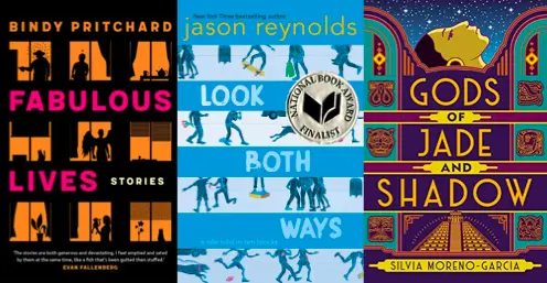
By “stacked,” I mean book covers that have levels — like layered cakes, with each tier stacked on top of the one below. As a result, the 2019 covers seen here — Fabulous Lives, Look Both Ways, and Gods of Jade and Shadow — have the opposite dynamic of the “intertwined flora” covers. Not only do the text and images remain isolated, they’re separated into discrete horizontal panels, which creates the uncanny (but intriguing) effect of peering through blinds.
This is especially true of Bindy Pritchard’s book cover, cleverly designed to resemble a series of small apartments, which are presumably full of people living the titular “fabulous lives.” Indeed, another element that all these “stacked” covers have in common is how they forge discernible objects and/or surroundings through their designs. The cover of Look Both Ways aptly takes on the appearance of several busy streets, and Gods of Jade and Shadow integrates its panels into an elegant partition, behind which a golden face ascends.
Prediction for 2020: More stacked and paneled covers — this trend is only just picking up steam, and it’s a simple-yet-effective way to incorporate text into an overarching design.
Of course, no one can definitively say what the future will hold, especially in the ever-capricious world of publishing. But if these 2019 trends are even a little indicative, we have a marvelous, inventive, and colorful 2020 in store for covers across every genre… and hopefully, from the brilliant minds of the designers reading this right now. If you want tips on how to design your own book covers, take a look at this post!

About the author
Emmanuel Nataf is a Founder at Reedsy, a marketplace and set of tools that allows authors and publishers to find top editorial, design and marketing talent. Over 3,000 books have been published using Reedsy's services.


