It's been a few years since the Scary Stories to Tell in the Dark trilogy got a major facelift, replacing Stephen Gammell's art/living nightmares with Brett Helquist's tamer take on the urban legends, folktales, and general creepiness collected by Alvin Schwartz. People were incensed, but now that some time's passed, we should be able to evaluate it objectively.
Was the change a good one?
No. It was not. Usually I wait until the end of a column to make a judgment, but screw that, this was a terrible idea.
Okay, okay. Before we go burning down...whatever it is people in mobs burn down with torches and pitchforks (and before we go pitchforkin' for that matter), let's be clear about something: Brett Helquist, Stephen Gammell's replacement, is a really good artist. Take this comparison from "Just Delicious" (Gammell on the left, Helquist on the right, which will be the convention throughout this column):
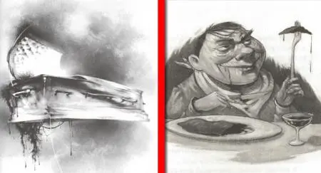
Helquist's toad-y creep is just about perfect. The meat on the plate and skewered on his fork look vile. His grin, the juice dripping down his chin, it's all spot on.
But let's face facts. Helquist had an impossible job. Has there ever been a collection of illustrations that caused more nightmares than those by Stephen Gammell? Have you ever seen anything like them? Did you, like me, buy a Halloween sweater with an all-over Gammell print?
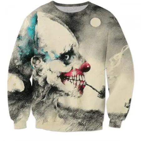
Thought so.
Let's gnash our teeth together and go through some of the worst replacements.
"The Hook"
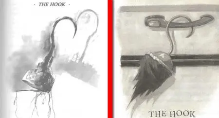
There are some general differences in what Gammell did and what Helquist did. With this image, being a similar subject, we can see those differences at work.
One big difference, right away, is the high contrast black and white from the Gammell books and the more sepia paper in the Helquist books. The high contrast and the stark white pages are striking. Cold. They feel more "other" and have this weird contrast of cleanliness and filth where the Helquist stuff is more muted, more leveled-out.
The other biggie is the general style. Gammell is a lot wilder. His images feel...wet. Helquist's stuff is more direct and tidy.
Why is this a bad replacement? Because we took the dripping, vein-y debris attached to the hook's cup in Gammell's drawing and replaced it with torn fabric. Snooze.
"Alligators"
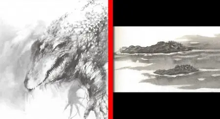
Neither of these gator drawings are overly accurate. Both give the gators a sort of facial expression, and as much as I love gators, I don't see them as having terribly expressive faces.
That said, Helquist's gators look a little sleepy, and their eyes are kind of cartoon-y. Gammell's gator? That looks like a disgusting killing machine. Look at its thick, sloppy arm. The malice. If I have a choice of going up against one type of gator in my nightmares tonight, and if I can choose between a Gammell gator and a Helquist gator, I know which way I'm leaning.
"Dead Man's Brains"
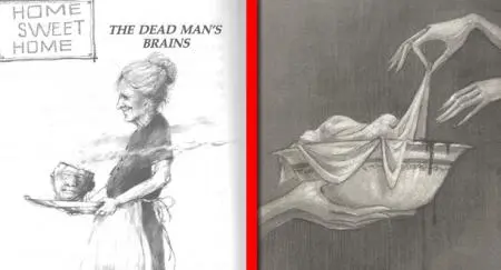
Helquist went for the more creeping horror. Gammell was balls to the wall. While Helquist has the cloth-covered bowl with a splash of blood, Gammell has the actual head with steam coming out the top, not to mention it's being carried by a grandmotherly type. This replacement is indicative of one of the issues with the new art. These books, to a kid, felt like forbidden objects, things you weren't supposed to have. Which made them scarier. While Helquist's image has the blood, it's just not in-your-face enough that it would raise a lot of parental eyebrows. With the new images, Scary Stories is not the taboo book it once was.
"T-H-U-P-P-P-P-P-P-P-!"
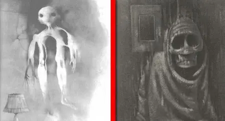
When Gammell gives us something ghostly, he gives us something that's totally new and unfamiliar. Look at that thing. Crotch up at its neck, one arm branching into two hands, another arm that is connected up all wrong. The more you look at it, the weirder it is. You want to stop looking, but you can't. The Helquist dead-y is a good piece of art, for sure, but it feels like something we've seen before. It's more familiar, less disconcerting.
"The Appointment"
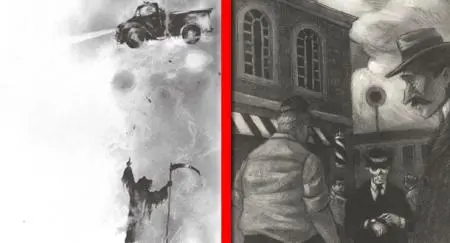
I wanted to include this one because I like the Helquist drawing quite a bit. That said, it's a great example of how the replacements really changed the tone of the books.
I had a photo teacher once who really discouraged photo projects based on songs. Why? Because students went SUPER literal most of the time. If you made a project based on Europe's "The Final Countdown," you'd probably have a clock, something indicating finality. Maybe a picture of a synthesizer.
Helquist's drawings are good, but they don't intrigue me or get me interested in the story so much as they compliment the story once it's read. Which may be why I like this one. I don't think that's a bad thing for illustrations to do.
But there's a good reason that people remember the illustrations in these books more than they remember the stories. And it's shit like Gammell's vision of Death. His abstract, non-literal stuff makes me more interested in the story than the highly-literal Helquist piece.
"Aaron Kelly's Bones"
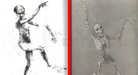
The skeleton is good and all, but Gammell illustrated a dancing corpse. You are watching it fall apart in all its gory glory, right there on the page. It's a memorable Gammell drawing, and the Helquist is just no match. C'mon, your kindest, sweetest neighbor will hang a cardboard skeleton on the door in October. Nobody is hanging anything that looks like Gammell's Aaron Kelly.
"The Ghost With The Bloody Fingers"
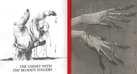
Gammell knows how to draw gore. The hand is disgusting. The blood looks like blood. The posing of the hand is icky. Helquist's hand just isn't scary. It's cartoon-y. And the blood looks like a slick oily thing, something you could wipe clean and walk away. Gammell's hand has a dirtiness to it that will never come clean.
"Hoo-Ha's"
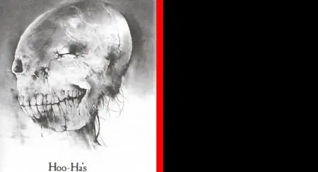
What? No replacement at all? I don't even know if I can count this as an egregious replacement as there was NO replacement. I will say it's an awesome Gammell drawing, and without anything replacing it in the new editions, it feels like an unanswered challenge.
"Somebody Fell From Aloft"
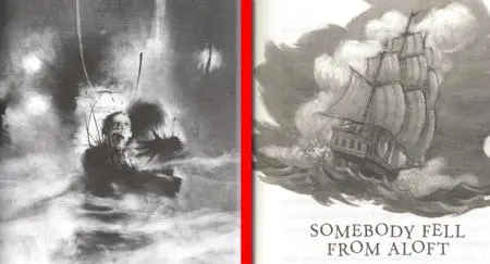
These don't even compare. The ship is an illustration that could fit into any number of children's books. The Gammell drawing would make a parent say, "What in the hell are you reading?" It's a powerful nightmare of an image. No contest.
"Wonderful Sausage"
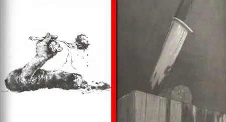
I will see this Gammell image in my mind every time I think about these books.
Look, the Gammell is just...gross. And it's a little better in terms of summing up the story. If we've got a story about sausage made of flesh, what better way to illustrate it than to show it being forked up by a severed arm? Makes sense to me!
"Oh, Susannah"
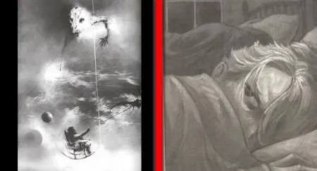
I feel like we're always in our world with Helquist's drawings. With Gammell's we're somewhere else. Gammell's willingness to go abstract is a big strength of his work in these books, and Helquist's mostly-accurate drawings leave me wanting a little bit of that uncanny horror, a little bit of that feeling when you turn to a page and go, "What in the actual fuck is that?"
"BA-ROOOM!"
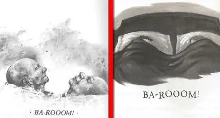
C'mon. The Helquist drawing is creepy once you read the story and realize these are dead people in the bed together. But from a visual standpoint, how fucked up is this Gammell art? The Helquist is a drawing of dead people, but the Gammell is a drawing of dead people that LOOK dead.
"Footsteps"
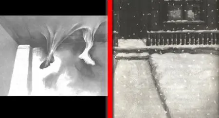
One of these is nightmare fuel, feet coming through a suddenly soft ceiling. The other looks like leftovers from a Christmas book. No thanks.
"Harold"
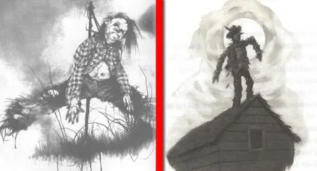
Unspeakable body horror or a leftover from Wizard of Oz? Jesus, Gammell's Harold has a BELLY BUTTON! That's a man of flesh, and he looks the part.
"The Dream"
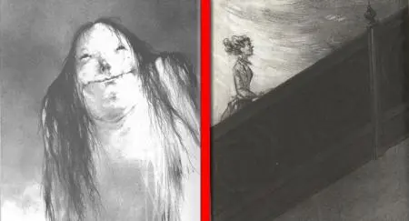
Something Gammell did that Helquist seemed to shy away from was stuff like this. The perspective here makes it seem like you, the reader, are waking up to face this oddly frightening character. Gammell's work didn't let you keep your distance. You always felt like you were right there, touching, seeing, smelling. It felt so unsafe because it was all so immediate. In this Helquist drawing, the character is going up the stairs, into the dark, but the reader isn't. We're smiling, saluting her bravery, and getting the hell out of there.
"Sam's New Pet"
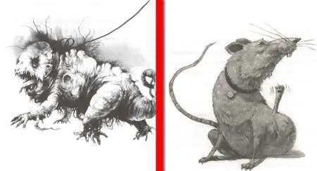
Most of us probably remember this urban legend, the one where a kid gets a "dog" that turns out to be a rabid sewer rat. This Helquist drawing looks like a delightful unusual animal friend. Dare I call him "cute?" Seriously, with the collar, it's straight out of a Disney movie. Gammell's? THAT'S a walking, tumerous abomination.
"The Red Spot"
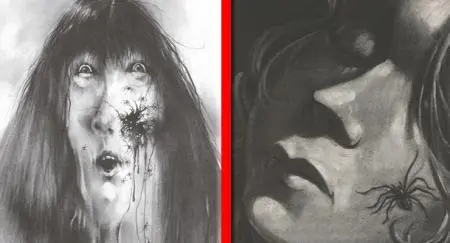
I mean, duh. A spider on the face is nothing to sneeze at. But if we want to talk Would You Rather, I'll take a big spider on my face over the moment when an egg sac bursts my cheek flesh open and spiders come pouring out. But I was raised with certain values, so maybe it's just me(?)
"Is Something Wrong?"
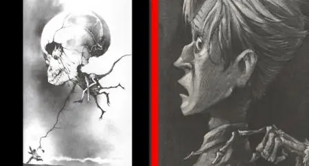
Just so gloriously weird. Also, an enormous, deformed skull with a melting eyeball. Did Gammell make squish noises with his mouth while he was drawing? He must have, right?
At The End of the Day
I think what chafes me, just a little, is that Scary Stories to Tell In The Dark was one of the few things, growing up, that I had access to that was too scary for me. It was in the kid's part of the library. It was a Scholastic Book Sale, teacher-sanctioned way for me to push the boundaries a little. These books were passed around between friends, and we would all try and outdo each other by finding the grossest drawings buried in the different volumes.
I grew up thinking books were boring. There were some notable exceptions, like Scary Stories to Tell in the Dark. The change in the art, not the individual drawings, but the overall tone and level, prove Young Me right. We took a book that was scary, gross, gory, and disgusting, BUT DEFINITELY NOT BORING, and we made it safer, more appropriate, and totally boring.
That's me, though. I'm not a kid anymore, nor do I have kids. What say you, parents? What about you, folks who read these as kids?

Meet the best editors in the industry on Reedsy
Sign up to request quotes from editors who shape bestsellers.

About the author
Peter Derk lives, writes, and works in Colorado. Buy him a drink and he'll talk books all day. Buy him two and he'll be happy to tell you about the horrors of being responsible for a public restroom.

