Polis Books will release my debut novel, New Yorked, in June, with the follow-up, City of Rose, slated to follow in 2016. This is a column about taking a book over the finish line.
Fact: People judge books by their covers.
You're told not to, but you do. It's natural. The amount of care that goes into a cover often correlates to how much care has gone into a book. A good cover can jump off a screen or a bookshelf. A bad cover can drag a book down into the murky depths of obscurity.
It's time to talk about cover design.
Did you know I used to go to art school? It's true. I got into the art conservatory at SUNY Purchase, and planned to get a degree in graphic design. The first semester I got straight C's and realized I did not like going to school for art, so I changed my major to journalism.
While I don't have a degree, I do have a modicum of design sense. And I've got a good sense of the brave new world of book design. For most people, their first introduction to a book is on a computer screen—that means big letters, bold colors and images, and less reliance on small text and detail work.
When my book was out on sub, I had a few deal breakers. A big one was: I did not want to sign with a publisher who did crap covers. Every time my agent sent me a new list of presses we were on submission to, the first thing I did was check out their cover game (second: stalk their editors on Twitter).
Polis, luckily, has some serious cover kung-fu. Check out the website. There's some sweet stuff there.
For the most part, I don't think authors should design their own covers. This is my business side speaking—as the associate publisher at MysteriousPress.com, I know that it's best to let a talented artist run with it and put their own spin on things. Authors can sometimes get too precious or too literal with the work.
Still, input is important. No one knows the work better than the writer.
Problem is, some publishers don't want to play ball—they design your cover and if you love it, great, if you don't, tough shit. This is why it's helpful to negotiate consult or approval rights in your contract. Consult means they'll at least talk to you. Approval means they can't move forward without your sign-off.
Chances are, if you're a first-time author, you're not getting approval rights. Stephen King gets approval rights. I don't get approval rights. And not every publisher is even going to give consult (not that it doesn't hurt to try).
Lucky for me, Jason Pinter at Polis was willing to give me consult rights, and after signing, he invited me to send him my thoughts on design.
I had a couple of things, right off the bat, that I want to stay away from:
- Generic skyline
- Silhouette or image of a person
- Man holding a gun
Not that these tropes can't be done well (check out The Killing Kind by Chris Holm to see two of these done extremely well, thanks to a smart use of color and layout). Still, we see these things a lot in crime fiction, and I didn't think they'd fit the book.
I also noted that the colors blue and white kept coming to me, and that since it was intended to be a series, it would be nice if the look could be carried over into future installments.
Among my notes was this tidbit:
The title of the book refers to how snow turns to black slush from trash and exhaust, i.e., the snow got "New Yorked." A play on that would be interesting. Also, I like the idea of a cheap bodega umbrella, lying on the ground and broken in half. One of those four dollar umbrellas that gets snapped in a light breeze. Also "New Yorked."
Jason took that, hooked up with 2Faced Design, and they ran with it. Here's what landed in my inbox one glorious morning:
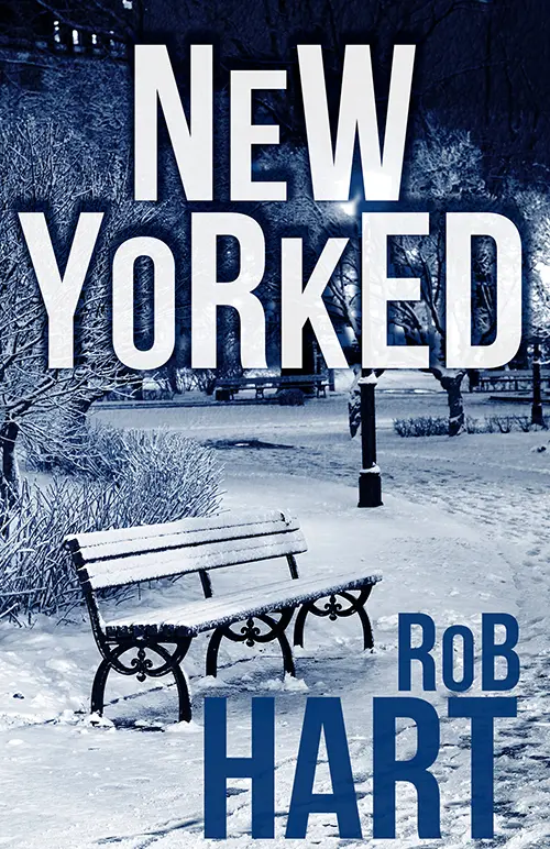
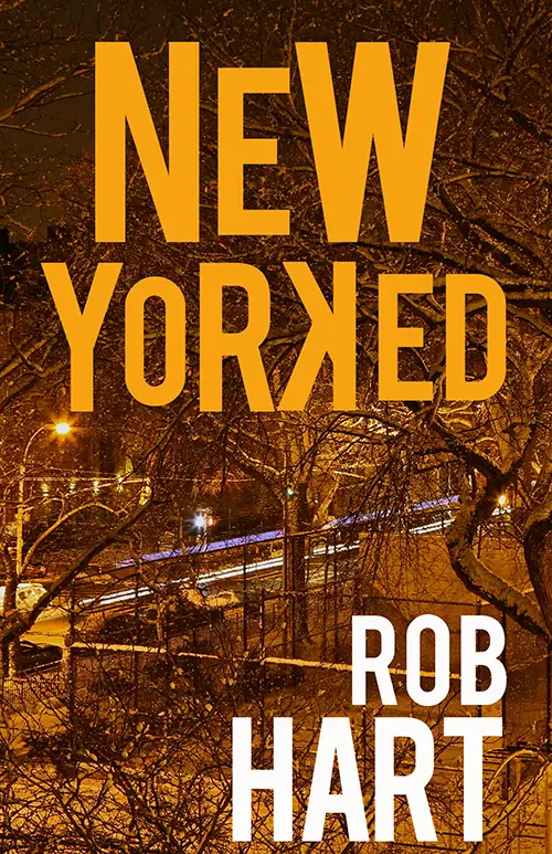
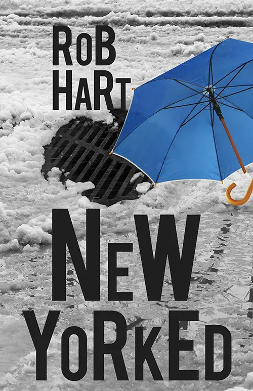
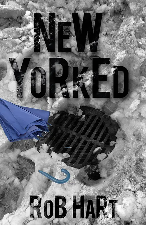
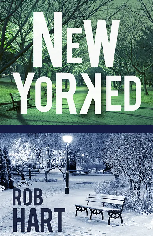
There are things I like about each one, but there was a clear favorite. My agent and my wife both agreed (because for as much as I trust my own instincts, I wouldn't dream of moving forward without getting their sign-off).
At that point, the detail work started. There were some tweaks I came back with—asking to add a bar at the top, so a blurb would be readable. Then, to even out the lettering on my name and go from textured to solid black, to make it stand out more. And finally, to move the umbrella handle.
They were receptive, and we ended up with this:
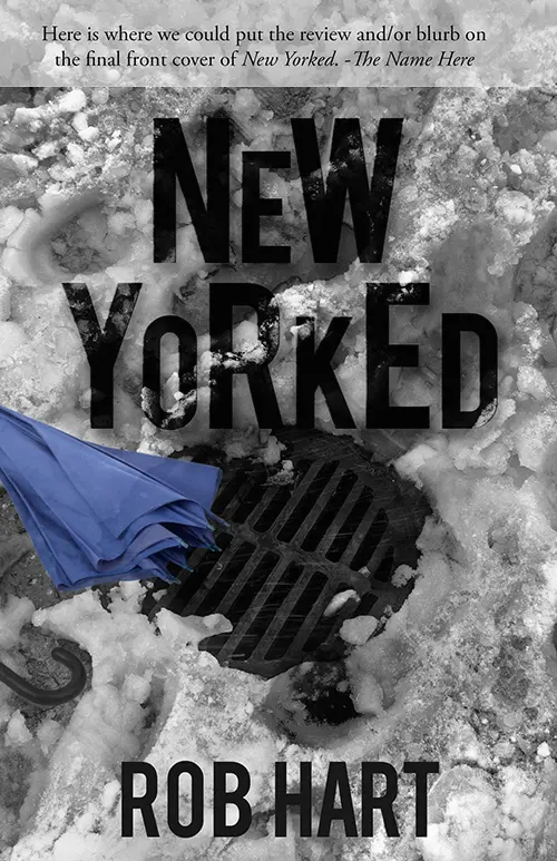
Almost there.
Adding the blurb bar meant knocking down the title, and I didn't like how it ran up against the manhole cover. It was getting a little muddled with the black on black. And the umbrella handle wasn't working for me. I asked what it would be like it we lost it completely. And then I asked that we use the blurb from Josh Bazell for the cover.
Besides being a great blurb, Josh read the book a few years ago and gave me some great editorial notes—and a lot of encouragement, which I very much needed at that point. It was important to me to have his name up there.
Here's what we ended up with:
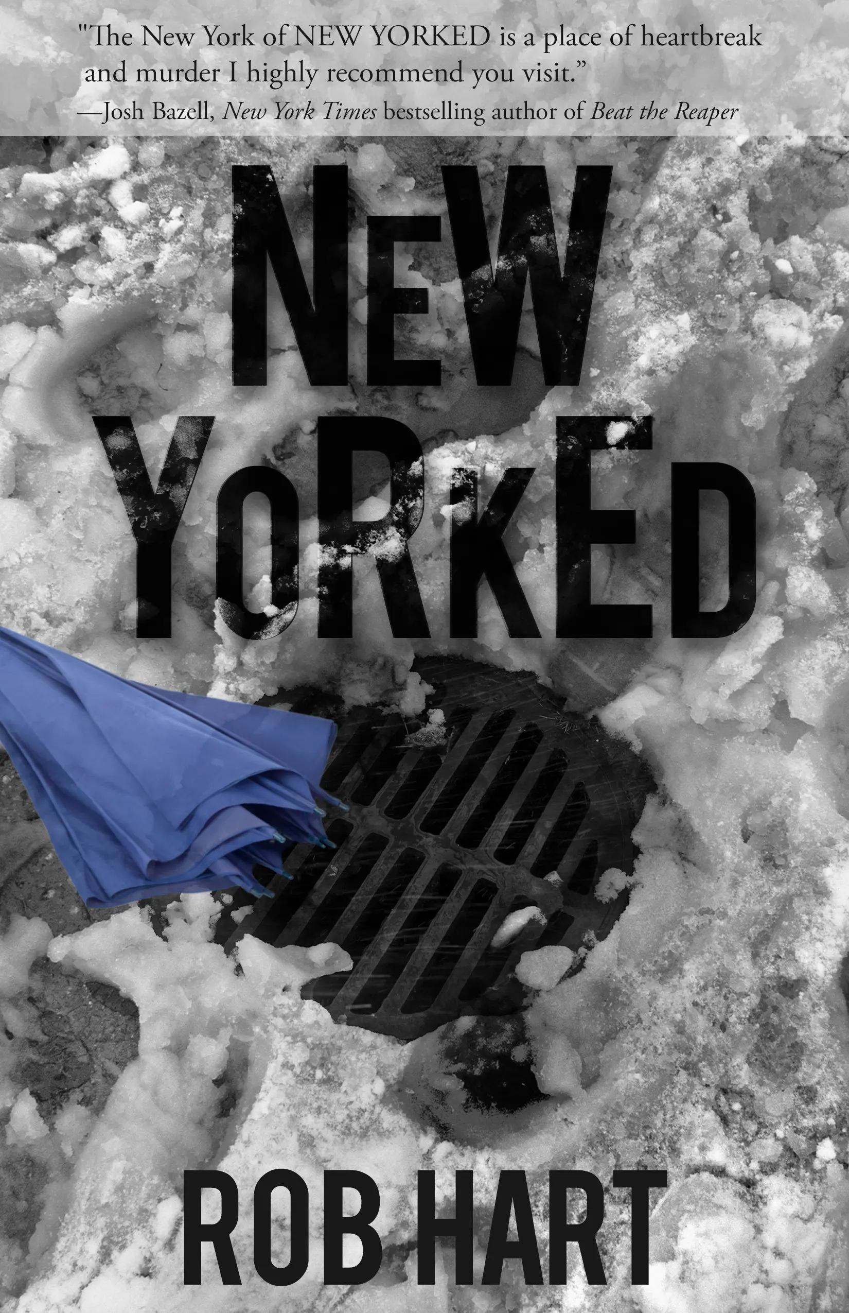
That's a hell of a cover. Really, truly, I love it.
The color scheme, the way it plays on the idea of the title. I love the way the lettering of the title mimics the alternating heights of a cityscape. I like that it's grungy without being grimdark. And it just looks so different. Covers, especially genre covers, can sometimes fall into the trap of looking a little similar. This doesn't look like anything else.
The final step was jacket design. This, I didn't give notes for. Which I was fine with. The cover design went so smoothly—we went from comps to finished product over the course of a weekend—that I knew I was in good hands. Polis didn't let me down.
Here's what they sent me:
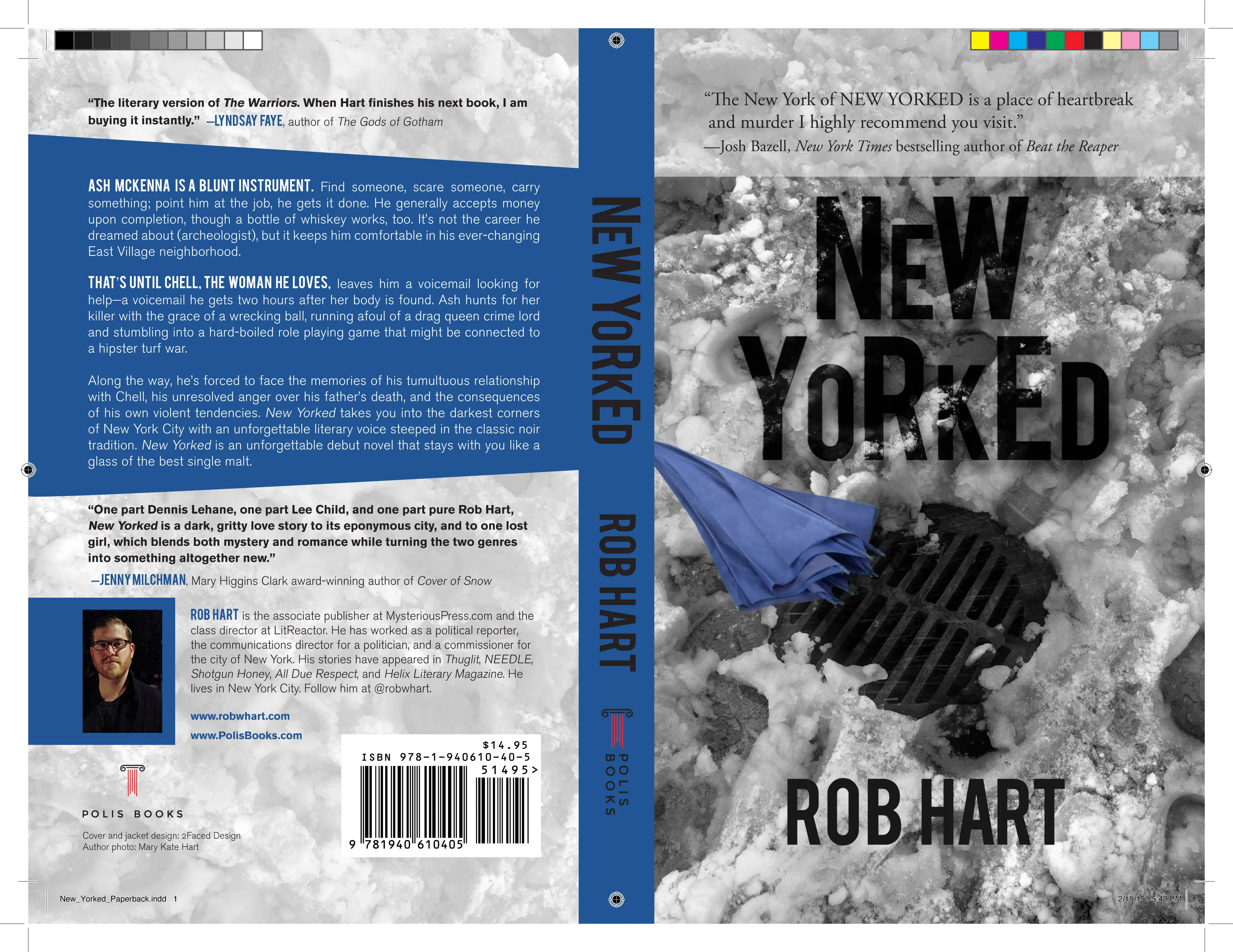
It looked great. I only had two requests: First was a tweak on the wording of the synopsis. Second—I asked if it would be better to do the spine text in white. Given the depth of the blue, it felt like the black was getting lost.
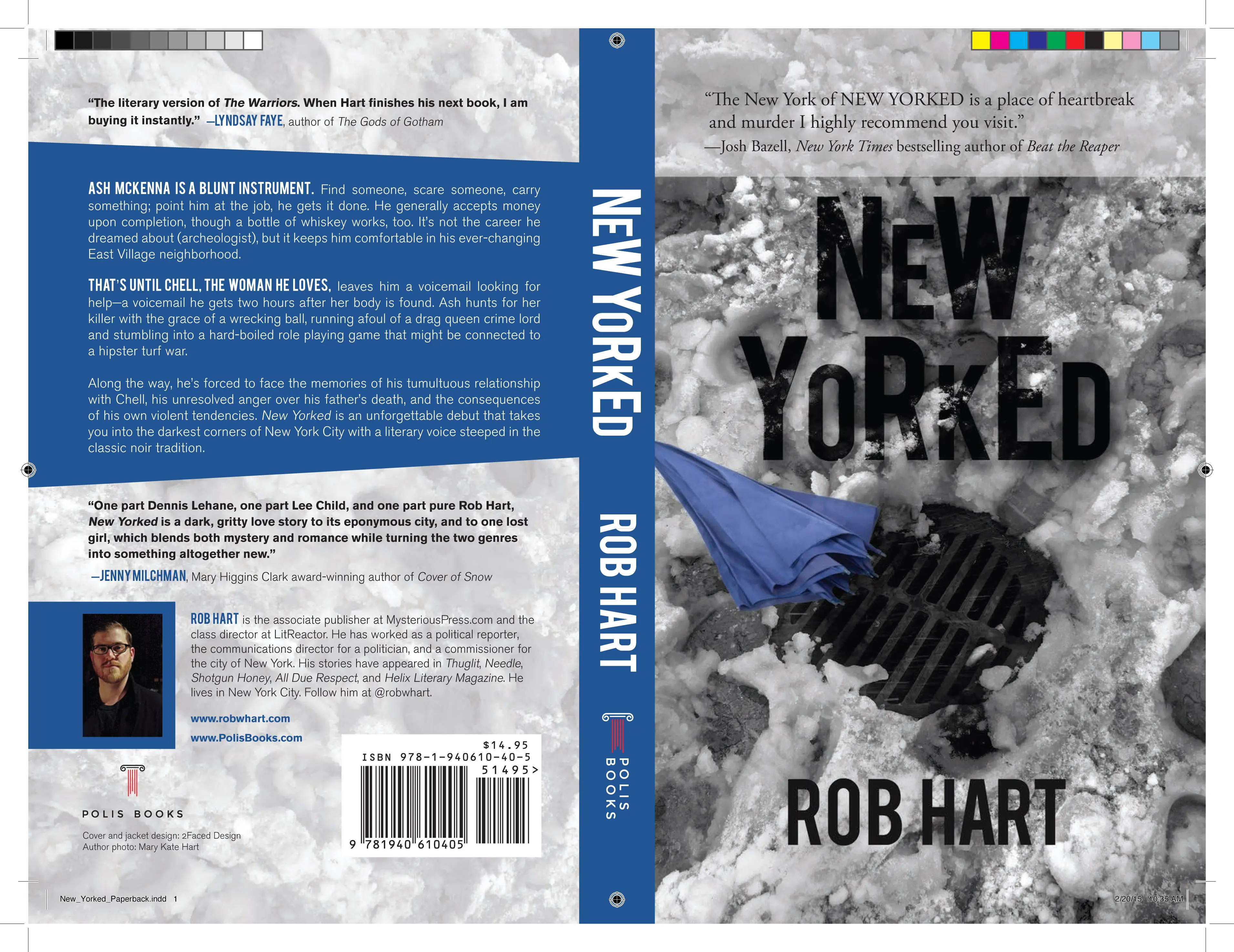
And you know what? It looks great in white.
Now that's a cover that's going to look damn good on a bookshelf, whether it's facing out or lined up with the spine sticking out. I spent a little time after this wandering the stacks in The Mysterious Bookshop, checking out spines, and blue is such an under-used color.
And as an added bonus, since my sister did my headshot, she has a credit on the back.
All told, I was exceedingly lucky. I've heard horror stories—authors saddled with covers they didn't like, authors that got boxed out of the process. As a publisher, I always try to make authors feel like they have a voice in the process, even if the final design doesn't totally match their vision.
So to have such a strong voice in the process was an incredible feeling. I can look at that cover with no regrets or second guesses. And given this, I'm excited to see what they come up with for the next book, City of Rose.
And then the books arrive...
Even though the pub date is June 9, the books still have to be printed and shipped out so they're ready for stores and online retailers. Jason had been telling me the books were due to arrive the week of May 11. So it was a very pleasant surprise when they turned up on May 7, more than a full month before release.
And I'm still a little flabbergasted.
First off, it's a damn pretty book. The cover is glossy, which mimics the feel of sunlight reflecting off the snow. It's nice and solid and has good heft. It's a real thing.
Then I flipped through it, and it's full of words that I wrote, and the feeling of seeing it, all printed out and pretty, made my head spin a little.
I got 20 author copies. Everyone who blurbed it got a copy as thanks, plus some other folks had to get copies, and then I gave copies to my mom and mother-in-law for Mother's Day. I'm down to six. I'm bringing one to Noir at the Bar New Jersey on May 24, to toss onto the raffle table (so hey, come on out and try to win it!).
Otherwise—time to order some more.
Extras
Do you prefer that your books be read to you? Then good news... Audible has picked up audio rights! The last time I heard an audio version of something I wrote (my short story in the Kwik Krimes anthology), it was deeply unsettling. So this should be fun.
Want to come out and hang and do stuff and be friends? I've got a couple of events scheduled—a release party at The Mysterious Bookshop on June 9, a signing at the Staten Island Barnes & Noble on June 17, and a Noir at the Bar at Flagship Brewery on Staten Island, on July 12. Find out about all of them on the events page on my website. RSVP at the Facebook links if you can—it helps to have a head count.
And finally, check this out:
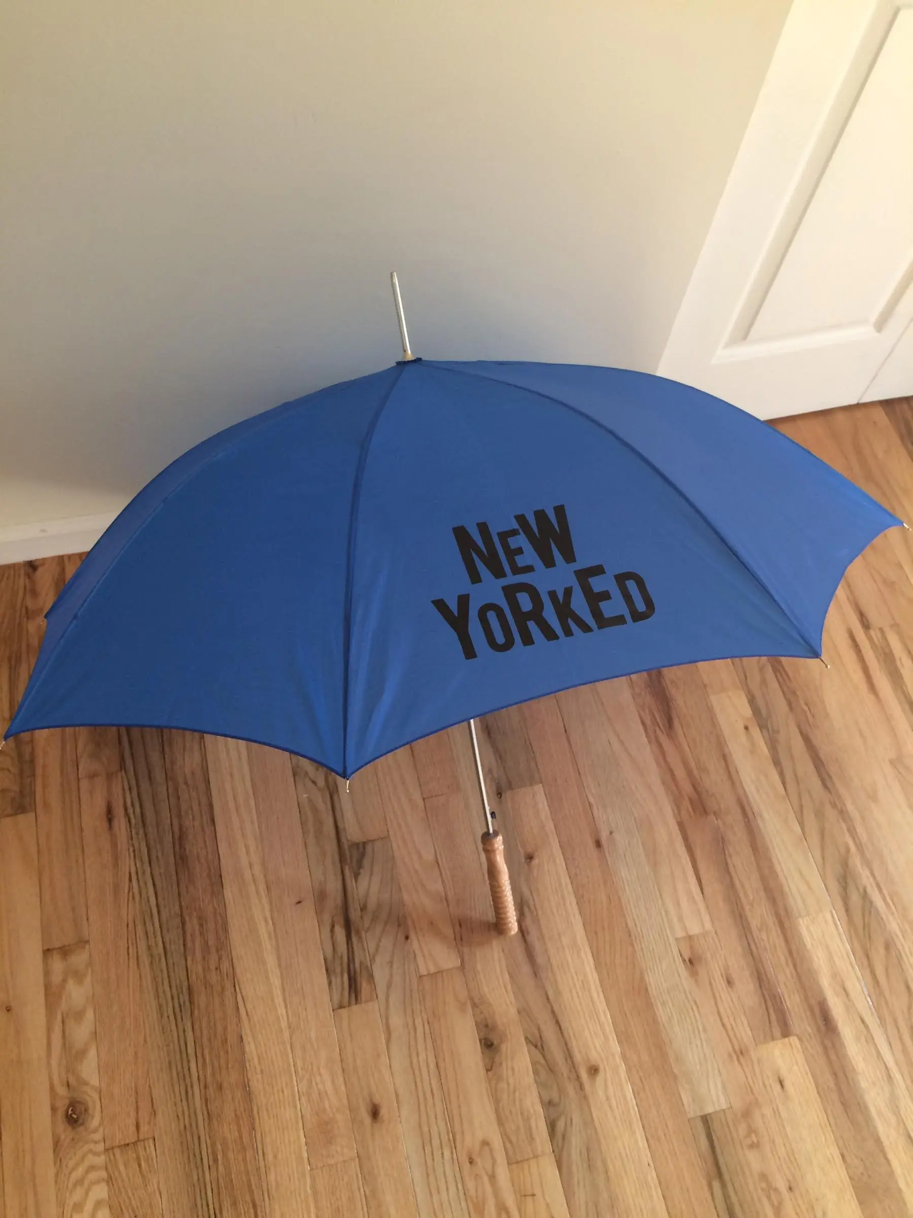
The protagonist of New Yorked carries a weaponized umbrella—so Jason came up with this brilliant piece of swag. It's a limited edition... and there's going to be a couple of ways that you can win one. I've got a LitReactor promo planned for next month, but in the mean time...
Have you added New Yorked to your Goodreads 'want to read' shelf? If not, you should. Come June 8, my publisher is going to pick someone off that list to win a New Yorked prize pack: An umbrella and a free copy of the book!
You have to be in it to win it—go here to add the book to your shelf.
Otherwise, we're getting close now. Less than a month. Got questions? Ask away.

About the author
Rob Hart is the class director at LitReactor. His latest novel, The Paradox Hotel, will be released on Feb. 22 by Ballantine. He also wrote The Warehouse, which sold in more than 20 languages and was optioned for film by Ron Howard. Other titles include the Ash McKenna crime series, the short story collection Take-Out, and Scott Free with James Patterson. Find more at www.robwhart.com.

