I’ve committed the worst sin of self-publishing. No, not failing to hire an editor (well, okay, I did that one, too. A bunch of times). No, not falsely representing myself to try and get my books on digital platforms used for library checkouts (wait, I TOTALLY did that one, and I won’t apoogize).
I must confess: I made my own covers.
If you get one piece of advice about self-publishing (which you won’t, you’ll definitely get WAY more than one piece, totally unsolicited, but if there was an award for Most Common Advice it’d be this): Don’t make your own covers.
What most people won’t say is why this is a bad idea. You know, beyond the generic, “They look crappy.”
What is it about a homebrew cover that just doesn’t fly? How do people pick them out immediately? What are the mistakes that I made? How can you avoid repeating them?
Right Now Versus Right
The excitement of self-publishing got the best of me more than once. So, I’d make something "right now" instead of making something that was right.
An ugly cover is like a crime: sometimes you’ll get away with it in the moment, but there’s no such thing as getting away with it forever.
Instead of making a cover quickly, make it right. You’re self-publishing. Nobody is going to remember if you blew your self-imposed release deadline because it took you a couple extra days to get a cover. Everyone will remember that cover if it sucks.
Not Picking a Theme
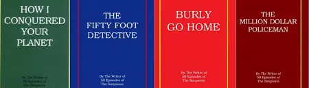
John Swartzwelder has some fairly boring covers, but he’s got a standard, and damn it, 15 or so books in, I can't help but get excited when I see a new one.
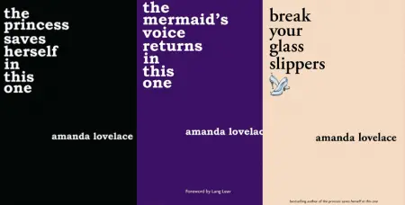
Amanda Lovelace changes out titles and colors, and other than that puts out the same cover over and over.
For a self-published author working in one genre, a certain uniformity isn’t the worst idea in the world.
If you don’t like screwing around with covers, work hard on a single, nice template, change out the title and some colors, and call it a day.
Given the choice between 10 unique, ugly covers and 10 same-y but decent covers, put me down for decency. For once.
The Tools Matter
You can make a cover in Microsoft Publisher. But...don’t.
It’s been like 15 years since my first self-pub, so I have an excuse, but you don’t. You can jump online and find options that’ll give you Photoshop quality, in terms of pixels per inch, and much better font and design options than Microsoft’s design program, which really doesn’t even fulfill the aesthetic needs of a B+ Lost Dog poster.
I know it seems like there’s a high barrier to entry on some of these programs, but those “barriers to entry” can also be called “competencies.” Or maybe “features of the program required to produce a decent product.”
Using Kindle Cover Creator
Again: Just don’t. The cover creator is the most underwhelming feature of publishing on Amazon. I would love to start an award, a challenge, to use only the cover creator and its built-in assets to create a cover that doesn’t suck.
If you think those covers look fine, take a cover you designed over there and remake it using a better tool. As you go, you’ll tweak a bunch of shit that’s not tweak-able in the cover creator, and you’ll see how those little options make all the difference.
It’s also a red flag for “I’m self-published!” Wear your self-pub status as a badge of honor, but don’t wave it as a red flag.
Not Evoking the Text
When you make your own cover, you are mega familiar with the book’s contents, not just the surface, plot-level shit. Use this knowledge to create a cover that’s enticing and interesting to new readers and also evocative to people who have finished the book.
Your understanding is much deeper than that of a hired gun, so capitalize on that. It’s one of the few advantages you have over a pro.
Not Mimicking Good Covers
You don’t have to use a knockoff as your final cover, but just like the way you learn storytelling by writing like your favorites, learn how to make covers by designing like your favorites. Find a cover you love and remake it. Again, not as your final product, but as a learning tool.
Looking Only To Books For Inspiration
When I’m stuck, I’ll check out the greeting card aisle.
Greeting cards have weird layouts, mess with color in big ways, and might provide you an inspiration that’s unexpected and still pleasing to look at. And they’re of similar proportions/dimensions to a paperback book, so you can usually scale the design.
T-shirts can work, candy packaging. Look outside the book for ideas, and take pictures, save ideas you can come back to later.
![]() Don’t Assume People Are In On The Joke
Don’t Assume People Are In On The Joke
 Don’t Assume People Are In On The Joke
Sometimes I’d make a silly cover for a silly book. Which makes sense in a certain way, but in another way, it’s insane.
You could get away with this if your book showed up in a bookstore or a library. Because something about a legit binding, an actual physical object you can hold in your hands, something about that works if you have an intentionally bad cover. But online, nobody is going to know that YOU know that the book looks ridiculous and that this is intentional.
Going the “shitty on purpose” route is a mistake, even if that matches the book’s theme.
On the other hand, Jon Konrath takes everything I just said and shoves it right back in my stupid face, so what the hell do I know?
Using Unaltered Stock Images
If you use a stock photo or image, especially a free one, be aware that there’s a good chance it’s been used before, and there’s a good chance it’ll be used again. If you use a free image, make sure to alter it in some way so that only someone who peruses this stuff A LOT will recognize the image.
For the love of god, don't put something like "typewriter" or "bookshelf" into a free picture site and use something from page 1 of the results.

Don't use this. Don't.
Abiding By All The Rules
The rules exist for a reason, and a lot of the reasoning behind the current rules of cover design exist because of the ways books function, as objects, on retail shelves.
You’re self-publishing, so why bother making something for bookstore shelves, where your book will probably never show up? Make something that looks good on a screen. Make something that looks good with a field of white behind it. Look at the colors and fonts on the websites you'll use to sell, and make something that stands out.
You’re self-publishing, so you don’t need to make something that is polite, clean, and generally not disgusting. Make something weird.
You don’t have to put a publisher logo on there, you don’t have to devote a certain percentage of the space to your name, and you don’t have to ugly up a nice design with a blurb if you don’t want to.
Listening To People Who Decree That Self Pubs Must Hire Pros
I’ve experimented with roasting my own coffee. With fixing my own car. I’ve experimented with a circular saw. I’ve tried out all kinds of shit more complicated and with a much higher risk level than making a shitty book cover.
No matter how bad you screw up a book cover, you get to hang onto all your fingers.
When someone tells you “You can’t do that,” when you’re discussing a matter of taste, like making your own cover, what they’re really saying is, “I wouldn’t do that.”
Yeah, you wouldn’t. And if you’re unwilling to accept that small level of risk, or to understand why someone else might, I’m betting that all the pages between your slick, well-designed cover reflect that risk-averse mindset.
You CAN make your own cover. And yeah, you’ll make mistakes, and when your mistakes take the form of art for public consumption, you’ll probably hear about those mistakes from people who...aren’t all that nice.
But you’ll still have all your fingers. Including the middle ones, which you can use to express how you feel about being bossed around by cowards.
Get Ranch: The Musical by John Konrath at Amazon
Get The Squirrel Who Saved Practically Everybody by John Swartzwelder at Amazon

About the author
Peter Derk lives, writes, and works in Colorado. Buy him a drink and he'll talk books all day. Buy him two and he'll be happy to tell you about the horrors of being responsible for a public restroom.