There's a moment in your novel's lifespan where it's done, but not quite out yet. People can order it, but they're not going to be receiving their copy for weeks or even months. It's pre-order, the hype period, the time in which you're pumping up this thing that no one has seen or read yet. You're in dire need of press, reviews, and maybe even an interview or two. Bottom line: you've got to put on your public relations hat and solicit some attention. This is where the press release comes in.
What is a press release?
Essentially, this is a flyer for you and your book. It should include: a synopsis of the novel, cover art, the publication date, the publisher, author endorsements (if available), your name and bio, the publisher's website, contact info, distributor info, and pricing. It should have all the pedigree info, and it should be presented in a clean (not confusing) way.
What should it look like?
Let's start with how this shouldn't look. The following is a real example of a press release that was sent out on my behalf:
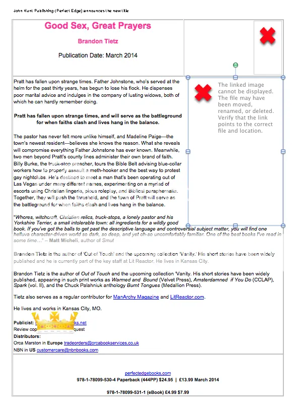
A crown sticker has been placed over the publicist's info to keep their identity on the DL.
The first thing you may have noticed are the rather large red X's indicating that an image didn't load properly. That's because the file was sent in .docx format. First rule of press releases: never ever ever ever send anything to anybody in .docx format. Either use PDF or JPEG — something that pretty much anyone can open on any device.
That brings us to our second issue: always make sure that your images come through cleanly. Never send out a press release with grainy photos.
Third: give a nice clean synopsis. This isn't executed properly in the above. Here, the first part of the synopsis is given, then the final tease in bold, then the rest of the synopsis. I really have no clue what the hell they were doing when they put this together, but I know it's confusing...so yeah, don't send out a confusing synopsis.
Fourth: in the vein of sending out a nice, clean synopsis, the same should hold true for your bio. Yet again, this isn't done in the above. They give my short bio immediately followed by a longer bio. Why on earth I'd need two bios on one press release is beyond me, but there you go...amatuer hour.
Fifth: all text should be easily readable. Can you decipher what it says on the top-left without squinting or zooming in? Maybe. But that font is way too small.
Sixth: the press release should not be ugly. As the saying goes: "I may not know press releases but I know what I like."
For those of you who are asking yourself, "Did this guy really just throw his publisher under the bus?" Not exactly. Just the person who designs the press releases. They did a piss poor job, I complained, and then I told them I'd re-do the thing myself since it wasn't done right the first time.
So let's try this again. What should a press release look like?
Here's my version (crown used again to conceal contact info):
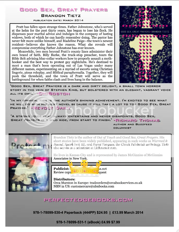
Better, right?
At the risk of tooting my own trumpet, I'm going to go ahead and say this does the job better than what was originally sent out. Aesthetically, it's more pleasing to the eye. The synopsis is the same one that appears on the back cover and is sectioned off in its own panel. There are now three blurbs as opposed to just one. The bio has been done correctly this time and now includes an author photo. And because this is a jpeg, there's not going to be any issues opening the file or dealing with a wonky format. Is it the best press release in the history of press releases? Of course not. Is it better than what my publisher sent out? Hell yeah!
I've got a press release ready. Now what?
Compile your list of bloggers, book reviewers, and interviewers and send that puppy out. Remember though, the press release is just an attachment to the email. What goes in the actual body of the email is another issue entirely. Introduce yourself and your book, and then explain why you're reaching out. Be direct. The deal is fairly simple: you are giving out a free copy in exchange for some fair and honest coverage. No need to be coy about it. Personally, I always try to sell them on the eBook for the obvious reasons: it's quick, easy, and doesn't cost myself or the publisher anything. If you have someone who absolutely has to have a physical copy, ask yourself if the juice is worth the squeeze. If it's a reputable reviewer like Booked. or The Nervous Breakdown, I'd say go for it. If it's something like ReviewPooper.com or some bullshit that doesn't get a lot of traffic...maybe hold off.
Conclusion...
You've seen two press releases now. A bad one and a good one. Try to avoid the mistakes made in the bad one when you do yours. Much like shitty cover art or a bad edit, people judge you on your press release the same as they do your actual book. Also, if the publisher says that they are going to do a press release for you, make sure you request to see it before it goes out...that way you can make last-minute changes. Believe me, you do not want to be a position where the wrong thing goes out and you have to make another pass to fix it. Measure twice, cut once.