Having given out thousands of free book cover templates, I can’t help but feel a bit responsible whenever I see an especially ugly book cover on Amazon. Especially if the author tags me or thanks me for the guidance.
So while it’s definitely possible to do it right, the bad news is that most authors won’t. A single misstep (like using neon script on a neon background — please don’t!) can torch your credibility faster than you can say “free sample.”
The good news is that, with a bit of effort, anyone can create a professional-looking cover without a design degree or a million-dollar budget. Let’s talk specific, no-nonsense steps to DIY a killer book cover — while avoiding the blunders that plague way too many new authors.
1. Start with a “bestseller swipe file”
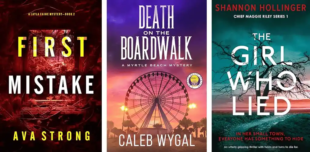
A “bestseller swipe file” is a personal collection of 10-20 covers in your subgenre that are both top-selling and visually appealing. Hunt them down in Amazon’s Top 100 for your category (cozy mystery, urban fantasy, dark romance — whatever you’re writing).
You’ll start to see recurring color palettes, fonts, layout patterns, and emotional vibes. This will become your design baseline. If your design doesn’t share at least 70% of these visual cues, you risk confusing shoppers. (“Is this a horror novel or a work of literary fiction?”)
❌ The fatal mistake: Thinking “cohesion doesn’t matter” in your genre, so you can just do whatever you want. While some genres do have a wider variety of cover aesthetics than others, you can always still narrow it down — even if just by selecting the covers you personally like! You’ll struggle far more if you throw genre conventions out the window.
✅ What to do instead:
- Screenshot or download these covers, taking the time to choose your favorites.
- Note the major patterns: Moody silhouettes? Bright, cartoony vibes? Glowing magic swirls?
- Again, don’t try to “innovate” if it means losing the genre signals. You want to look like those bestsellers — just done really well.
- But also, don’t copy them precisely; this is just a vibe check.
Also remember that traditional vs. self-published book covers are not the same. Trad books don’t rely on their covers nearly as much, and are more designed for bookstore browsing. Indie books selling on KDP or online bookstores need their covers to do a lot more of the heavy lifting.
So in your research, and make sure you’re looking at the real competitors who are performing in your market.
2. Pick your main image (no mega-montages)
Authors often think in scenes and characters, but your cover’s job is simply to tell certain readers this book is for them — or at least compel them to read your blurb (where specific story details belong). That’s why you need to pick a strong central image to get your message across.
❌ The fatal mistake: Trying to represent your entire plot on the cover. I once tried to jam in the main hero’s enchanted sword, the donkey sidekick, a wizard’s staff, an airship in the background, plus a cameo of the wise old sage…
The result? A jumbled collage that screamed “fan art,” not “commercially viable book.”
✅ What to do instead:
- Stick to one dominant focal point — often a person (or couple) if it’s fiction, or a single clear symbol for nonfiction.
- If combining multiple images, blend them carefully so the lighting and colors match.
- Use high-resolution stock or 3D renders. Avoid pixelated freebies that cheapen the look.
Pro tip: Always check site licenses to ensure a given stock photo is legal for commercial use. Don’t risk a takedown over an unlicensed image!
3. Choose a clear, bold color scheme
Now it’s time to think about your overall color scheme. If you find yourself in a color crisis, remember that 99% of the time, simpler = safer. A bold red background with “basic” white text will typically look more professional than a half-baked swirl of six different colors.
❌ The fatal mistake: Random rainbow colors because you think “It’ll catch the eye,” or relying on just one bland shade that disappears into the crowd.
✅ What to do instead:
- Look back at your swipe file. If 80% of epic fantasy covers lean toward cool blues/purples with gold or white text, follow suit.
- Use one main hue (e.g., a steely blue wash) plus a contrasting accent (e.g., bright orange text).
- Convert your mockup to grayscale. If your focal elements and title still stand out, you know your contrast levels are sufficiently strong.
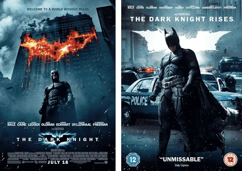
In one of my earliest tutorials on book cover design, I recommended teal and orange, like the movie poster for The Dark Knight. (Take a look below — you’ll see it really is dark teal and bright orange flame!)
But you can use any combination, and it depends on the genre. Certain genres may be “darker” or “lighter”, more purple or blue or green. Often the muted, warm soft peach of skin is enough of a contrast to the main background color.
4. Nail the fonts (yes, they matter!)
Fonts are pretty easy to get right if you know what you’re doing — and also easy to get wrong if you don’t. You can use a book cover template to get you started in the right direction, or again, simply look back at your swipe file: if those books mostly go for chunky, blocky letters, try that. If they’re all capitalizing author names at the bottom, maybe replicate that too.
Too many authors either disregard font entirely or choose a font that they think looks “interesting” without any thought for genre implications. Which leads to…
❌ The fatal mistake: Throwing a weird curly script or jagged “horror” font on everything. Or using a default system font that screams 1995.
✅ What to do instead:
- Pick a main display font that screams your genre. Sleek sans-serif for thrillers, swirling serif for epic fantasy, playful script for cozy romance — but make sure it’s actually readable!
- Choose a simpler secondary font for your author name or subtitle.
- Keep the arrangement and spacing tidy. Crowded letters or huge gaps can look off-balance.
5. Build in background layers
Here’s where things get a bit more complex. You have your font, color scheme, and central image — but how do you layer them in a professional and aesthetically appealing way?
Basically, you need to make sure that your background, focal point, and title text each has its own layer in Photoshop, Canva, or whatever tool you’re using. This ensures you can “layer” them effectively on your cover.
❌ The fatal mistake: Slapping everything on one layer so your figure merges with the background in a random, disjointed manner — or worse, not even considering how your design elements will mesh, meaning they’ll still look “wrong” even on separate layers.
✅ What to do instead:
- Background: A cityscape, forest, or textured gradient. Often darkened or slightly blurred.
- Focal point: Your character or object. Blend edges carefully, adjust shadows/highlights to match the background.
- Title/text: Placed on top, with the best possible contrast. Don’t bury it in a busy patch of the background.
There are basically three layouts that always work, but really they’re all the same layout: simple background + humanizing element.
Stories are about people, so you’ll rarely have a random object-based or typographical cover… though these minimalist covers may be more common in certain genres like contemporary fantasy and, interestingly, literary fiction.
But for most genres, you’ll have a character or two on the cover, or at least something that “gestures toward” a character. On a thriller or mystery cover, for example, it might be a lost kid’s toy in the woods — showing the absence of a character, hinting at the suspense within.
Pro tip: Add a subtle spotlight or glow behind the focal figure to make them pop. Light and contrast can elevate your design from “meh” to magical.
6. Test your cover at thumbnail size
Remember how I said self-pub covers function differently from trad pub covers? This is one of the areas where that’s most true — because while trad pub covers are often seen at full size in bookstores, indie covers rely on “thumbnail readability” for sales.
It’s another reason why you’re better off following certain formulas (like the “layers” formula above) than trying to strike out on your own. You don’t want to spend hours honing your cover only for it to wind up totally overengineered for thumbnail purposes.
❌ The fatal mistake: Designing a gorgeous full-size cover that turns into a smudge at Amazon’s micro preview. Readers see a tiny rectangle, and if it’s all mudded together, they’ll just keep scrolling.
✅ What to do instead:
- Shrink your cover to around 100px wide on your screen, then ask:
- Is your title still somewhat legible? (Doesn’t have to be 100% readable, but you should be able to discern the shape of it.)
- What about the central image? Can you tell what it might be?
- Does the cover still convey the right overall “vibe”? If it looks like a big splotch, you need either more contrast or less clutter.
- If you’re struggling to look at your cover with fresh eyes, ask someone you trust for their answers to these questions. (More on this in Step 7.)
Pro tip: “Flat”, modern cover aesthetics look better in thumbnails. While beveled fonts with dropshadow are certainly cool — and may look nice on a print cover — they are impossible to read when small… which is why I tend to steer authors away from this combination.
That said, I’ve also ignored this rule on occasion, as long as the cover looks amazing at normal size on the Amazon page (i.e., it can compensate for a potentially confusing thumbnail). The beveled font approach may also be helpful if you’re making 3D book promo graphics, to ensure the details really “pop.”
7. Ask for brutal feedback
As I said, if you can’t evaluate your own cover design honestly (and the truth is, most authors can’t), you’ll need to get some external feedback.
Not to say it will be easy. Indeed, there’s a whole meme about authors refusing feedback of this nature. With my first book, for example, I hand-painted a cover… and it ended up looking awful. Though I’d poured all my artistic talent into the design, it simply didn’t work for the genre and it got all muddled at thumbnail dimensions.
This is why you must be careful about the sunk cost fallacy when DIY-designing. You’ll waste dozens of hours and fall in love with your work — to the point where you can’t see straight!
❌ The fatal mistake: Showing your cover only to your mom or best friend, who says, “That’s nice, dear.” Or ignoring the friend who says, “I can’t tell if this is romance or horror. The font looks kind of generic.”
✅ What to do instead:
- Send your cover to people who actually read in your genre. Ask: “What genre do you think this is? Would you buy it?”
- If they’re uncertain or say, “It looks a bit homemade,” listen to them. This is your chance to fix it before you publish.
- If you have the budget for it, run a simple A/B test with minimal ads. Which cover variation gets more clicks? Data doesn’t lie.
Remember, your book is the art. Your cover is merely the packaging. If it’s not working, strive to do better! It’s the easiest way to sell more books.
RECAP: 10 cover design dos & don’ts
✅ DO:
- Compile a genre/subgenre swipe file and analyze what works.
- Use a single focal point that’s instantly recognizable.
- Select a bold color palette (one main hue, one accent) that matches your genre vibe.
- Blend layers carefully with consistent lighting.
- Get real genre feedback before finalizing.
❌ DON’T:
- Overstuff the cover with every plot detail.
- Use so many colors that they overwhelm the reader.
- Pick fancy but illegible fonts that vanish at small sizes.
- Ignore the thumbnail test — that’s how readers first see your cover!
- Dismiss feedback from potential buyers who say it looks off-genre.
DIY cover design can be intimidating, but if you follow these guidelines, you’ll avoid the rookie blunders that make so many self-published titles look amateurish. Yes, if you can hire a pro with proven genre expertise, go for it! But if your budget says otherwise, these steps can help you craft a cover that at least stands tall among the competition.
About the author

Derek Murphy is on a decades-long quest to make money online with his art and writing… so he can create fun stuff all day. He spent 10 years getting a PhD, so he can sometimes sound smart. Check out more of his articles for design, formatting, and marketing strategies for modern creatives.