Click HERE for previous installments.
You may remember a time back in the late 90’s/early millennium when it seemed like every girl on the block was getting a lower back tattoo of a fairy or a butterfly or some kind of tribal design. These girls would lie down on the vinyl padding of a tattoo booth, shirt pulled up and tucked under the bra, waistline tugged down far enough so that the cleft of their asscrack would show. The artist would then shave and disinfect that particular area, swabbing and prepping. Skin so clean you could eat salmon croquettes off of it. For hours these girls laid under a motorized needle jumping up-and-down into their skin, injecting rose red or shamrock green. In a matter of minutes, this area could be stabbed up to a few thousand times depending on the gun and grouping of the needles, buzzing so loud the AC/DC track on the PA was all but muted. This hot scratching feeling continued as crude Lepidoptera wings or song lyrics were branded, staining the top and middle layers of the skin. Girls suffered, paid hundreds of dollars, and spent the following post-op days keeping the wound clean and covered, applying anti-bacterial ointments and protecting it from prolonged exposure to sunlight. And like anything new, they couldn’t wait to show it off.
Fast-forward many years later, we see that same tattoo, some warped little fairy or faded tribal stain—this is when the girl says, “I need to get this shit removed.” Or: “Biggest mistake of my life.” They compromise during swimsuit season, opting for a one-piece as opposed to the shame display a bikini would yield. Boyfriends are asking when they’re going to get touched up. After all that pain and anguish and money, this youthful act of trend has turned into a sore subject.
At Face Value
Remember the tattoo story when you’re designing your cover. Don’t suffer through all the pain and anguish of writing a novel only to slap a tramp stamp on it you’ll live to regret years (or even months) down the line. Regret is a terrible feeling, and unfortunately, something the author usually imposes upon themselves, either due to lack of funds or impatience. There’s a myriad of just flat out horrible novel covers out on the market, and although we’d like to adhere to the adage of “don’t judge a book by its cover,” the fact of the matter is, the casual consumer is highly judgmental.
How often have you turned your nose up at a movie based on a bad trailer? How many times have you written someone off as a terrible singer after hearing only a few bars?
Nathan Shumate from the Huffington Post has a nice little article/slideshow of bad covers. Here's a few to get the idea across (cool chainsaw smoke, bro!):

Like it or not, the cover is the first impression, so it’s in the best interests of the author to make it a good one. We’ve entered the age in publishing where one can distinguish self-published vs. traditionally published by the graphic alone, a sort of prejudice where quality of work is discarded because the thing looks like it was mocked up in MS Paint. For the aspiring authors who come to LitReactor looking for advice, my recommendation is to invest money in a professional, if you can. If the money simply isn’t there, at least try to find a person who knows more than you do about graphic design. DevintART is a fantastic resource for making those types of contacts. Get on there and start poking around.
Designing Good Sex, Great Prayers
Regarding Good Sex, Great Prayers specifically, my publisher has an in-house designer they put at my disposal. I could use this person, but the idea of going back and forth through email sounds less appealing when compared to working with a designer directly. So I hire Jamie Turpin, who is an award-winning designer here in Kansas City. Granted, there’s a fee involved (one that won’t be reimbursed by the publisher), but I’m paying out of pocket for the luxury of being able to sit down with her and bang out ideas in person. That, and her attention isn’t split between myself and however many other authors.
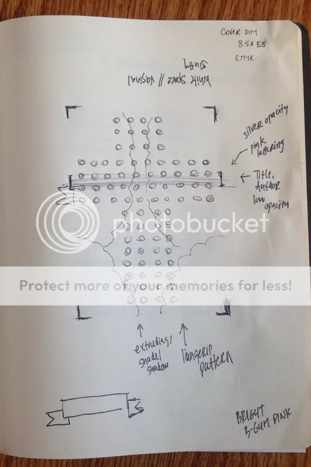
We set a meeting at a wine bar. It’s about an hour and a half of sketching, brainstorming, drinking Cabernet Sauvignon, and Jamie showing me design elements and what all is possible on her iPad. She knows her shit. I can see already this is going to turn out fine. In the end, this is the drawing she leaves with:

Not much to work with if you’re just going off the sketch, but I was very specific about what I was going for: that the crucifix needs to pop color-wise, we need to play up the Christian lingerie aspect and the composition of it should look almost vaginal. Good Sex, Great Prayers is Christian-erotica, and so I stressed we need to put those two elements across visually: sex and faith. After a few rounds of revisions and tweaking, we now have this:

It’s not the FINAL final version, but it’s damn close. The publisher approves and public reaction seems to be mostly favorable. I did have a couple girls tell me I was going to hell for this (in a non-joking way), but I anticipated that part of it. When you tackle anything Christian-related, prepare for some resistance.
Author Photos
Author photos should be handled the same way as the cover graphic: professionally. Use a real camera to capture a high-resolution image. Use studio lighting and a legit photographer. I know it’s tempting to whip out the ol’ iPhone and run your pics through the filters of iDarkroom and Instagram, but it’s never going to play as well compared to when a pro does it. Again, this is one of those times when forking over some cash is a good investment. If the cash isn’t there, try to seek out that one friend who has a decent camera. The last thing you want is for your author photo to come out stretched, warped, grainy, or lit wrong. Don't let it become a bad tattoo you live to regret.
With the exception of doing a live reading, getting professionally photographed is one of those anxiety-inducing experiences all authors should experience at least one time. It's the singular instance in which you absolutely have to look cool or attractive or engaging or whatever the hell you're going for. Even if you're not photogenic. This is why hiring a pro is in your best interests: if you don't think you can make yourself look good, might as well bring in someone who can.
A guy named Chad Cogdill (another local) shoots me in the bottle service area of a certain club I go to on weekends. I wear Guess jeans, leather jacket, and a tee shirt that says 'Cocaine' on it in Coca-Cola font. I don't know how our illustrious LitReactor higher-ups will feel about a Schedule II narcotic blown up on their site, so you can click HERE to view a sample image. The shoot goes well; Chad is a pro.

Image Rights, Payments, and Agreements
The following apply to both your cover image and your author image:
-ALWAYS have a written agreement between yourself and the designer/photographer. You never want a business relationship to go bad, but just in case it does, have your ass covered.
-ALWAYS get invoices. If you paid this person to do a job, make sure you got proof that you paid them. This is especially important if you plan to pay in cash.
-ALWAYS own the rights. Those images are yours to use for whatever you want. You can, of course, give credit to the artist in the book for the work they did, but the actual rights belong to you/the publisher.
-NEVER walk away unsatisfied. If the photographer or designer returns to you with an image that is sub-par or barely passable, don't accept it. Convey your corrections or recommendations in a respectful manner and have them try again. If you paid for them to do a job make sure it's done to your satisfaction.
Conclusion
Writing a book is probably one of the most difficult creative endeavors one can take on. I commend anyone who actually manages to stick through the entire process long enough to finish it. And as hard as it is to rack up sales in this game, it's even harder when the cover is low-rent and shitty. Again, the casual consumer doesn't see the work that went into the writing upon first glance. They need a synopsis that hooks or an engaging graphic, so give yourself that advantage. Don't tramp stamp yourself out of a sale.
To recap: If the funds are there, hire a pro. If you absolutely can't afford it, at least reach out to someone who knows more than you. And always have the the proper paperwork and agreements in place.
Misc.
Good Sex, Great Prayers is over 100K words at the moment and due to the editor in mid-February. The editor slated to work with me is Pela Via whom I've worked with before on the Warmed and Bound anthology. More on that in the next installment.
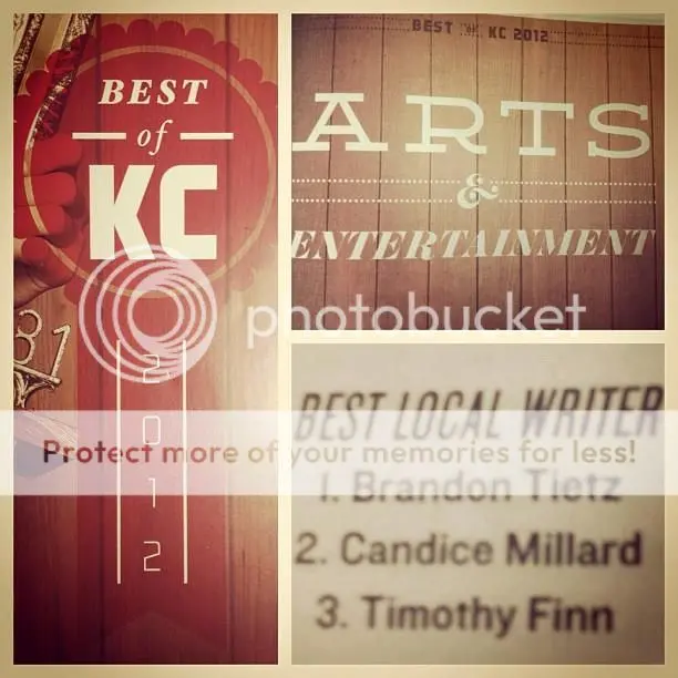
Also, I recently won my first award:

Feel free to holler back in the comments. You can also find me on Facebook and Twitter. Deepest apologies to anyone I offended with the tramp stamp metaphor. I've seen some bad ones in my day.


