They say not to judge a book by its cover, but nobody said we couldn't judge a cover by its art. Classic novels see redesign after redesign, but do any of them stack up to the originals? Let's find out...
Round 1: The Great Gatsby
 Disembodied Face - Eighty-seven years before every available copy of F. Scott Fitzgerald's classic was plastered with Leonardo DiCaprio's haughty smirk, a little-known artist named Francis Cugat created the original blue cover that has become one of the most classic and most-recognizable images in literary art. Fitzgerald himself reportedly liked the image—a disembodied face floating in the blue sky above the lights of a city—so much that he wrote it into the novel, describing Daisy as a "girl whose disembodied face floated along the dark cornices and blinding signs.” Not everyone was as impressed; Hemingway reportedly called it "garish" and said it looked like "the book jacket for a book of bad science fiction." While a ginormous floating face with an unnervingly tiny mouth and reflections of naked chicks in its eyes (look closely) is rather creepy, its instant recognizability and iconic status earn it a lot of points and make any redesign a challenge.
 Rage Face Gatsby - Artist John Sewell was ahead of his time. In 1963, decades before the age of internet memes, he created a cover for Penguin Modern Classics' 1963 U.K. version of Gatsby that looks like Okay Guy and Troll Face had a baby in the Jazz Age. He gave the fella an itty-bitty bow tie, Panic At The Disco-style guyliner, and a wicked unibrow that would make Sesame Street's Bert envious.
 Pulpy and Punny - If Gatsby were played by James Cagney, and Daisy were about a third of the size of a normal woman, this cover would win, hands down. Unfortunately, neither of these things is true. Pulp! The Classics's retro take on Fitzgerald's novel also earns kudos for being the most pun-tastic of the covers: "When it came to loving... He knew which Daisy to pick!"
Our winner: On the basis of its iconic status, Disembodied Face wins Round 1.
Round 2: Anne Of Green Gables
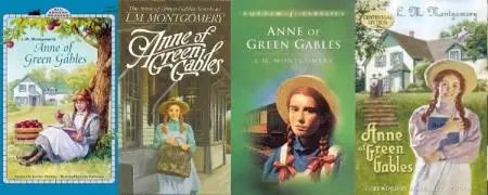
Red-Headed Anne - Look, we could talk about each one of these covers individually, but in the end, most covers of Anne Of Green Gables are pretty similar—pigtailed, red-headed little girl eating an apple, reading a book, waiting at a train station, doing other wholesome activities—so we'll just lump those together. The young orphan's red hair, freckles, and innocent demeanor are mentioned over and over in the series. Keeping that in mind, let's take a look at the competition for this round...
 Anne of Abercrombie & Fitch - When an independent publisher used the public domain status of L.M. Montgomery's books to reprint them with a cover featuring a sultry teenage blond vixen with bedroom eyes, it upset Anne fans everywhere. Amazon removed the cover image but angry reviews remain, calling the cover "nuts, offensive even," "a disgrace," and noting that it's "supposed to be Anne Of Green Gables NOT Anne Does Green Gables." Oopsy, too whorey for the kiddies.
Winner: No contest, Red-Headed Anne.
Round 3: 1984
 Happy Green Original - The original UK edition of Orwell's dystopian masterpiece is the cheerful green of a freshly mowed lawn with a jaunty font that says, "Hey! Let's have a picnic!" And that, as we all know, is exactly what this book is about... picnics. Finally, a redesign stands a chance at winning a round.
 Teenage Girl Font - Our second contender is the 1985 cover from Signet Classics, which appears to be written in the same cartoonish lettering with which I wrote the names of my middle school crushes on my Lisa Frank notebooks. This cover doesn't evoke images of picnics, but it does say, "Enjoy this lighthearted romp through the colorful eighties!" Once again, exactly as Orwell intended.
 Creepy Eye - Plenty of 1984 covers feature a creepy eye motif—I'd go so far as to say it's most artists' go-to when designing a cover for this book—but Shepard Fairey's 2008 Penguin UK edition adds a number of nifty modern design elements that give it a street art feel. The red and black color scheme is appropriately bleak and the barbed wire is a nice touch too. Fairey, who is best known for the HOPE posters he designed during Obama's 2008 campaign and his OBEY stickers featuring Andre the Giant, also redesigned Orwell's Animal Farm.
 Ant Sex? - At my first cursory glance at this 1954 Signet edition, I thought the woman with the low-cut top and freakishly skinny waist was wearing a button that said "Ant Sex." Then I was like, what's with that dude in the swim cap and black leather, chest-baring getup? Is he supposed to be dressed up like an ant? The text does proclaim "Forbidden Love" is involved, but these people are into some seriously kinky shit. On closer inspection, I realized the woman was Julia, the pin announces her membership in the Anti-Sex League, and the man in black is a member of the Thought Police. This seemed far more reasonable, and my initial take probably says much more about me than it does about this cover.
 Redacted - The brand-new cover designed by David Pearson features Penguin's most recognizable design: black, sans serif, all capped title in a white bar over an orange background with a little penguin guy at the bottom. The difference is in the black censorship bars placed over the book's title and author, effectively erasing the existence of Winston's story and turning its author into an unperson. The Ministry of Truth would be so pleased. The effect was achieved using matte black foil over debossed text that can be read when it is held at the right angle. No picnics or colorful eighties bubble fonts here.
Winner: Capturing the theme of the book perfectly in its design, we're giving the win to Pearson's clever redacted cover, though Fairey's red-and-black art wasn't far behind.
Round 4: The Bell Jar
 Concentric Circles - The 1966 Faber & Faber edition of Sylvia Plath's tale of woe—the first version under her real name—was published with a cover designed by Shirley Tucker, who recently made videos describing the design process. The vertigo-inducing series of slightly off-center concentric circles mess with your head, and the muted color scheme reflects the bleakness of the book's content. It's not the most stunningly artistic cover ever, but it says what it needs to.
 Gothy Rose - A black background, droopy rose, a hand that can barely even be bothered to close around what it's holding, grey gothic lettering—this cover is the most emo thing going. This cover shops at Hot Topic. This cover has bangs that cover one eye. This cover loved Depeche Mode before Depeche Mode was cool. Besides, the Violator cover totally ripped it off.
 Sad Feet - This blue cover is depression in a nutshell. There's no "look how sad I am." No dramatic dropping of roses. No individual identity whatsoever. It captures the book's focus on the confines of gender expectations (do look how she's strapped into those shoes!) but allows any woman to identify with the sadness of Plath's character. It might be the perfect cover were it not for the splashes of cheerful pink.
 Chick Lit - This round's chick-lit-inspired final entrant has certainly caused a stir, inspiring ridiculous parodies and comments calling it "a fuck you to women everywhere" and "hideous." And while most people agree that a pin-up applying makeup alongside a sassy cursive font is more appropriate for a summer beach read than a story about clinical depression and suicide, Telegraph UK writer Kristy Grocott is a lonely defender of the redesign, claiming "the powder and the lipstick are a mask, an image that is projected to others irrespective of what lies beneath" and noting that the cover "makes reference to societal pressures of the time." Sorry, Kristy, not really buying it. We're calling chick lit bullshit on this one.
Winner: If not for the cheerful pops of pink, we'd give it to Sad Feet, but as it stands, Concentric Circles win.
Round 5: Fahrenheit 451
 Burning Man - Burning Man is disturbing. Not the hippie fest in the Nevada desert—though that's disturbing in a whole different way—but the image on the first 1953 edition of Bradbury's unnerving predictive novel of conformity and control. It featured a man, wearing printed pages, on fire. The resignation with which he covers his face, the flames licking his limbs, and the pile of burning books he stands on still manage to creep me out sixty years after the image was created by artist Joe Mugnaini.
 Pyromaniac Superhero - I take issue with this comic booky, sci-fi-inspired cover because it makes book burning look like a pretty good time, a la paintball, lasertag, or grown-up go-karts. It seems like you'd don some superhero-esque protective gear and spend a day at it ("All you can burn for just $19.99! Free corndog with purchase!"). It isn't portrayed with enough venom to suit me.
 Daft Punk - The gleaming helmet, the lens flares around the head, the pose, the spotless mirrored visor—this cover says nothing but Daft Punk to me. I can't even get past that to make further commentary. Harder, better, faster, stronger, hotter, more inappropriately shiny.
 Matchstick - This year, designer Elizabeth Perez created an almost-too-clever version of Fahrenheit, complete with a real matchstick in place of the number one in "451" and a striking surface screenprinted along its spine. It's wonderfully, gorgeously simple with a white cover and large black block-lettered title. Fortunately, no one would be fool enough to actually burn it.
Winner: This one's tough because Burning Man and Matchstick are amazing in two very different ways. We'll give this one to Matchstick for the sheer ingenuity and its ability to put a fresh spin on a book that people just keep redesigning with a flame on the cover.
Your turn to vote. Which covers should have won? Which ones do you hate? Tell us in the comments.

About the author
Kimberly Turner is an internet entrepreneur, DJ, editor, beekeeper, linguist, traveler, and writer. This either makes her exceptionally well-rounded or slightly crazy; it’s hard to say which. She spent a decade as a journalist and magazine editor in Australia and the U.S. and is now working (very, very slowly) on her first novel. She holds a B.A. in Creative Writing and an M.A. in Applied Linguistics and lives in Atlanta, Georgia, with her husband, two cats, ten fish, and roughly 60,000 bees.