Everyone does it. Some people might claim they don't, but they're lying. It's ingrained in our human DNA. It's a natural reflex that can't be denied. We can fight it, but our first instinct will always be to judge a book by its cover.
And what's so wrong about this behavior, anyway? We may not have evolved enough as a species to overcome our superficiality, but haven't we developed as artists and designers? Is there any excuse nowadays for a bad cover? (The answer, by the way, is no.)
In order to bring attention to this irksome problem that continues to plague literature, I'm bringing together books from the young adult and adult shelves to face off in a battle for design supremacy. It's widely known that YA novels suffer from stock photo abuse and an incessant parade of emo girl faces, but adult books aren't always much better. In order to determine the most artistically egregious offender, let's take a look at how covers of books, paired by topic, stack up.
Round 1: Cancer
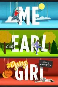
Just because a book involves cancer doesn't mean the cover has to be a Debbie Downer! The use of color is marvelous, and the cut-out paper artwork is charming without being twee.
VS
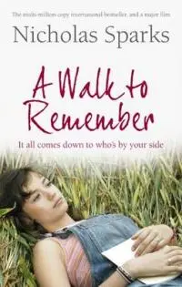
It all comes down to... a poor man's Mandy Moore in overalls? Yikes. While this image is appropriate for the style of Nicholas Sparks, it seems more fitting for a high school guidance office poster that everyone secretly mocks.
Winner: YA - Me, Earl and the Dying Girl
Round 2: The Apocalypse
I assume that the designers were going for "terrifying," and they definitely got pretty close with this grainy zombie image. Even though the cover does its job by indicating the scary contents inside, I'm turned off by the low-fi look of the whole thing, especially the cheesy fade of the title into the artwork.
VS
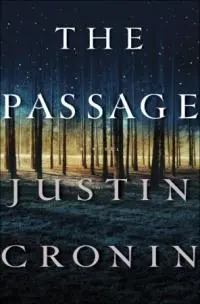
In contrast to its opponent, the cover of The Passage isn't nearly terrifying enough. But I still give it points for the beautiful simplicity of the tree image, which provides potential readers with a glimpse of the epic, haunting nature of the story.
Winner: Adult - The Passage (Barely!)
Round 3: Vampires
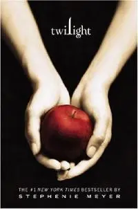
It's hard to look at this image without all of the stigma attached to the Twilight franchise, but if you can forget about all of that hoopla, you'll appreciate the stark nature of this cover. Sure, there's tons of copycats out there now (including some classics, because certain members of the book industry have no shame), but back when Twilight was released, the elegant symbolism of this cover really stood out.
VS
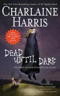
I'll never understand why someone thought it was appropriate to market Sookie Stackhouse books with folk art from the '80s.
Winner: YA - Twilight (I know. I can't believe it, either.)
Round 4: Bluebloods
This cover is what designers technically refer to as a "hot mess." The craftsmanship is shoddy, and none of the pieces really come together. If you're planning on reading this in public, I suggest putting another, more respectable book jacket over it.
VS
Dizzang! This cover hits you harder than an apple falling on Newton's head. The color scheme totally pops, and the retro style is insanely appealing. If you saw this book on the shelf, you'd be hard pressed to ignore it.
Winner: Adult - Special Topics in Calamity Physics
Round 5: Homosexuality
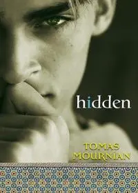
Maybe it's the typeface, or the strange juxtaposition of the photo with the tiled design, but this cover is just plain fugly. (Which is a shame, because the book is devastatingly compelling.)
VS
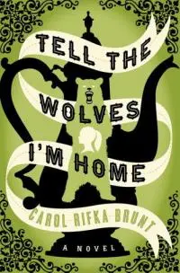
Excuse me while I take a minute to soak in the glory of this cover. It's positively breathtaking, and the symbols hint elegantly at the story inside. I wouldn't be surprised to see this hanging in the MoMA, and you certainly shouldn't be surprised to see a blown-up version of it hanging in a prominent place in my house because WANT.
Winner: Adult - Tell the Wolves I'm Home (Duh!)
Round 6: Royalty
There is nothing about this artwork that indicates the young adult nature of this book... which is awesome. It's bright and fetching, and the image of the woman gives you a sense of the historical elements of the novel while keeping the design fresh and contemporary.
VS
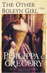
This cover is fine, I guess? There's nothing inherently bad about it, but it's just not exciting or dynamic. I wouldn't be surprised to see this novel basking in the banality of an airport bookstore, if I even noticed it at all.
Winner: YA - Prisoners In the Palace
Well, after six brutal rounds, it's time for the final tally.
YA: 3
Adult: 3
Hold the phone, it's a tie! There is no champion in this battle! Folks, I know you're disappointed, but hopefully this score serves as a wake-up call for publishers everywhere. (Because everyone reads my column. Obviously.) It's time that we as readers stopped settling for mediocre design and started fighting for better artwork, because good books deserve good covers.
(Or, you know, you could just read everything on an e-Reader and make this whole argument totally obsolete.)

About the author
Sarah lives in Austin, TX, where she programs screenings at the Alamo Drafthouse and coordinates events at The Highball, a playground for adults. Tired of feeling like a creepy old lady in the bookstore YA section, she created Forever Young Adult to provide grown-ups with a community where they can gush about young adult literature without shame. In addition to crushing on fictional teenage boys, Sarah enjoys fancy cocktails, dance parties and macaroni and cheese.
