A book is kind of like a taco – the shell is as important as the contents… though I guess you probably shouldn’t eat a book, right? – Imaginary Uncle Larry.
“When you don’t know how to start a column, quote an imaginary uncle, then yourself, then address your audience in a broke-ass Socratic dialogue that references a Rob Reiner film – Me
You: Can we hear about the history of Book Cover design?
Me: I don’t know if you’re ready for it. It's pretty wild!
You: Are you just trying to use reverse psychology to make us more interested in the topic, kinda like the grandfather does to Fred Savage’s character in The Princess Bride?
Me: Yes! Now scootch closer and listen up, ya huckleberry!
So you want to hear about the history of book covers, huh? Well, it’s an epic story that goes back more than 2,000 years and involves fencing, fighting, torture, revenge — oh wait, that's The Princess Bride. The history of books is much more technical, boring and glue-centric. Instead of subjecting you to all of this, I’ll give you a layman’s introduction to the evolution of books, and then jump into modern design when covers became more expressive and artistic, and less utilitarian. Sound good? (Please nod at your monitor/phone to proceed.)
Layman’s Introduction: Prior to the advent of bindings, invention of the printing press, and the broad application of traditional covers, written materials were the taco-equivalent of shell-less lumps of carne asada that, while delicious, got your hands all greasy and forced you to carry around WetNaps. Text was mostly transported via carved tablets or scrolls of papyrus or parchment. Eventually, everyone agreed that these were burdensome and dumb, and the codex was invented, which gave way to the modern book as we know it and, as Uncle Snoop says, things started to get “Real Deal Holyfield!”
(For more information on old-timey book materials/binding techniques, hop over to the well-cataloged university library archives of Michigan State or Rochester. For more vague history, taco analogies, and lots of links to more expansive explanations, continue below.)
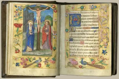
I. "Why, what a fancy book you have, sir!"
In the late 18th- and early 19th-century time, the functional gave way to the artistic, and imprinted leather covers, like the $140,000 beast to the left, were the norm. In addition to providing protection for the inner pages — their original purpose — covers became increasingly representative of both their contents and the statuses of their owners.
Books weren’t cheap in the day, especially finely bound ones, and ownership became, in part, a means for one to advertise that he or she was a very important person… You know, the type who, nowadays, could afford very expensive tacos.
 II. "Iron and cloth? We truly are living in the world of tomorrow!"
As the 1800’s progressed, iron presses began to push their traditional wooden predecessors to the antediluvian curb, and cloth began to replace hides, making covers cheaper and more versatile. Silver and color stamping technologies also helped designers adopt more artistic representations, as seen to the left with Walt Whitman’s first edition of Leaves of Grass
The Cover catches design at a crossroads between the old and the new, combining the imprinting of yore, with Whitman’s own expressive experimentation with type and symbolism. (Check out the Walt Whitman Quarterly Review's take on the cover for more backstory.)
While Whitman self-published this edition, formal publishers became more common in the later part of the century, and their promotion and branding efforts helped modernize the art.
III. "Wrap it up for protection, yo!"
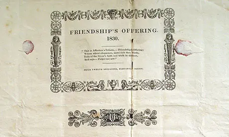

When cloth was introduced, so were dust jackets. The protective sheets were introduced to wrap silks and more delicate materials. As you can see above the evolving purpose of dust jacket was mirrored in design.
Temporary covers, like the one for 1830's Friendship's Offering, were meant to be thrown away once books made it safely to market or home. By the 20th Century, however, the dust jacket was a yummy tortilla-like extension of the book design. More purposeful covers, like the 1928 version of Gulliver's Travels (from the Victoria & Albert Museum collection of British dust jackets) were meant to compliment and advertise the book as much as protect it.
 IV. "Can I find a plumber in there?"
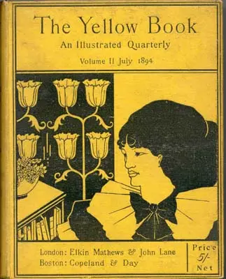
Yellow Book is often credited as ushering in the Modern Book Cover Era (or MoBoCoEr, if you’re nasty).
Arriving in 1894, just as cloth was falling from favor, this literature and arts quarterly favored avant-garde design over fine illustration or the ornate arabesque prints of the early century. The depiction was reviled in its day by the established print critics – (“I mean just look at the provocatively-dressed hussy and her floral sconces! She should be ashamed!”), but the design would usher in the expressionistic designs of the 1920’s (around the same time tacos became popular in the US, according to this gem from The Smithsonian).
V. "Well, I don't like your politics, but nice covers, gentlemen!"
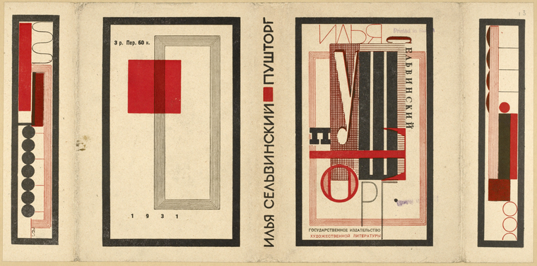


In the early 20th century, bold and simple typography was king, though this was largely undone by the post-war cultural revolution of the 1920s. Led partially by the earlier impact of Yellow Book, and the work of early-century Soviet and German artists (seen above via New York Public Library's digital gallery of Russian book Jackets, and the great cover design connoisseurs @ 50 Watts), a world of symbolism and color entered into the mainstream, with publishers reaching out to fine artists for covers. The most known example, perhaps, being Francis Cugat’s famed cover for the first edition of The Great Gatsby. (For more on the history of this cover, check back w/ the same old taco geniuses at Smithsonian.) These artists, and the graphic designers to follow, used informed imagery to subtly convey plot/tone/character in ways that traditional illustrators couldn't.
 VI. "I like the cut of your jib, flightless bird!"
The 1930’s saw a paperback revolution that made both classics and trade works available to the common consumer at inexpensive prices. Penguin, launched in 1935, was the era’s most successful publisher, thanks in part to its universal motif featuring genre-specific coloring and consistent type. With universal branding, the company stood out in a growing paperback sector that relied heavily on inconsistent, graphic-heavy covers.
(For more on the legacy of early Penguin, check out the fourth part of BBC’s Beauty of Books, pick-up the publisher’s anniversary book, or check back in w/ the taco-loving, Gatsby-applauding homies at Smithsonian... what don't those guys cover?)
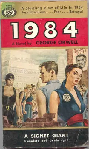 VII. "You've made a real pile of it, haven't you?"
The aforementioned "inconsistent, graphic-heavy covers" ruled a certain sector of the industry for a good deal of the 20th century. These "sexy," ill-fitting and over-literal illustrations migrated from pulp and genre fiction to mainstream and literary work in the 50s, and hung around like a big ugly Taco Bell that misrepresents your favorite book's metaphors and runs out of cheese just as you get to the front of the line.
The 60s and 70s saw some great experimentation with abstraction/illustration/type, yet wide-market designs seemed to settle into a late century rut that relied heavily on dated, photo-heavy motifs.
Luckily, the era also birthed future pioneers of the industry. Designers like Knopf's Chip Kidd and Peter Mendelsund, and Rodrigo Corrall of Farrar, Straus and Giroux, slowly brought sophisticated and tasteful representation back, when the industry needed it most.
IIX "Oh snap! That's what I'm walking about!"


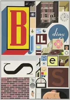
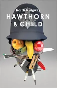
And that brings us to the here and now, where on-location book sales are lower, competition is steeper, and shelf space if smaller, all of which has forced publishers to reinvent the proverbial taco. Since the turn of the century, houses have been upping design in efforts to catch the eyes of remaining bookstore loyalists. So while the brick-and-mortar book industry looks increasingly grim, design has been nearing something of a renaissance that's pushed covers (and packaging) in smart, alternative work and conceptual directions.
And that, Grandsons and Granddaughters, is a brief history of book cover design!
You: Wow! That was great!
Me: Thanks. Buy me a taco?
You: As you wish!
Me: Yazoooooo!

About the author
Robert Bieselin is a writer and graphic designer, who splits time between New York and Los Angeles. He is currently the graphic designer at Book Soup in West Hollywood (booksoup.com), and previously, was an entertainment reporter at The Record (northjersey.com) newspaper in New Jersey.


