Back in the day, the closest thing to a bookstore in my town was the rack of paperbacks in the grocery store. V.C. Andrews, Stephen King, and one book that I always giggled at because the title was Bitch Factor. Oh, Bitch Factor. I’ve never forgotten you.
One of the greater pleasures of grocery store paperbacks was the gimmick covers. A little die-cut window, some texture, really anything that made the book stand out from the other similar titles. And from Bitch Factor.
The digital age has all but doused the flames of gimmick covers, but if you're in the market, maybe you'll find a little inspiration.
Die Cuts
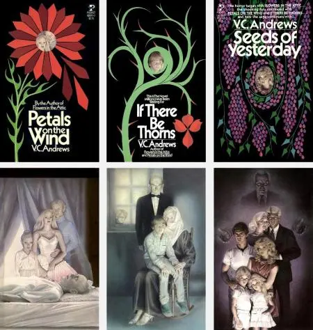
V.C. Andrews really put the DIE in die cuts.
I’ll leave a little space here for you to finish laughing at that great joke and move on.
These die cuts were always a little surprise, right? You've got a window out in front, then you open it up and get the bigger picture. It gets you to turn at least a single page, and once you turn that first page, maybe you’re hooked.
V.C. Andrews artist Lisa Falkenstern explains the thinking behind the design:
Having two covers allowed for a clean interesting front cover and a stepback art that could show all the characters in the book.
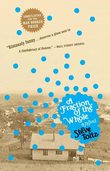
There are tons of other die cut examples. Steve Toltz’s A Fraction of the Whole has a replica of a scattergun shot, which is pretty easily accomplished with a hole punch.
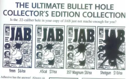
But maybe my favorite version is Jab #3, a comic that was shot through with a bullet. Yep, each issue was authentically shot.
And the interiors made use of the bullet hole:
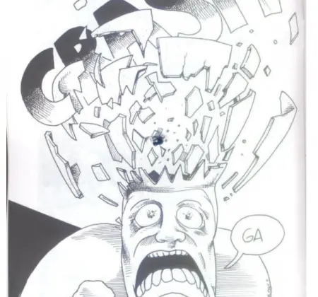
It’s a little less tidy than a traditional die cut, but hey, you’ve got an extra couple hundred bullets lying around, right? I know some of you do. I was at a sporting goods store back in March, and I saw you all buying ammo like you were going to stop hordes of people in the post-Corona-pocalypse. If only you could see the future and know that these folks would complain of being suffocated by a bandana being placed gently over their mouth and nose. Could've saved a lot of dough.
Glow in the Dark
My favorite entry is the glow-in-the-dark Geek Love that I saw in a bookstore and didn’t buy because I’m a stupid idiot asshole.
Now, I THINK this is it, but I can’t find much mention of it glowing in the dark, which makes me wonder sometimes if this is a fantasy I invented.
Either way, a glowing book cover is pretty awesome. You stop reading for the night, set it on the nightstand, and boom.

Mosaic Spines
Sometimes a book set will work so that a picture is formed by the collected spines. My preference on these is that the spines look like their own thing on their own, and then put together, they form something special. You'll see some of these where the spines look cool together, but on its own, each one is basically a blob of nothing. Don't waste my time with that shit.
Foil
What I love about foil is that it’s a high/low thing. You get your fancy Shakespeare or whatever, foil embossing all over that damn thing.
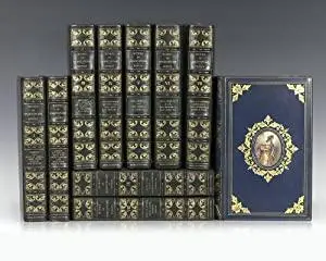
AND, you get a cheesy paperback, same deal.
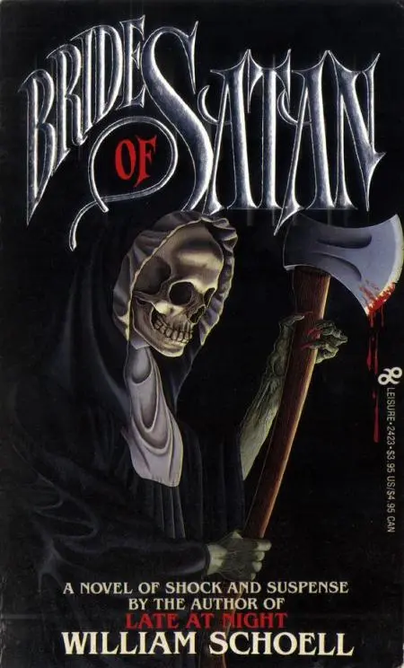
And there's definitely a more is less aspect to foil:
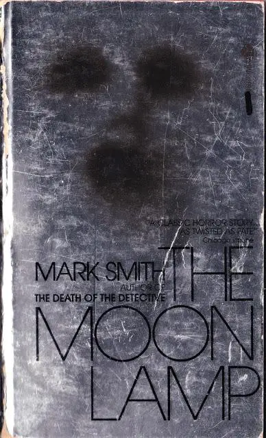
I mean, good lord, did someone's dad own a foil factory?
Hologram
Holograms were a huge thing for trading cards in the 90s, so of course they made their way to book covers.
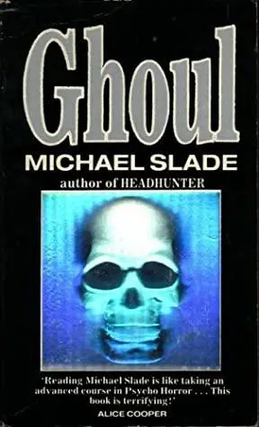
Holograms never quite worked how I’d hoped. For one thing, they always had a rainbow look. So you could have an awesome skull, but then it was this sort of...rainbow skull. And then you’ve got the sort of weird, blurry image. It’s just a great idea on paper, but it doesn’t work out...I guess, also on paper, but you know what I mean.
Realia
"Realia" is a fancy word for "stuff." Like having a piece of string on a knot-tying book.
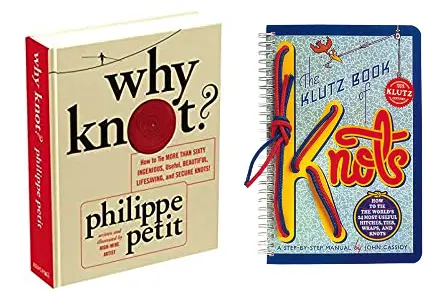
Maybe this is a big thing with knot books?
There’s also this pretty amazing Eclipso comic which came with an actual plastic gem.
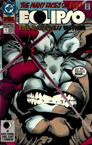
Probably not as useful as a string in a knot-tying book. Unless you play a lot of dress-up of third-tier DC characters and want something semi-authentic to complete your Eclipso getup.
Man of Steel 30
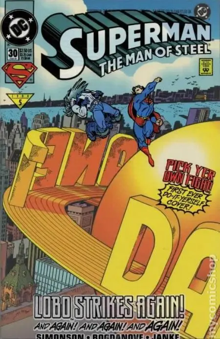
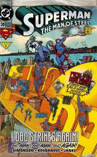
This issue of Man of Steel comes with stickers of Superman and Lobo, so you can make your own cover, sort of, of two space aliens kicking the shit out of each other. I know you’ve always wanted to take a shot at this sort of thing, aliens with anatomy that fortunately matches up in such a way they can have a slugfest. Now you can! And you don't have to learn how to draw. Even a little.
Nudity
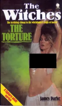
The cheapest gimmick, the cheapest special effect, is always nudity.
Ogle The Witches covers at Amazon
Get DC Comics Cover Art by Nick Jones at Bookshop or Amazon
Get The Look of the Book: Jackets, Covers, and Art at the Edges of Literature by Pete Mendelsund at Bookshop or Amazon

About the author
Peter Derk lives, writes, and works in Colorado. Buy him a drink and he'll talk books all day. Buy him two and he'll be happy to tell you about the horrors of being responsible for a public restroom.

