I got my first Kindle about a year ago, and although I spend a good chunk of my work days troubleshooting eReaders and eReading apps, this last year has provided a true, intimate experience with an eReader.
The honeymoon is over. I’ve got some complaints.
I’m not alone. EBook sales are declining. And a good chunk of those surveyed said they wanted to spend less time with digital devices, which doesn't bode well for digital books. The group that expressed this most consistently was the youngest group surveyed, those between the ages of 18 and 24, which suggests a dark future for eReaders.
Why hasn’t digital reading technology found the firm footing of digital music and streaming movies?
Because digital reading technology stinks. It’s packed with a bunch of stupid features we do not need or want.
Let’s get specific.
Enough With All The Dumb Menus
On a basic, e-ink Kindle with a touchscreen, when I’m looking at a plain ol’ book page, I can do the following:
Touch the screen anywhere on the right-ish to turn the page.
Touch the screen on the left 15% to turn the page backwards.
Touch the screen near the bottom to change what’s displayed near the bottom.
Touch the screen near the top to bring down a menu.
Touch the screen near the top, on the right to place a bookmark.
Touch the screen with the tip of a hammer really hard: feel better.
Oh, and there’s a button on the bottom of the Kindle too. An actual analog button that does stuff too.
Here’s a quick diagram:
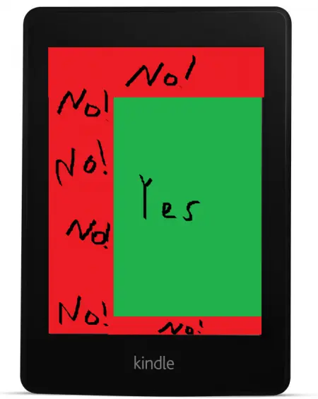
C’mon, guys. I don’t need to have ALL of these options in the middle of a book. Think about it. What options do I need with a print book? Turn the page. That pretty much covers it. I don’t need to have the option to go back to the table of contents. I don’t need the option to change what’s displayed on the page. I don’t need to see whether there’s fucking wifi in the area. I damn sure don’t need to do some kind of sharing on social media.
Are these good options to have? Totally. Could they be in a menu that’s more than a single touch away? Yes.
And the real issue here is how this disrupts one-handed reading. How am I supposed to crank it to my favorite books for crankin’ if one-handed gestures result in me going back a page, opening a menu, or placing a bookmark?
Wait, I’m Not Done. Single-Touch Backwards Page Turning
I can’t tell you how many times I’ve been reading, tapped to turn the page, and then realized, a couple lines in, that I accidentally went backwards.
I can say, with confidence, that this has NEVER happened to me with a print book. It’s not like I go to turn the page, read a couple lines, and then say, “Holy shit. I just went backwards on accident!”
Why? Because turning a physical page forwards and backwards is a completely different motion.
I’d estimate that 90% of my tapping on the Kindle screen is for the same purpose: turn the page forward.
5% is navigating menus, and 5% is turning the page backwards. And of those backwards turns, nearly all of them are accidental and anger-inducing.
Seriously, just make a swipe the only way to turn the page backwards. Tap forwards, swipe backwards. I don’t need this ease of turning the page the wrong way. I don’t need an easy way to screw up. I’ve got that covered, thanks.
Who Decided Touchscreens Were Such A Fabulous Idea?
You know what I love about touchscreens? I can put my dumb greasy finger right on the surface. That’s really awesome.
Finally I have a tangible, awful proof that I eat too many Cheetos for an adult man.
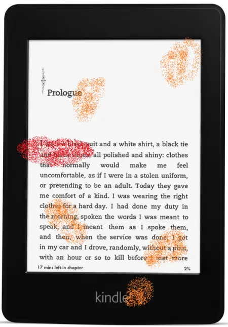
Uh, the lipstick is from a reading of The Internet Is A Playground. I quite liked it.
Why did we all agree that the best way to turn pages is by touching them? Why is the trend moving this way? What happened to buttons that turn the pages, leaving the screen fingerprint free?
I Don’t Care What You Care About
For some reason, Kindle is so kind as to place a dotted line under text that’s been frequently highlighted by other users.
I knew this guy in college who highlighted the shit out of his psych textbook. There was so much highlighter on the page that when he opened the book, it was like looking inside the briefcase in Pulp Fiction. The dude should’ve been reading with sunglasses on to protect his vision.
Do I care what some anonymous dope thought was important in the erotic tale Santa Steps Out? Hell, no. This is just another needless feature that’s designed to make me feel connected or some such nonsense.
I’m reading a book. I want to be connected to the book. Not some dope.
“Take A Moment To Rate This Book”
When you get to the end of a book, Kindle immediately brings up a screen that allows you to give the book a star rating.
As an author, I like this idea. But that’s only because I’m a whore. Seriously, buy my books. I’d tell you they’re great, but I don’t care. Buy. Click on Amazon, type in my name, and click "Buy Now" until your mouse wears out.
As a reader, however, this rating thing is stupid.
Do we really need to eliminate the period between finishing a book and then telling the world what we thought about it? Isn’t it better to think about it for a minute? For yourself? Does this thing have to pop up the moment I finish (or once, frustratingly, BEFORE I was finished so I had to keep closing it to read the final pages of a book), or couldn’t we give ourselves a moment to decide how we feel about something? Or, to put it another way, are we really in need of options that bypass the filter from first thought to internet posting? I feel like we’re already pretty good at bypassing that filter, but maybe it’s just me.
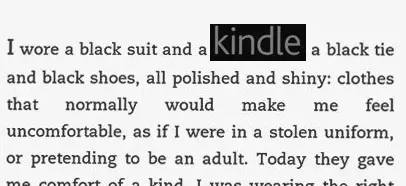
KINDLE
I bought a Kindle. I use a Kindle. I shop in the Kindle store. Why does my Kindle need to have the word “KINDLE” emblazoned on the front? Why does its flesh have to be branded like that? How many times do I need to see the word KINDLE?
It’s the equivalent of putting RANDOM HOUSE at the bottom of every single page of a book. In larger type than is present in the rest of the book. It’s obnoxious. It’s stupid.
Just look at this. I took the actual "kindle" branding and put it into the text. It's twice as big!
I’ve seriously considered ways to buff it out of my Kindle or possibly fill it in, and these discussions have resulted in my partner using a phrase that she uses sparingly with me because if she didn’t, she’d have to use it ALL THE TIME: “Maybe you’re being a bit obsessive.”
We don’t want this. We don’t need it. I’m aware I’m using a Kindle. Message received.
What’s With The Bookmarks?
I’ve got highlighting, and eBooks pick up where you left off. What are the bookmarks for? I don’t get it.
The convenience of a bookmark is to pick up where you left off. That convenience is already provided in no less than two ways. How many redundant systems do you need to perform this same simple task?
Progress Markers
This is one some will disagree with me on. Hear me out.
The progress markers on eReaders come in a few forms.
First, there’s “Loc 234354 of 348798237.” That’s utterly useless. Is this meant for people who want to do the math? Or maybe it’s people who want to feel like they’re blazing through pages. “I read at a rate of 2,000 Locs per minute. That’s a lotta Locs.”
Then there’s the time left in book/chapter thing. Which is always off for me. The same way it works with Google Maps where the walking speed seems to be set to someone with one half of one leg dragging their battery-dead mobility scooter behind them down city streets, time estimates on the Kindle seem to be built for third graders who are riding a Gravitron and have partially blinded themselves by eating too many off-brand crayons that get their colors from lead.
They’re never right, so why bother?
Plus, it turns reading into a needless contest. You think it’ll take me an hour? I’ll show you, Kindle!
And finally, there’s the third method of tracking, the percent of completion or “Page X out of Y,” which most people seem to like, but I loathe.
When I bring up my hatred of this, I inevitably hear the same thing: “It shows you how much you have left in a book, which is needed because you’re not holding a physical book and can’t count pages.”
Yeah, I get it. I know WHY it exists. It exists because manufacturers of gizmos had to replace really good technology (books) with something newer, more expensive, and that connects directly to a marketplace. And so, they had to address some of the downfalls.
Has the drawback of eReading been addressed by giving me a percent or a page count? Sure. Has it been satisfactorily addressed? Absolutely not.
What this solution has done is take very simple, received information of page weight and turned it into another piece of information that’s constantly displayed, noted, and re-absorbed. It’s another thing amongst a bevy of things that takes you right the fuck out of the story.
Why, when I go to a movie theater, don’t they have a clock at the bottom that counts down to the end?
Is it really important to most consumers to know exactly how long a song is?
Isn’t there a reason that, in an art museum, the little card that explains all the nonsense is off to the side rather than having it stapled to the bottom of the painting?
There is a reason for all of these omissions, and that reason is because the artist is creating something, and being highly aware, in a numerical way, of the duration of that experience detracts from the actual experience itself.
Do eReaders probably need a way for readers to gauge how far they are in a book? Yes. Do they need these particular solutions? No way.
Slavish Devotion To The Single Page Portrait Format
Why is every eReader approximately the same shape and size?
Why have we decided that the rectangular, portrait-orientation tablet is the way to go? Or, better question, have we decided that, or is that the only option we've been given?
Dig this: magazines are all bigger than eReader pages. Comic books. Hardcover fiction. Almost every non-fiction book ever made. All significantly larger.
Comic books and magazines also like to experiment with layouts that cross over two pages. As do art and photo books.
The shape and size of eReaders, frankly, sucks if you're reading anything other than plain text.
Features We Do Need
Are you listening, manufacturers? Because this is some crap we actually want.
Waterproof: Because duh. If it’s waterproof, I can light a candle, jump in the tub, and read great romances like License to Love, the story of Vegas magician Rock Powers. I won’t spoil the ending, but I WILL say it involves a villain who has a bayonet affixed to a rocket launcher. Plus, if eReaders are waterproof, that means they’re probably also coffee proof, sand proof, and easier to clean Cheeto dust off of.
Comic Book Format: Make an eReader that’s killer for comics. Comic book size. Portability is good, but seeing comics displayed as they were meant to be would be so, so awesome, and it would make reading older comics a much better experience.
Text To Speech: I know there are lots of issues here. But get cracking. This is something we can use.
Author Personalization: I don’t have a vision for how exactly this works, but if you’re hoping the world will move away from print, figure out a way to get this going.
The Future: To me, here’s what the future of an eReader looks like:
Yeah, it’s a book. It’s e-ink, and what happens is you purchase an eBook, and that eBook's text is downloaded into your physical book. The words populate the pages, you read the damn thing, and then you download something new.
To me, the future of the eReader looks like the past.
Some jokers make a mint selling, basically, typewriters. Don’t tell me you couldn’t make bank selling, basically, books. EReaders with all the advantages of eBooks and print? Sign me up.
I know you all use eReaders. Which features do you like? Which do you hate? What's the future of eReading look like to you?

About the author
Peter Derk lives, writes, and works in Colorado. Buy him a drink and he'll talk books all day. Buy him two and he'll be happy to tell you about the horrors of being responsible for a public restroom.