Let's flash back to a young Pete as he browses the aisles of Blockbuster.
He walks the store's perimeter to check for new movies. Sees if there are any guaranteed-in-stock titles that are all rented out, just for the sake of getting a coupon to rent something for free later (not that he ever actually WANTED to see Hope Floats).
And then, he steels himself and heads for the horror section.
Friends, THIS is what prompted this column:
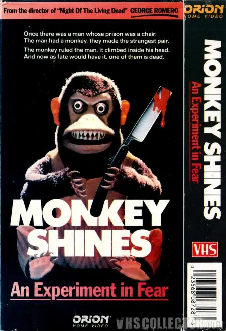
A fake monkey. With an even faker razor. This was well before the days of Photoshop, but c'mon. Make the effort.
It's easy as hell for me to be brave and mock this thing now. Now that I'm an adult and enjoy more sophisticated fare around Halloween, like Chopping Mall and Dawn of the Dead. Any mall-based horror, really.
But the thing is, this cover stuck with me. This damn monkey and his grin. I NEVER rented this movie, but the image followed me home, and it lodged in my brain for the next, let's call it 20 years. Two decades, people.
Here's the part that turned that shoddy monkey into a column:
Why don't book covers stick with me that long?
Let's look at some of the top sellers right now.
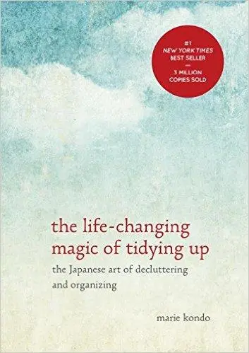
Suh-nooze. What do people say when they're looking for this book. "It's like...the one with clouds-ish things"?
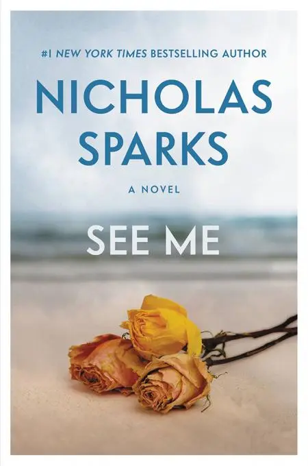
Ugh. I hope those roses aren't too brittle to stab my eyes out with, because I can't stand to look at this any more.
Okay, maybe we should be looking at horror? What's on Amazon's horror charts right now?
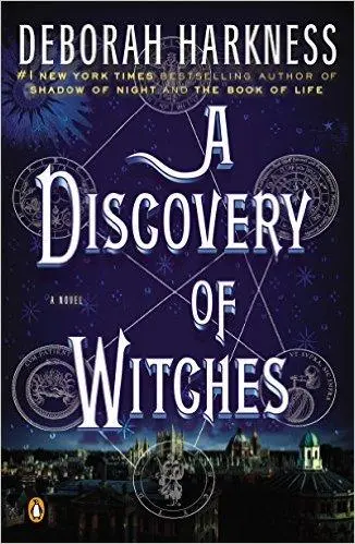
Nothing really wrong with it. But when I close my eyes, can I really remember it? Is it something that I'll remember 20 years from now? It's no razor monkey, that's for sure.

Dave, baby. I love you, but what are you doing to me here? Some squares and some keys. Not exactly Wes Craven stuff. Not exactly terror on the level of a horribly burned child murderer back for revenge here.
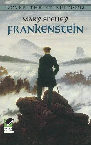
Oooookay. This is Frankenstein. The book that launched a bajillion Halloween costumes. A slew of horror movies. A whole lot of corrections about who's Frankenstein and who's The Creature. One of the absolute classics of horror. And what's on the cover? A seaside dandy. My god is that NOT what I want from this cover. Need I remind you that this book is about a creature sewn together from human corpses?
Alright, enough. Let's get to the good stuff.
What can book covers learn from VHS horror of the past? How can a book cover lodge itself in my memory? What are the advantages of a toy monkey with a cartoon razor?
Don't Be Afraid To Hook Me With Visual Narrative
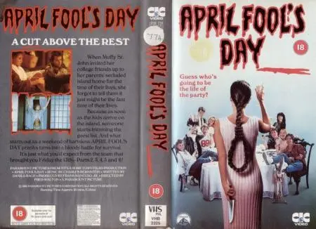
This cover gives me an idea of what's actually going to happen in the movie. Not an artist's vision of an emotional journey as expressed in colors and patterns. I know, when I get this movie, that I'm about to see a teen romp gone awry. In the murder way.
Maybe it's a good idea to create more than atmosphere with a cover. Maybe it's a good idea to relate some of the story, something that prompts me to pick this up off the shelf.
Taglines Set The Tone
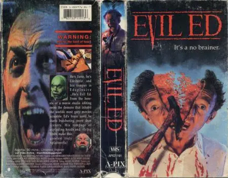
Note the use of little taglines in this cover. Horror VHS taglines are cheesy, but hey, they express the way in which horror movies mix fun and terror. Maybe even allowing the viewer to laugh at a guy getting his head split in half by a hatchet that's held by...an invisible man?
I like how this cover tells me that I've got a horror movie, one that's got the gross-'em-outs, but without the serious, hostile Hostel feel. Those few words of tagline give me an entire reading on the film.
Basically, I like how this cover tells me that it's okay to watch this as a gore fest, but also gives me permission to get a chuckle out of it. It gives me not only the plot, but a way of coming at this whole thing.
Playfulness
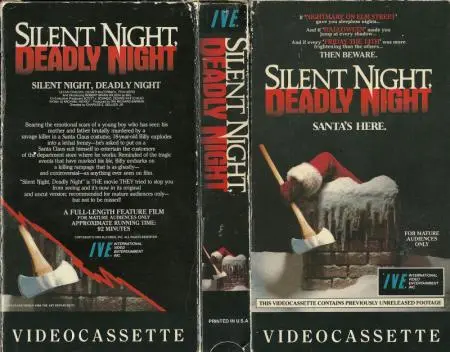
There's a way in which a lot of book covers take themselves very seriously. They say, "There is ART between these covers, sir. Real art. The kind from the museum you hate. The one with no dinosaurs or caveman dioramas."
This cover is playful and menacing at the same time. It doesn't detract from its scariness, but there's still a laugh wedged in there.
We read sad, heartbreaking books all the time, but there's a part of it that's enjoyable, right? There's a part of reading, even something that can be difficult at times, that gives us pleasure? Is there a way that a book cover can acknowledge that? The dual nature of books? Is there a subtle way books can accomplish that, like, I don't know, a Santa going down a chimney with an axe, or maybe Rudolph burning someone's flesh with his red hot nose? His nose is red because it's hot, right? And he burns people with it?
Tap That Spine
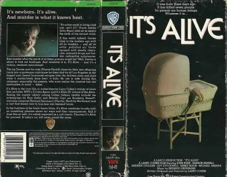
Look how this cover relies on one little detail. It's creepy, and then once you see it, that's it. You're in, my friend. That gross little baby hand will haunt your dreams.
Now look at the spine. That's the real money right there.
For the amount of time books spend on our shelves, the spine is wasted graphic real estate. Why not give me SOMETHING? A gross, mutated baby, a baby with no face, a baby that has fangs. Some kind of gross baby on the spine could salvage that Nicholas Sparks cover nicely.
When In Doubt, Bees
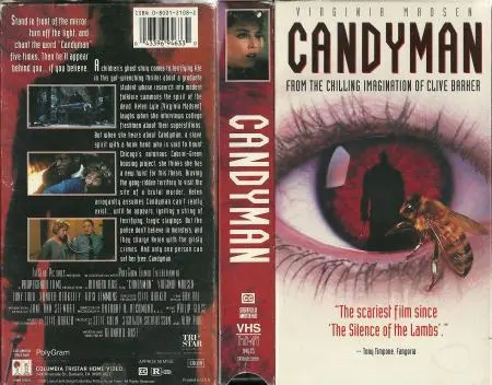
If you're not sure what to do, throw a bee in there. Bees are scary. I don't care what some hippie says. In fact, I'm coming out right here as anti-bee. Mother nature has been trying to kill humans the entire time we've existed, and now that we've got her on the ropes, we're going to save the bees? I think not. Screw the bees.
Entice Me Up Front, Take Me Even Further On The Back
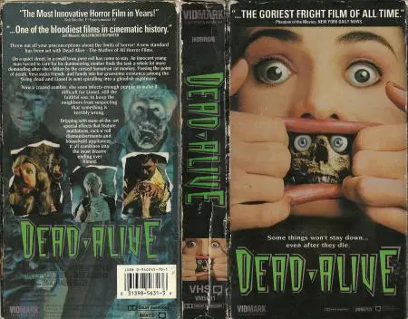
The front here is pretty great, and we think, "Alright, I've seen the worst. Let's find out what this movie is about." We're hooked.
Then you flip this bad boy over, and we've got A GUY SHOVING HIS HAND THROUGH A LADY'S HEAD SO IT COMES OUT OF HER MOUTH. Okay, that's worse. That got a lot worse.
When I see that much "narrative progression," let's call it, in that tiny space, I'm left feeling like there must be a hell of a lot going on with this one. If we go from something bad to something worse just from cover to cover, what's happening between those two things?
This cover makes me want to find out what's in the middle.
Dolls, You Idiots. More Dolls.
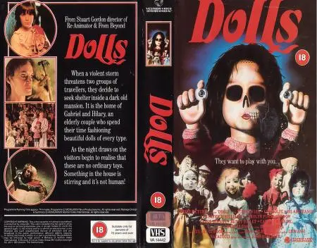
Every 5th horror movie involved spooky dolls. I don't think I need to explain myself on this one. Dolls, you fools. Dolls.
Visual Metaphor Doesn't Have To Be Impenetrable
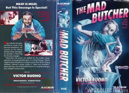
I'm assuming that this doesn't ACTUALLY happen in this movie. A very tiny woman sliced in half by a butcher. A simple film about a butcher who sells human flesh would only be complicated by the existence of a race of tiny women. That's too much, even for me.
You can put a metaphor into your cover, express what's happening, without having it be so confusing, so non-specific that the only way you'd understand it is by reading the book. You can show me a version of what happens. You don't have to make it, I don't know, a yellow feather in a pile of red feathers or something.
Again, Dolls.
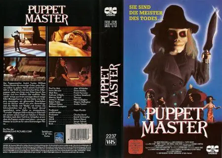
Puppets are pretty much dolls. Bonus points if you can add some German text. One of their words for "the" is "die." That's about as metal as a language can get.
Quit Trying To Make Something Timeless
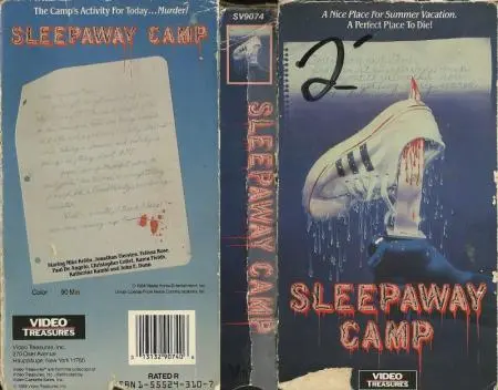
Bold moves never go out of style, even if footwear does.
Okay, it's the opinion of myself and Run D.M.C. that these shoes are still great, but that's not an opinion we all share.
The thing of it is, I think a lot of books would move away from doing something like this for fear that the image wasn't timeless enough. That the shoe would go out of style, and people would recognize this as being of a certain era.
But shooting for something timeless, that's the ultimate in homogeneity. Not only do you want to please EVERYONE, you want to please people who aren't even born yet. That's a lot of pressure, and it doesn't usually work out anyway. It's alright if your story is time stamped.
Get All Bob Ross On It
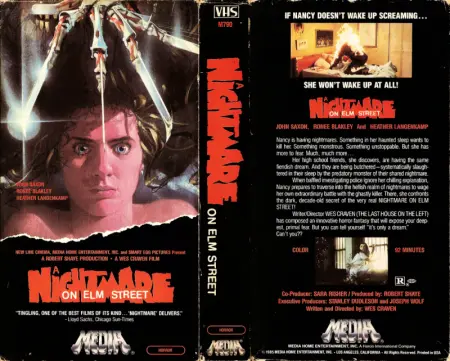
Painted covers aren't just for six pack abs on pirate ships. There's still some value there. You can still make an evocative image this way.
This is a cover that would stand out right now on bookshelves. It doesn't look like a lot of the other stuff that's out there. It falls somewhere between the big-budget covers and the inexpensive, computer generated stuff you're likely to see from some indie presses.
My theory is that book covers would benefit from a little back-to-basics, paints and pencils.
Just Go For It
I was at a reading once where someone asked Patrick DeWitt how he found the names for characters in his books. He said he went to graveyards and looked at older graves. The reason? When it comes to names, people back in the day "really went for it." They weren't afraid of a name that might have been a little much. It's true. Look at your Civil War generals. Henry Blackstone Banning. William Tecumseh Sherman. Pierre Gustave Toutant-Beauregard. When your parents name you Pierre Gustave Toutant-Beauregard, that's not the result of a discussion along the lines of "Do you think it's a bit much?"
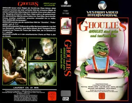
Is a Ghoulie coming out of a toilet the result of a conversation where ANYONE said "I think this might be a bit much?"
I think not.
My god, have some guts and go for it. Show me something. A toilet monster, a toilet snake. A toilet anything, really. If Jonathan Franzen's Purity had a toilet monster on the cover, I guarantee you we'd be having a VERY interesting discussion about that book right now.
Let Me Drive This Home, One Last Time: Dolls
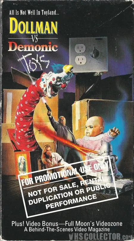
Toys, dolls, dollmen. Maybe Chip Kidd can get an internship at Full Moon productions, work up some new skills on the cover for Gingerdead Man vs. Evil Bong.
Hey, look. I get it. It's the internet, and we're all tired of hearing that everything is this, everything is that. Everything is the best or worst thing ever.
I'm aware of book covers that play by my rules. Ones that follow these lessons.
I guess what I'm saying is this:
Put two boxes in front of me. One is filled with book covers. One is filled with horror VHS covers.
Sight-unseen, I know which one I want to look through.
But hey, prove me wrong. Share some book covers you love.
And prove me right. Share some of the VHS covers that haunted your childhoods.

About the author
Peter Derk lives, writes, and works in Colorado. Buy him a drink and he'll talk books all day. Buy him two and he'll be happy to tell you about the horrors of being responsible for a public restroom.

