I've spent the last couple months inviting over 200 local authors to an event as part of my day job.
This means I've seen over a hundred author web sites in the last month.
Folks, these are rough waters.
As someone who does some writing AND booking of authors, let me tell you what your web site needs. To put this another way, please, allow me to BEG you to make sure your web site has these 10 things.
1. A Reason For Being
Okay, not really a component coded into your web site. But before the rest of this can do you any good, take a deep breath and accept that the reason you have a web site is for people to find out about you and find out about your work. If you're a true artist who doesn't give a damn about selling books or talking to people about your work, then that's FINE. But don't waste everyone's time with a web site.

2. An Author Location
Tell Me Where You Live.
And before you panic, I know this reads like the last line of a telephone conversation that ends with someone being killed by an electric drill, but I'm not asking for a street address.
But listing your state would be nice.
I work in libraries and for a non-profit that brings in authors, and I can tell you that when it comes to booking authors for readings, workshops, what have you, and when it comes to making sure that we've got a good representation of our local authors on our shelves, things are a lot easier when you say which state you're in.
I'm not going to email you and ask if you're in-state. If I can't be sure, I'll just move on.
This applies to bookstores too. And even Goodreads lists. You'll see things like "Best Colorado Authors" lists all the time. Make yourself just a little more eligible for that stuff.
If you get so famous that it's a problem, you can always lie later on and say you've moved. And if you do so, I recommend saying you've moved to French Lick, IN. Because it's hilarious, it's the home of Larry Bird, and it produced a very popular laxative. And also because it's a real place named French Lick.
3. An Email Address
Authors love their contact forms. And I understand why. It reduces spam, harassment, and other garbage.
But I'm going to tell you a non-secret: everyone else hates contact forms. When I fill out a contact form, I don't have the message in my sent email folder. I don't know that you actually got the message, whereas most bad email addresses will return a message letting me know you never got anything and I need to try again.
And, you know. A contact form, even a nice one, makes me feel like scum. When I contact you through a form, I feel like, in your eyes, I'm on the same level as penis pill spammers. I assure you, I'm at least as good as the cash-4-gold people, and I deserve that level of respect.
This is why I'm encouraging an actual, honest-to-god email address. You can set it up within an image if you want to discourage bots:

You can also set up an email that is ONLY used for this purpose.
If you must use a contact form for some reason, reducing the number of fields will increase the number of contacts you get. My recommendation: make the person provide an email and a message. That's all you need to get back to someone, and what good does it do to have their made-up name? How many contact forms does "Frenchlick Derk" have to fill out before people get the hint?
4. A Newsletter Sample
This column by Michael David Wilson makes some damn fine points about mailing lists. But I'm not signing up for any newsletters sight unseen. For all I know, it's a monthly email that says, "Buy my book. Don't forget to buy my book. For real, buy it!"
If you want me to sign up for your newsletter, tell me why (...ain't nothing but a mistake... Sorry. That's just a reflex when I hear the phrase "tell me why.") by showing me what kind of fun I'm missing out on if I don't get your newsletter.
Don't rely on me loving you so much that I'll sign up for your newsletter. Show me how I have as much to gain from reading it as you do from writing it.
5. A Two-Line Bio
I love your full-page bio. But if I'm putting something about you in a program or on a poster, if I'm spreading the word about you in some way, wouldn't you rather determine what those two lines will be instead of having me hack your bio to pieces and pick out whatever I think is important?
A two-line bio is easy for me to cut, copy, and paste wherever I might want to use it.
Good way to check this: Does your name, two-line bio, and URL all fit in a single tweet?
6. A Yearly Expiration

You will change your whole life today if you go through your spice cabinet and toss anything past its date. Yes, those bottles have dates on them. And yes, if you've never done this before, you'll toss half your stock.
There are things like milk where we don't go past the expiration. The consequences are dire. Rhea.
But with spices, whatever, you won't get sick. They're just less flavorful.
Web sites are the same thing. It's easy to let it slide because, hey, it still works. It still serves its purpose. As long as I don't experience bowel distress when I look at my web site, eh, good enough.
But if you set a yearly expiration for your web site's design, your web site will stay sharp.
You don't have to change everything around and make it insane. Just set a yearly date when you look around, make sure it all works, and ask yourself if there's anything that could be better. Make it a regular thing, and when you do it, don't leave any options for change off the table.
![]() 7. A Picture That Actually Looks Like You
7. A Picture That Actually Looks Like You
Look at this handsome fellow. Whose picture I stole and I hope isn't mad:
I've met this guy in real life, and he looks like this. If I were picking him up at an airport, this is the guy I would find if I kept my eyes open. If I were organizing an event with this author, I'd have an idea what he looks like and who to look out for.
I know, some of us are ugly as hell. Some of us have adult braces for a time. Some of us don't have the innate ability to look cool and pleasant at the same time. We can't all pull that off, ROB HART!
But your face is your face. If you don't like the look of your own face, I understand completely, and I suggest you do what I do and just consider your face to be utilitarian rather than unattractive. My face is meant to have a food hole, a smell hole, and eye holes. And as a tool for others to differentiate me when there's a need to do so. If my face serves those purposes while also growing eyebrows of a ridiculous length and being a place for acne scars to remain on lifelong display, then so be it.
8. A Place For People To Tell You About Typos In Your Book
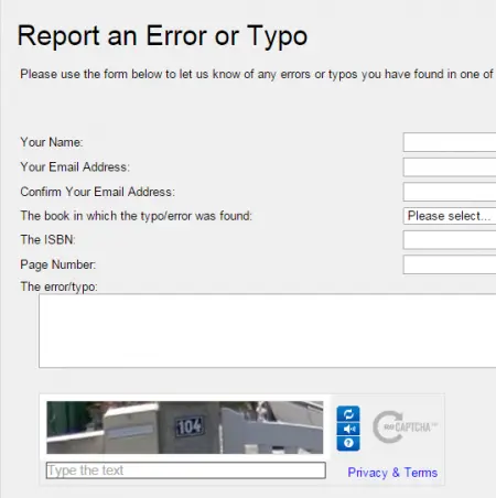
I am 100% kidding. In the research for this column, I found out that Stephen King actually has this, and it's too bonkers not to share.
Maybe the contact form does serve a good purpose here. My only hope is that the messages that go into this form emerge from a printer that sits on the very edge of a very deep hole in the ground.

9. A Description Of What You Are Willing To Do and For How Much
Are you looking to write columns for web sites? Magazines? Are you someone who is willing to teach workshops? Would you visit classrooms? Will you edit someone else's work?
These are all legit requests and ways that writers work and make money. If you're up for it, put it out there. If you're not, then it's totally okay to say, "Sorry, my writing schedule won't let me make any appearances or do any events at this time, but check back soon!"
Bonus points if you can prepare a packet that includes the kinds of things you do, what you charge, and so on. This might all sound a little too slick and business-y, but when I'm looking to book someone for a workshop, when I'm handing over a check, I want a great writer, and I need that person to have their shit together. If I'm looking for writers for a web site, I need to know they've got chops, but it doesn't hurt for me to see that they're someone who is likely to get the work done on time without a hassle.
If I'm being honest with you, I'll book a second-choice author in terms of writing skill if the person is easy to work with. This isn't to say that writing skill doesn't matter. It's to say that the other things are also very, very important.
And if you DO make appearances, get someone to record a portion of one for you. That gives people an idea of what kind of speaker you are.
10. A Sense Of Who You Are
This one's ephemeral and tough.
Most writer web sites I see are fairly serious. But the question is, are you a serious person?
And more importantly, is it possible that your seriousness is making people too intimidated to reach out to you?
Look, if you're not a fun person, then no one is asking you to be one online. But just take a look at what you're putting out there. If you find that you're getting a lot of requests to write fantasy fiction when your passion is true crime, maybe it's time to re-evaluate why there's a picture of a wizard on your site. If you're a writer of heavy, sad books, but you're a joy to be around in real life, how would you expect anyone to get that if your site has a black background, lighter black text boxes, and grey text? If you have weird political views...actually, just keep that stuff to yourself. Let's not challenge my ability to enjoy your work by telling me what kind of wall you want to build to keep whoever out of wherever.
What do you think belongs on a writer's website?
About the author
Peter Derk lives, writes, and works in Colorado. Buy him a drink and he'll talk books all day. Buy him two and he'll be happy to tell you about the horrors of being responsible for a public restroom.
 7. A Picture That Actually Looks Like You


