As a graphic designer, it’s rare that I get to interject my opinion into hot-button debates about the evolution of economic models… so it’s with great joy that I offer my (increasingly worthless) two-cents on the topic of Thomas Picketty’s “Capital in the Twenty-First Century.”
Now, just to clarify, I’m not really in any position to debate economics or decide who has and who hasn’t got the brains, balls and/or beard to be “the next Karl Marx.” What I am in a position to say, however, is “damn, this cover is a real poop sandwich.”
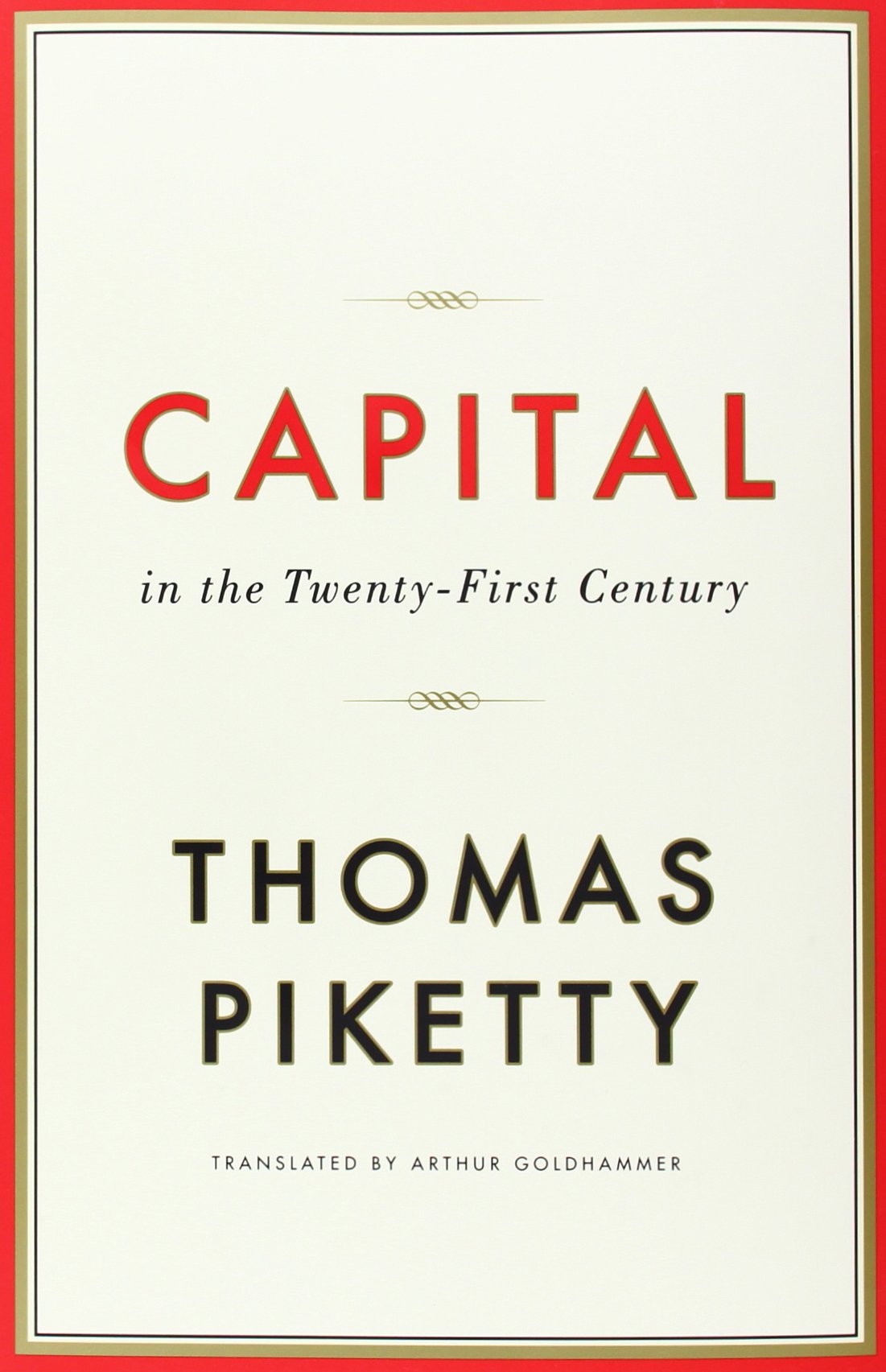 This bruiser to the left tells me nothing about the book, except that it’s probably self-important and boring, and might be a textbook. I have no problem with a minimalist, text-only approach (I love this one from “the old Karl Marx”) – but if you’re waving the “less is more” flag, well, then you actually have to wave it... and less has to actually be more. That is, it has to communicate something.
And this, if I may extrapolate and switch gears a tad, and maybe go get an ice cream sandwich – is my larger problem with what I call “the cult of Helvetica.” Ever since that damn documentary came out in 2007, a legion of young, lazy designers have decided that widely-spaced, san-serif overlays are all you need. They missed the point (i.e. - that these typefaces are great because they don't mean anything) and decided emotionless text is the best thing to hit the field since Photoshop, Illustrator and “those cool-looking antiquated design tools” whose names they never learned because they’ve always had Photoshop and Illustrator.
It's in movie posters. It's on album covers. It's in ads. And, it's pretty much rebranded laziness (and/or ineptitude) as “a clean, inspired nod to Swiss minimalism.” With that in the holster, designers can now sit back 'til the last minute, then slap any big, semi-opaque title over any related background, and kick their feet up on their desks like Mike Seaver in that episode of Growing Pains where he writes the answers to the test on his shoes and thinks he's home free, and pretty much is, until the teacher sees the writing on his shoes... In this scenario, I'm the teacher and I'm calling bullshit on all of us.
So, with that rant stuck in my proverbial craw, I say it's time to rethink our approach to type (and maybe wealth distribution), and stop accepting things like this:
![]()


These styles (which, I guarantee will be remembered disparagingly in 30 years as “so 2010s”) misunderstand the point of both simple type (meant to be neutral) and primary cover type (meant to be referential and expressive), and prove that when misused, a beautiful typeface can look dull, expressionless and hackneyed.
Our overreliance on “clean” typography has become the cliché black of the fashion world, the flavorless wheat of the food world, the cheap chair of the furniture world... Sure, it looks neat, and sure, it’s economical and sure, it has its place. Sometimes it's necessary to wear a Steve Jobs turtleneck and eat farina in a $20 Ikea chair — but isn’t it more fun to dress like Billi Gordon in “Coming to America” and eat a deep-dish pizza in a hammock?
I kinda lost my train of thought there, but the point is: you can do some pretty awesome stuff with type. It’s more than just “the words.” Type provides another dimension with which designers can relay plot, character, setting, and tone.
With that in mind, here are some covers that get it right and show what type can really do (with links, where applicable, from the indispensable Book Cover Archive listing typeface, designer and publisher info):
Type Can Stand In for the Author:


Type — like writing — doesn’t have to tell, it can show.
Here, a jazzed-up version of Caslon Bold foreshadows Roth’s prose — confident, self-aware and marked with playful flourishes. (Note: it can also be used to parody him.)
For a more extreme example, look to Ralph Steadman’s brush work on any of Hunter S. Thompson’s work. Would Helvetica – or any typeface for that matter – be able to capture Thompson’s mad, colorful and irreverent style? I think not.
Type Can Be Part of the Bigger Picture:

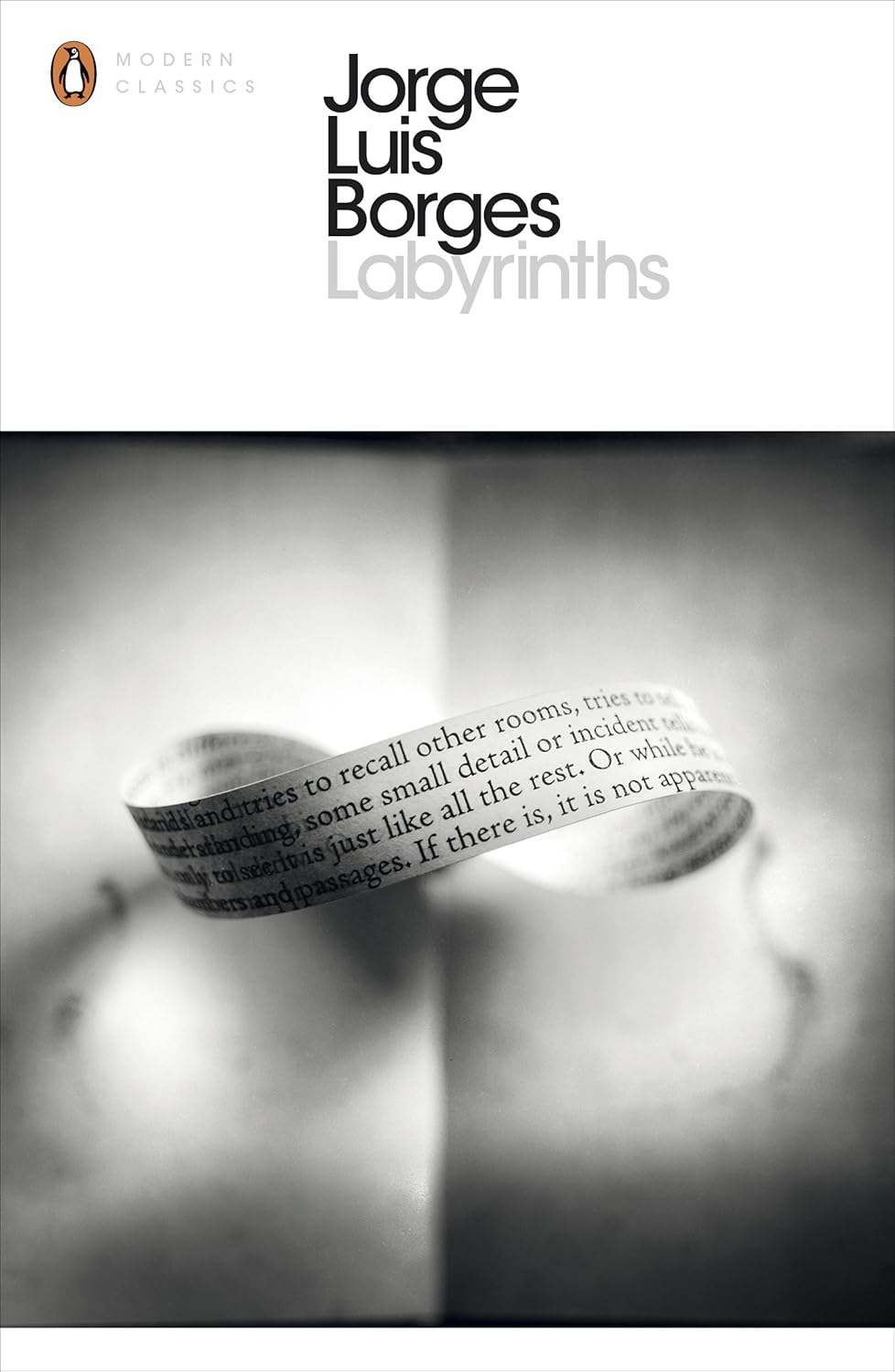
Here are two great covers of Borges’ Labyrinths that manipulate type to introduce his world and style.
The text-wrapped mobius strip in the second cover and the reflected letters in the first really bring Borges into focus. They’re real, but reflected, duplicated and flipped — in plain view, but impossible to corner... and the illusion keeps going and going.
You can’t do that with flat text.
Type Can Be Referential, Symbolic and Clever


Type, of course, exists in the world outside of books, and designers who remember that can piggyback on the atmosphere and authorities of its references.
Using the definition of “word” as a stand-in for the word “word” would be great even if this first book wasn’t about words… Since it is, well, double-word score.
“Design Flaws...”, on the other hand, wins by matching Helvetica (Light) with a very branded typeface. So when we see the second type (Make, Model, even “Turbo”), it’s like adding water to a packet of instant-setting. Boom: we can picture a Volvo (and all the baggage that it carries).
(And this is how you're supposed to use Helvetica/Futura/any such typeface. They’re great because they’re neutral and, in turn, universal. Unlike the "Volvo" mark, they have no baggage of their own. Thus, they work best when they play straight-man to a much more expressive — or in this case, referential or branded — typeface.)
Type Can Create a Universe:

The desaturated images on Kafka's new Penguin covers wink at the books' respective plots, but it’s the hand-drawn typeface, in my opinion, that sets the table for each story’s tone.
Textured and perfectly imperfect, these pop like the ransom notes from a peculiar and matter-of-fact kidnapper who knows exactly what he’s doing – and that’s precisely how I see Kakfa.
Type Can Reflect Character/Subject


I can give or take the photo on the first American Psycho cover, but the corporate blocks (in Bodoni) reminds me of the engraved Garamond used on Bateman’s famous business card. I like to think that was intentional…
The lettering connotation on the second cover is subtler, but if you know Noel Coward, then you know how aptly this stylish, smart script fits the man. The curves, the tilt, the fluctuating line weight – it’s all a perfect fit.
Type Can Lend Space & Depth


How do you lend perspective and a sense of space to a flat photo depicting a real city? The same way you show the brilliance of flat paintings that look deeper than real cities: A good typeface, and an angled perspective. (Another great example of how neutral type should be used...)
Type Can Provide Juxtaposition that Introduces a Thesis


Mixing typefaces is a tricky business. When it fails, it fails hard – but when it succeeds, it’s beautiful.
The central struggles of these books are perfectly conveyed solely using type.
Neither is particularly “clean.” Both are Brilliant.
So there you have it, kids:
Helvetica isn’t God’s handwriting.
Capitalism is probably dead.
And type can be pretty awesome.
Spread the word!
(BONUS LINK: for a great example of referential type — and a cute send-up of Picketty-Mania — check out Bloomberg Businessweek's recent cover on "Capital...")

About the author
Robert Bieselin is a writer and graphic designer, who splits time between New York and Los Angeles. He is currently the graphic designer at Book Soup in West Hollywood (booksoup.com), and previously, was an entertainment reporter at The Record (northjersey.com) newspaper in New Jersey.