Photo: Wtshymanski / Wikimedia Commons / Public Domain
Remember how computer screens looked back in the 1980s?
No? Have you seen Stand by Me? Richard Dreyfuss sort of plays Stephen King in it, and there's a moment toward the end where you see him composing the story Stand by Me (or is it The Body?) at his computer.
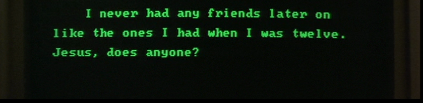
Black background, green text. Simple. No distractions, no tool bars, nothing else to click or focus on other than the text on the screen.
It may seem like a novelty to do so, but you can recapture that look and feel on your schmancy modern-day equipment with relative ease, and there are a few solid reasons to create this kind of writing environment beyond mere nostalgia (in and of itself not necessarily a bad thing). Having a dark theme on your computers, tablets, and smart phones can be a lifesaver for anyone who has a sensitivity to bright lights or certain visual impairments (which is why Accessibility features like Invert Screen Colors exist).
Overall, it's a good idea to at least use a dark grey background with light grey text, because white backgrounds (and even white text on black backgrounds) pretty much generates the greatest amount of strain on your eyes. Perhaps the bright white background with black text has never bothered you. Or perhaps you've simply never noticed it bothering you. Either way, give this approach a shot and see if your eyes feel better at the end of the day. You don't even have to necessarily go with the black and green color scheme (some people really like a cool cyan text over grey, or even blue background with yellow text). Just so long as you're avoiding white in any capacity, you'll be doing yourself a huge favor. If the dark background, light text set up hurts worse than a more traditional layout, you can always switch back.
Now, there are several word processors out there that have adopted the retro layout as their default landscape—WriteRoom being perhaps the most famous—but you don't have to pay extra money to reap the benefits of that Stand by Me look. Here's a look at three major word processors, and how you can change the settings to mimic that 80s computer monitor look.
Scrivener
First off, I'm a Mac user, but the majority of this information is fairly universal across different platforms. There might be slight differences in how you access certain features (like Preferences, for instance), but changing your settings to create the old school environment will be the same.
Also note that the changes you'll make will only reflect the writing environment when you're in Compose (or Full Screen) mode. In the standard Scrivener window, you can alter your font, its size and its color, but your background will forever remain white. If you prefer to write this way, with a smaller text window and other windows or programs accessible, this info may not apply to you. Remember, however, that the idea here is to create a distraction free and more comfortable writing environment, so I would personally recommend writing in full screen, no matter if you use Scrivener or another writing program.
Now, all that being said, you'll navigate to Scrivener > Preferences. From there, first go to the Formatting tab and click the Font button right under Main Text Style (labeled Aa). I chose Andale Mono, Regular, size 14, because this looks most like a 1980s plain text environment, but you could really use whatever font and size you prefer. I do recommend something unobtrusive, however: at least for me, the less flashy the font, the more I'm able to zone out and focus just on the output of words from fingers to screen (but then again, it's a bit easy for me to get distracted by things as simple as font flares, so if that doesn't apply in your case, just do you).
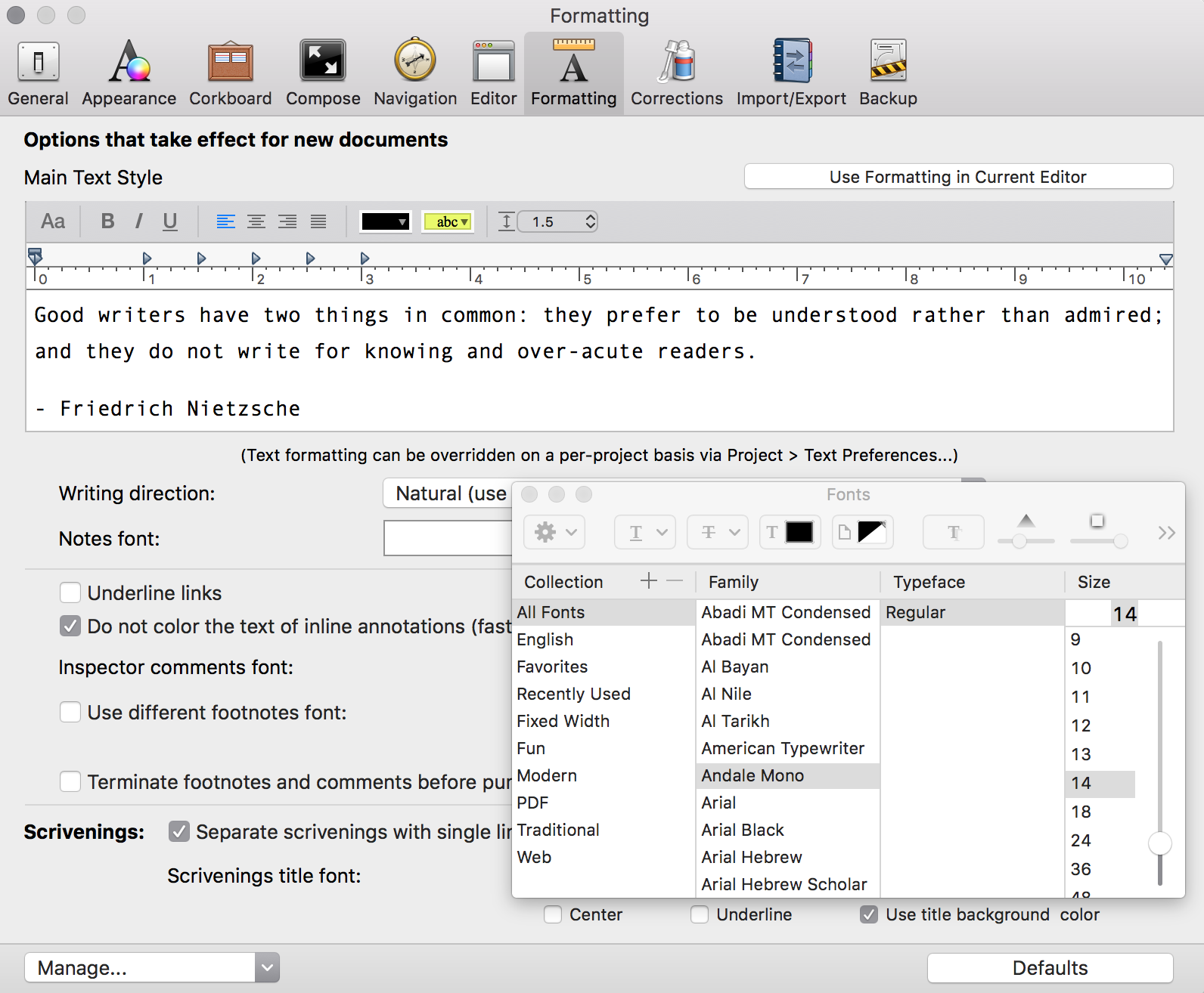
Next, you'll want to change the font color and background. To do that, click over to the Compose tab. Toward the middle of the window, you'll see a section titled Customizable colors. Select Text Color in the scroll down menu and choose the hue of green you prefer. If you're using the color wheel, I chose a hue smack in the middle of the green spectrum, with a slightly above the middle mark. This creates a nice, muted color, easy on the eyes but no so dark that I can't see what I'm doing.
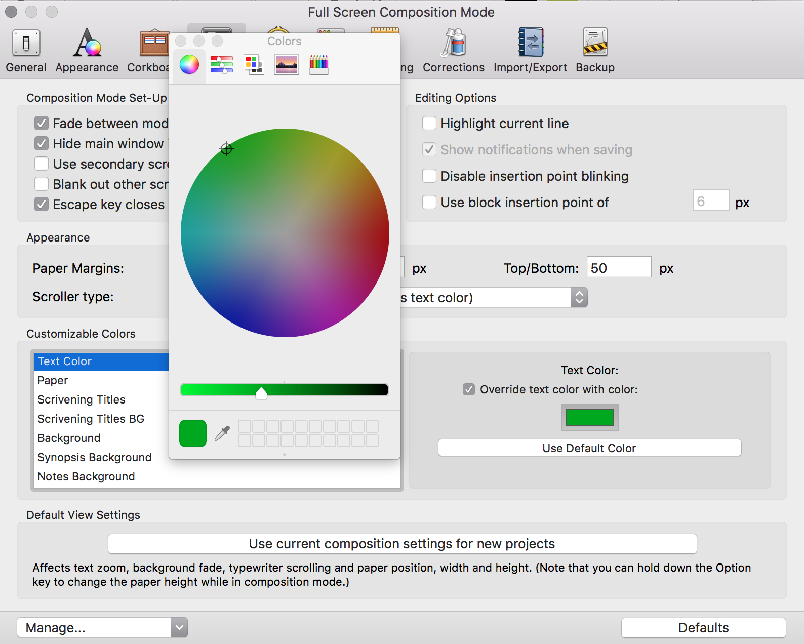
After changing the font color, the next step is to change your background to black. Remain in the Customize Colors section, but scroll down to Background. You'll notice that not much about the interface changes here. Click on the color box and select black. Done.
Finally, scroll down to Text Selection. This will alter the color of any text you highlight or double click. You might not give two craps about this, and if so, that's fine. However, I get irate when colors clash—maybe irate is a strong word, but it definitely annoys me, particularly when I'm dealing with something I'll be staring at for hours on end. For this setting, I left the color wheel at the same spot and simply notched down the brightness slider to a little under the halfway mark, so that the highlighted text bleeds through.
And that's that for Scrivener. As soon as you launch into Compose mode, your screen will look just like an old school word processor.
Additionally, I have no tabs set for new paragraphs, and the space after paragraph set to 14 points as well. That way, when I hit return, it automatically creates two spaces between the paragraph. Again, this is a matter of personal preference. I prefer no tabs and paragraphs as blocks of space separated by an empty line, but if you prefer a more traditional single or double spaced format, with tabs indicating new paragraphs, the world is your oyster.
Microsoft Word
This is one is quite easy to do, though double check which version of Office you're currently running. In its most current iteration, to change the background color, you click on the Design tab, then Page Color in the upper right hand corner of the document window. However, if you're running something older—say, the 2011 suite—the option to change the background color is found in the Layout tab. Either way, once you've clicked on Page Color, you simply select black, and then you're done. Next, navigate back to Home and change your font color to green.

The only downside to using Word: there isn't a quick and easy way to enter into a "true" full screen mode, as there is in Scrivener, which shows only the document field without any toolbars. This might just be a matter of personal preference, however. When I'm writing, I don't want to see anything else but my text. Some of you might not care. To each their own.
Apple Pages
Ugh. Technically, you can create this kind of writing environment in Pages, but it's...well, it's kinda dumb. It involves creating a rectangle shape that you have to reshape to fit the document window, then create a separate text box and...You know what, it's not really worth describing. Especially because you'll have to do this step for EVERY SINGLE PAGE in your document. Over and over and over again.
Like I said, it's kinda dumb.
If you use Apple Pages for your first drafts, you're basically better off straining your eyes than doing this tedious process ad nauseam. If you're cool with white background, black text, then you're all set. If not, use a different program.
And the Rest...
I'm sure there are plenty of other word processors that can recreate this old school environment, even if it's not necessarily advertised as such. One that is promoted as a distraction free, easy-on-the-eyes solution is the aforementioned WriteRoom from HogBay Software. It's a simple and clean app without many frills, which is just fine, except that it costs about $10 and it doesn't really do anything that Scrivener doesn't. Moreover, Scrivener has the advantage here because, unlike WriteRoom (or Word or Pages), Scrivener allows you to compose your first draft in the old school landscape, but export the work into standard manuscript format. In all the other programs, you'd have to do all the reformatting into standard manuscript yourself.
(I'd like to note here, as I have done so in the past, that I am in no way affiliated with Scrivener. I simply love it because it has every feature I want in a word processor).
Any of you LitReactor folk write in a retro landscape? Or do you prefer something a little less nostalgic, but just as easy on the eyes (like grey on grey, for instance)? Let us know your thoughts in comments section below.

About the author
Christopher Shultz writes plays and fiction. His works have appeared at The Inkwell Theatre's Playwrights' Night, and in Pseudopod, Unnerving Magazine, Apex Magazine, freeze frame flash fiction and Grievous Angel, among other places. He has also contributed columns on books and film at LitReactor, The Cinematropolis, and Tor.com. Christopher currently lives in Oklahoma City. More info at christophershultz.com


